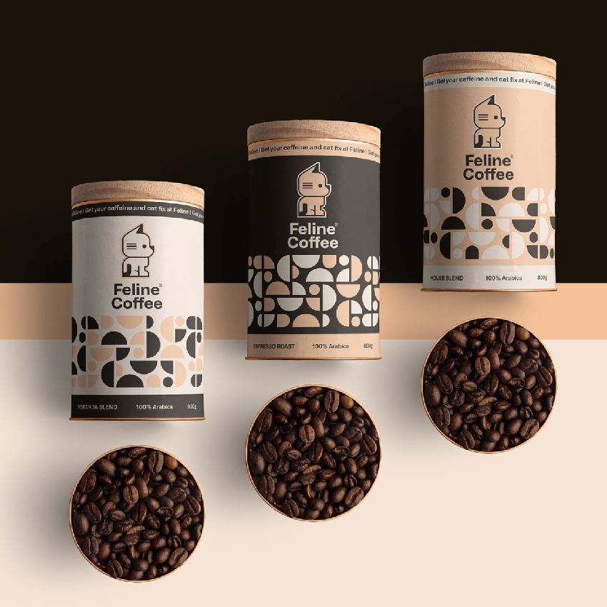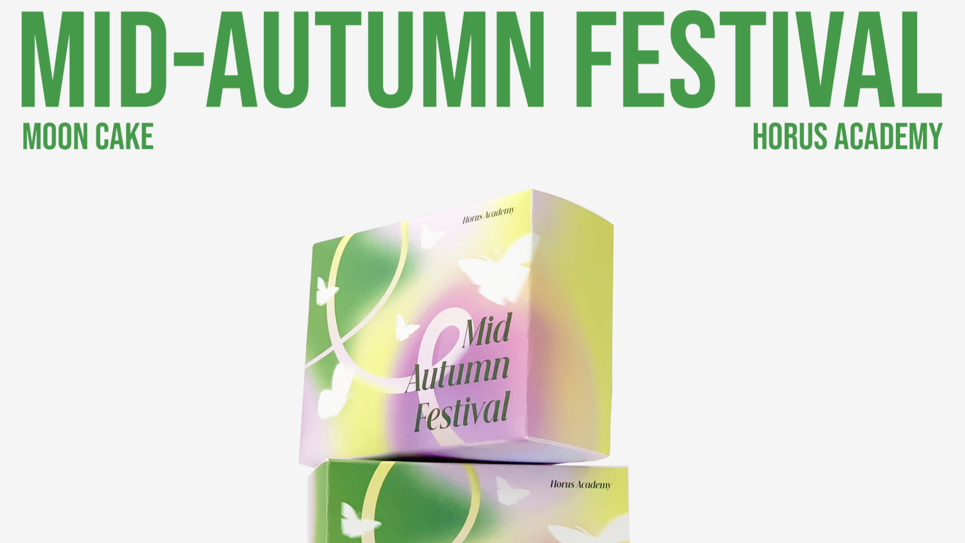
Mid-Autumn
品牌识别:
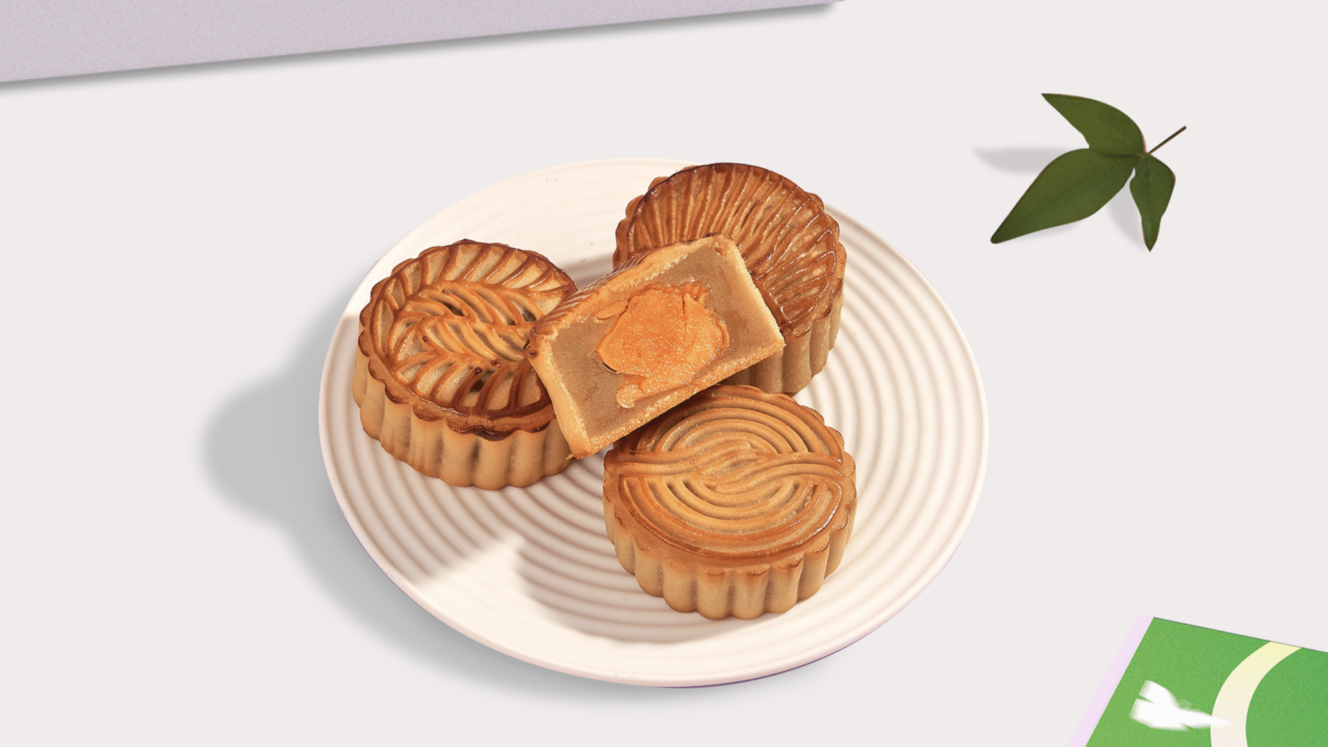
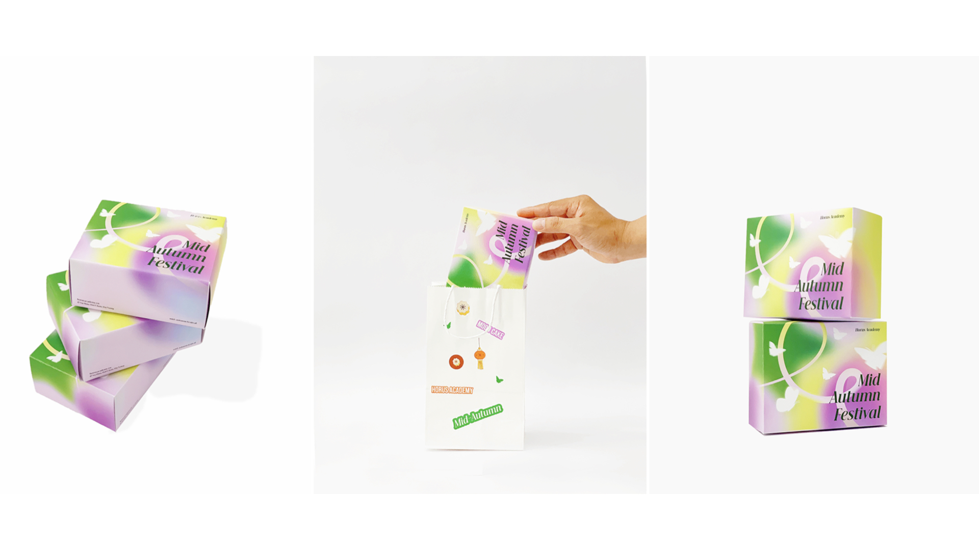
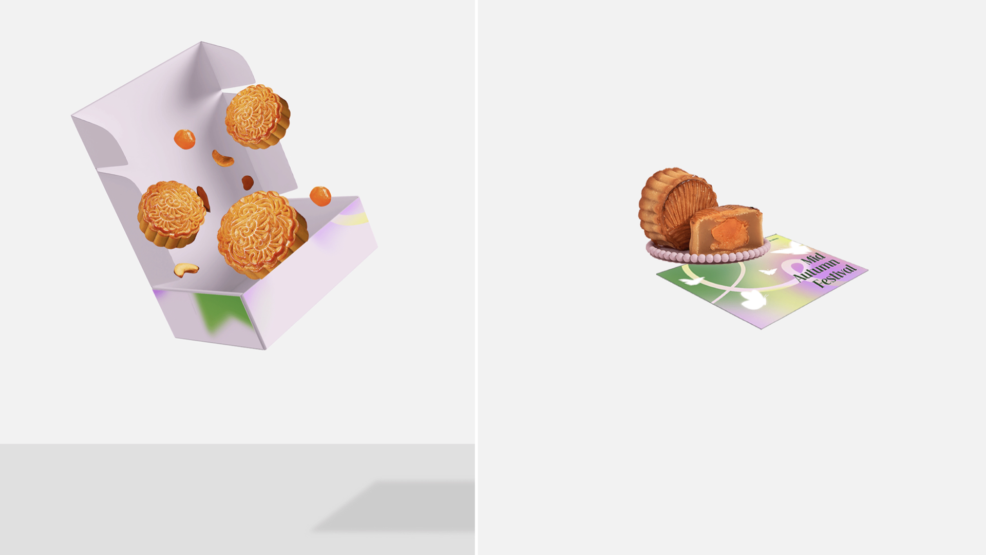
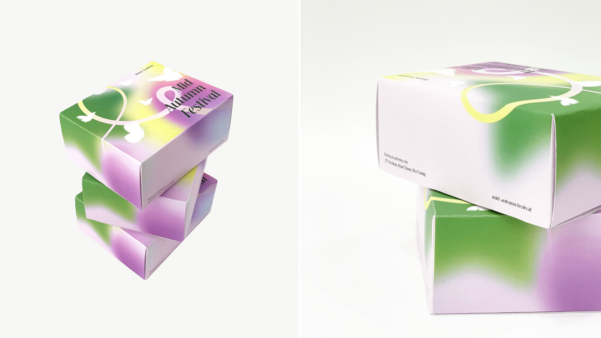
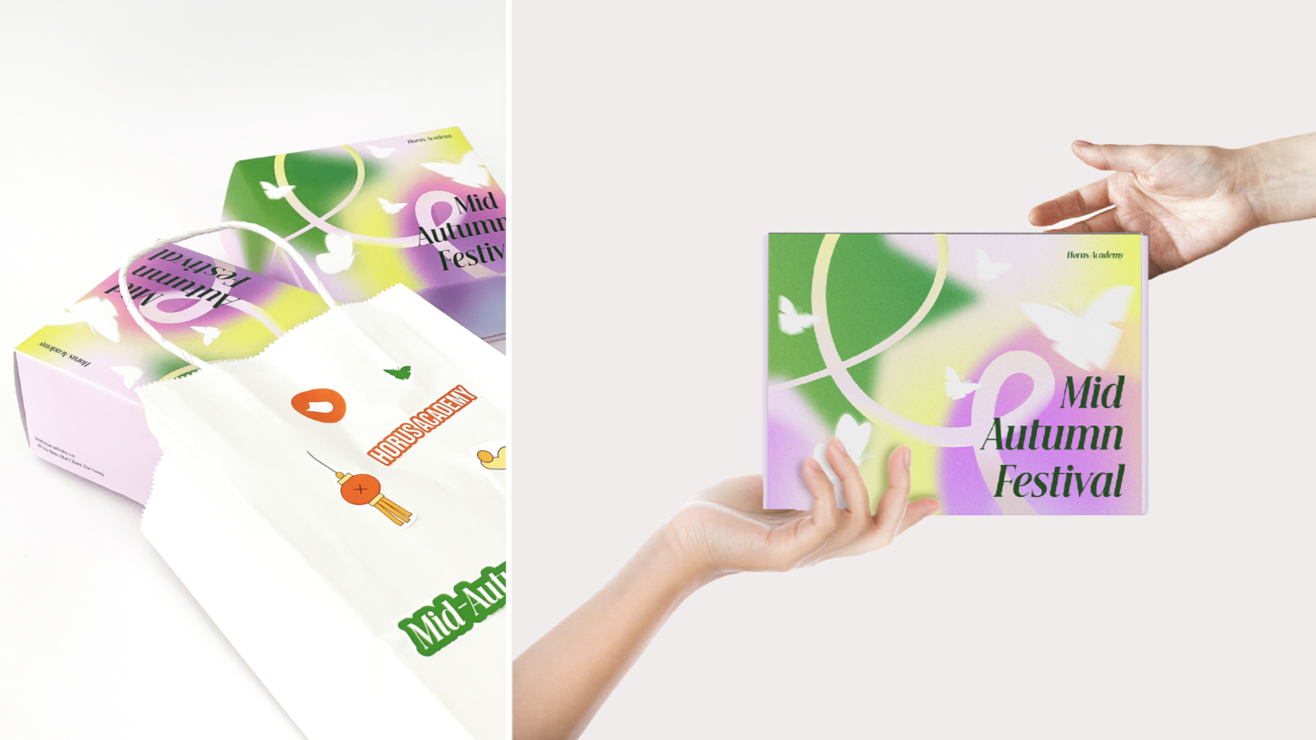
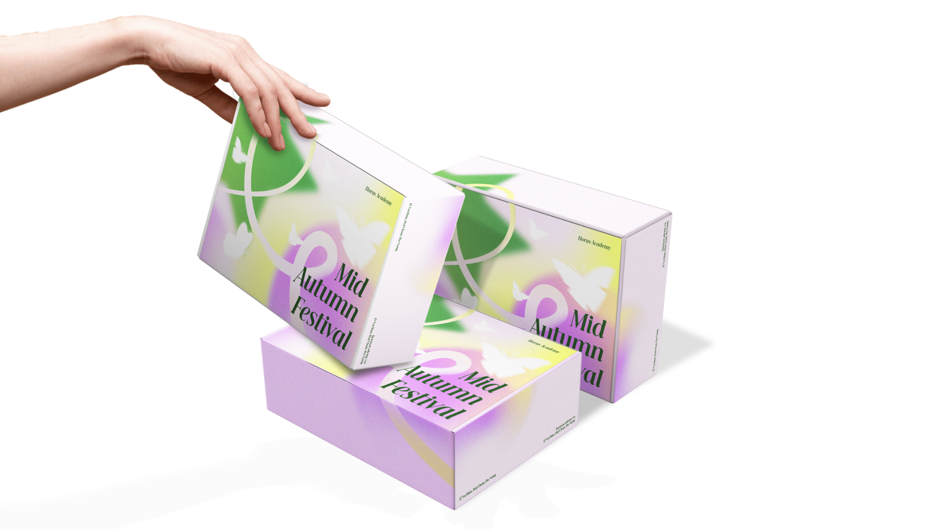
月饼品牌vi设计,月饼包装设计中的图案灵感来自于人们熟悉的中秋节形象,星星象征着与青春有关的星灯。将星星的形象与月饼相结合,使用圆圈来象征内馅,也象征着圆月。渐变色的运用突出了星星和圆月的亮点。所有这些因素都为丰富中秋节季节的视觉美感做出了贡献。在中秋节之夜,能与家人和爱人在一起,还有什么比这更快乐的呢?
使用渐变色,有必要突出图像,为背景营造亮点,不要淹没蝴蝶的形象。除了图像的突出显示外,字体的精致和令人印象深刻的组合也是必不可少的。选择了 Beautique Display 字体进行此组合,该字体具有坚实的结构,摆脱传统,传达了现代感,为这个包装创造了完美的组合。
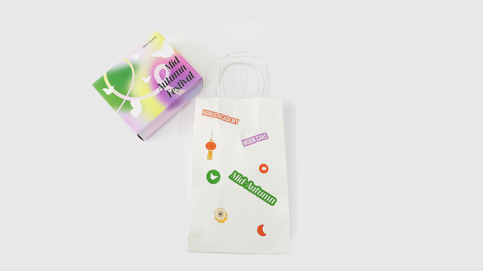
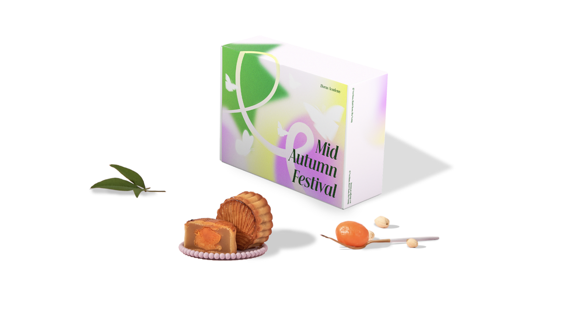
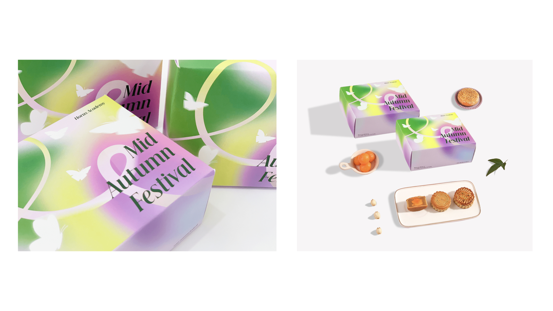
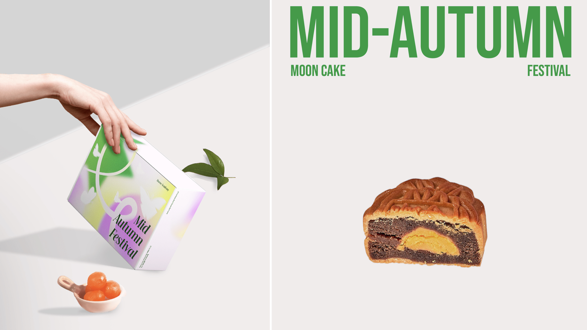
The patterns on the box were inspired by familiar images of the Mid-Autumn Festival, the image of a star symbolizing the star lantern associated with youth. Combining the star image that is the moon cake, we use a circle to symbolize the filling and also symbolize the full moon. The use of gradient colors brings out the highlights of stars and full moons. All of these factors contribute to enriching the visual beauty of the Mid-Autumn Festival season. Butterflies show the image of us being free, flying freely, not thinking too much, we are not alone. What could be happier than on Mid-Autumn Festival night when we can be with our family and loved ones. Let's create memorable moments this Mid-Autumn Festival.
Via: Ceris Creative