Belcolade
品牌识别:
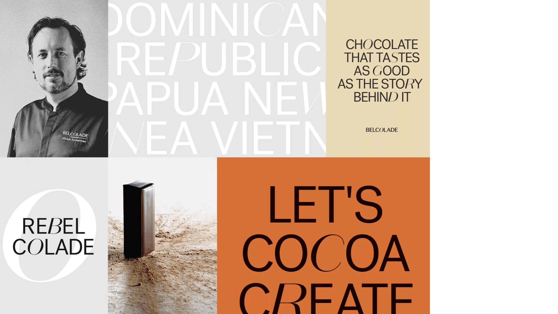
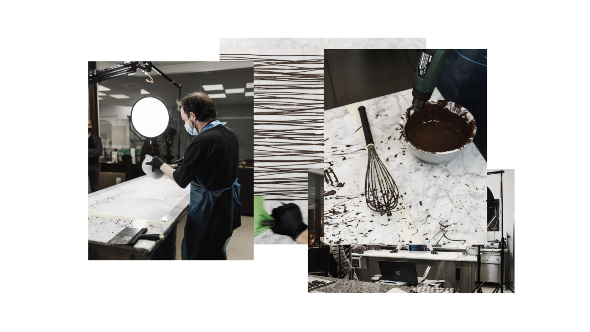
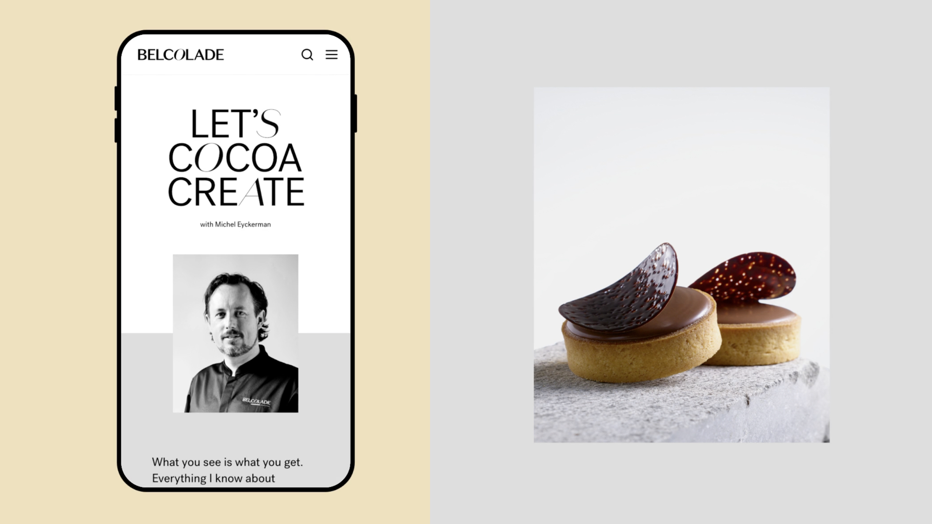
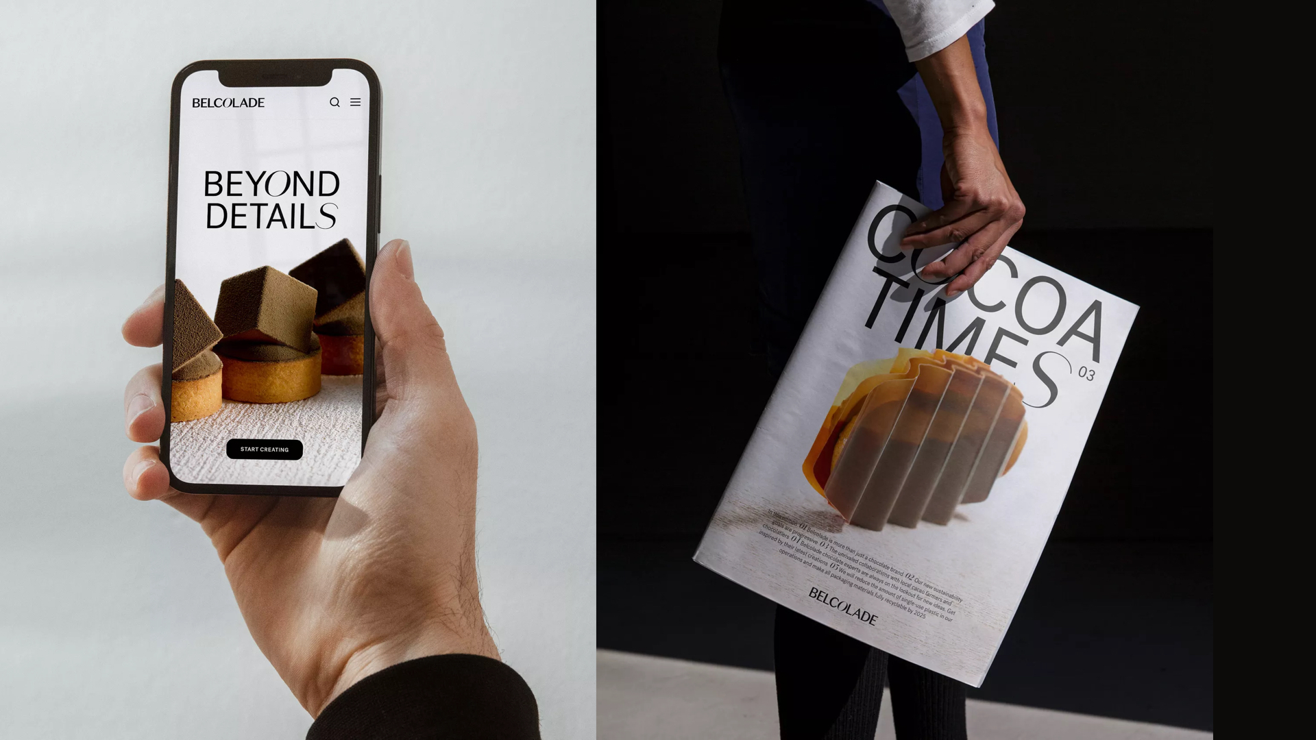
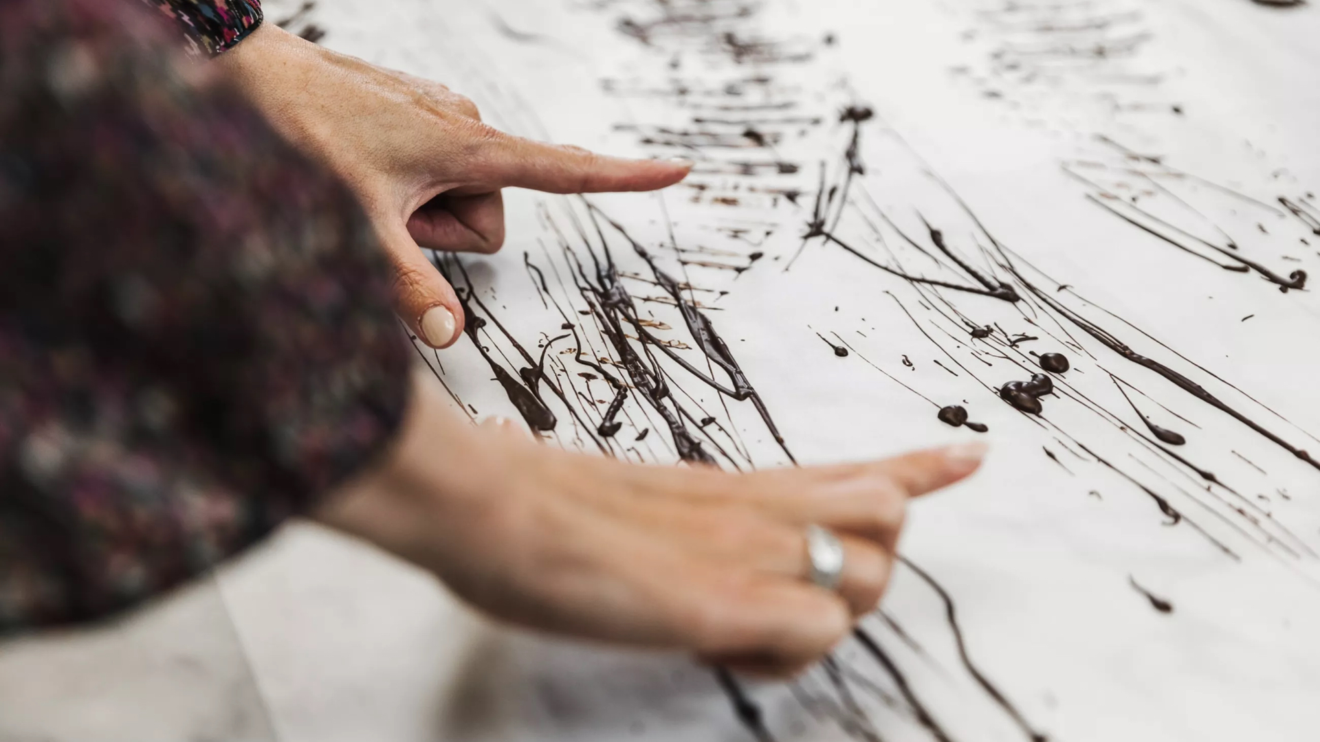
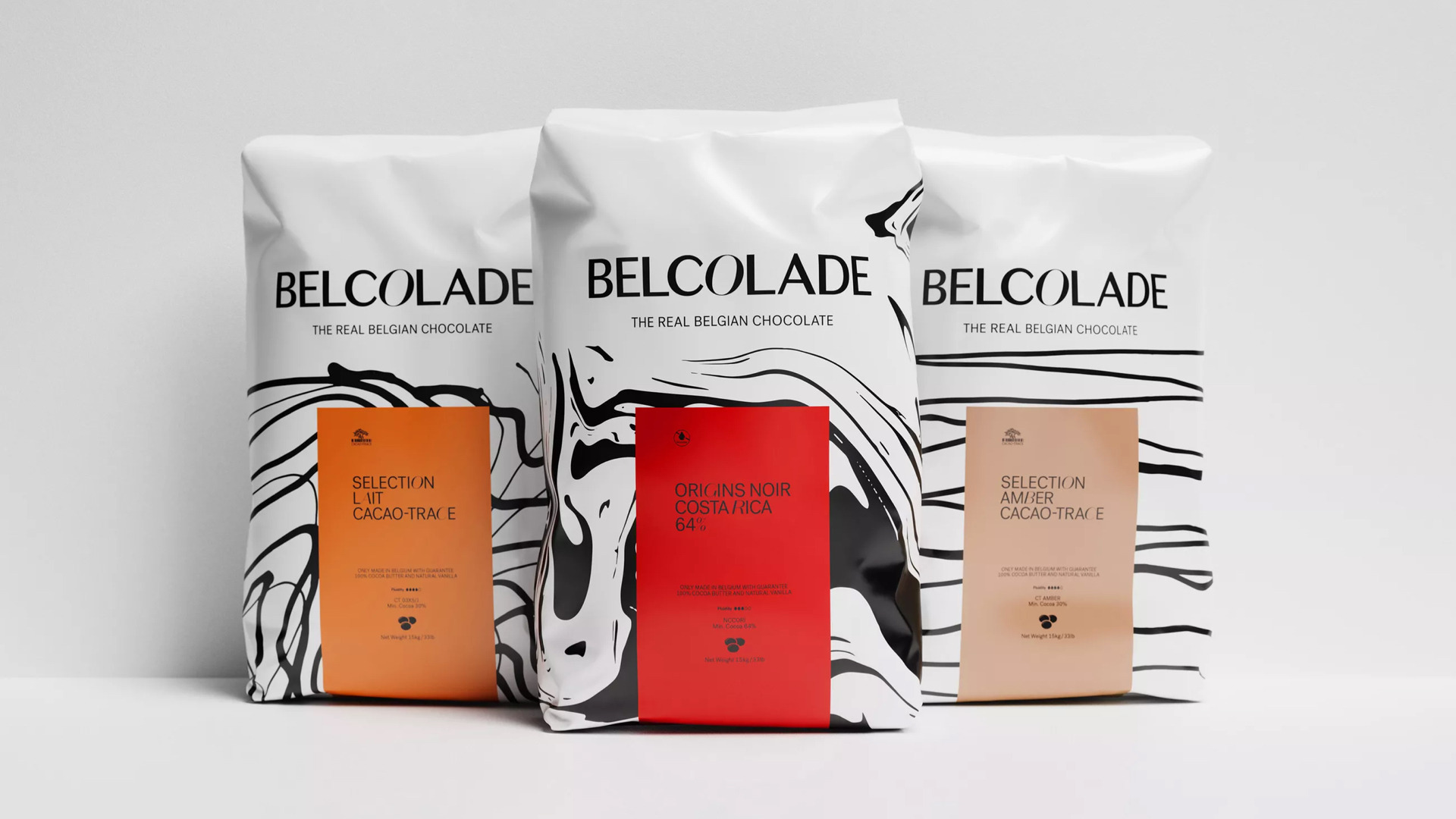
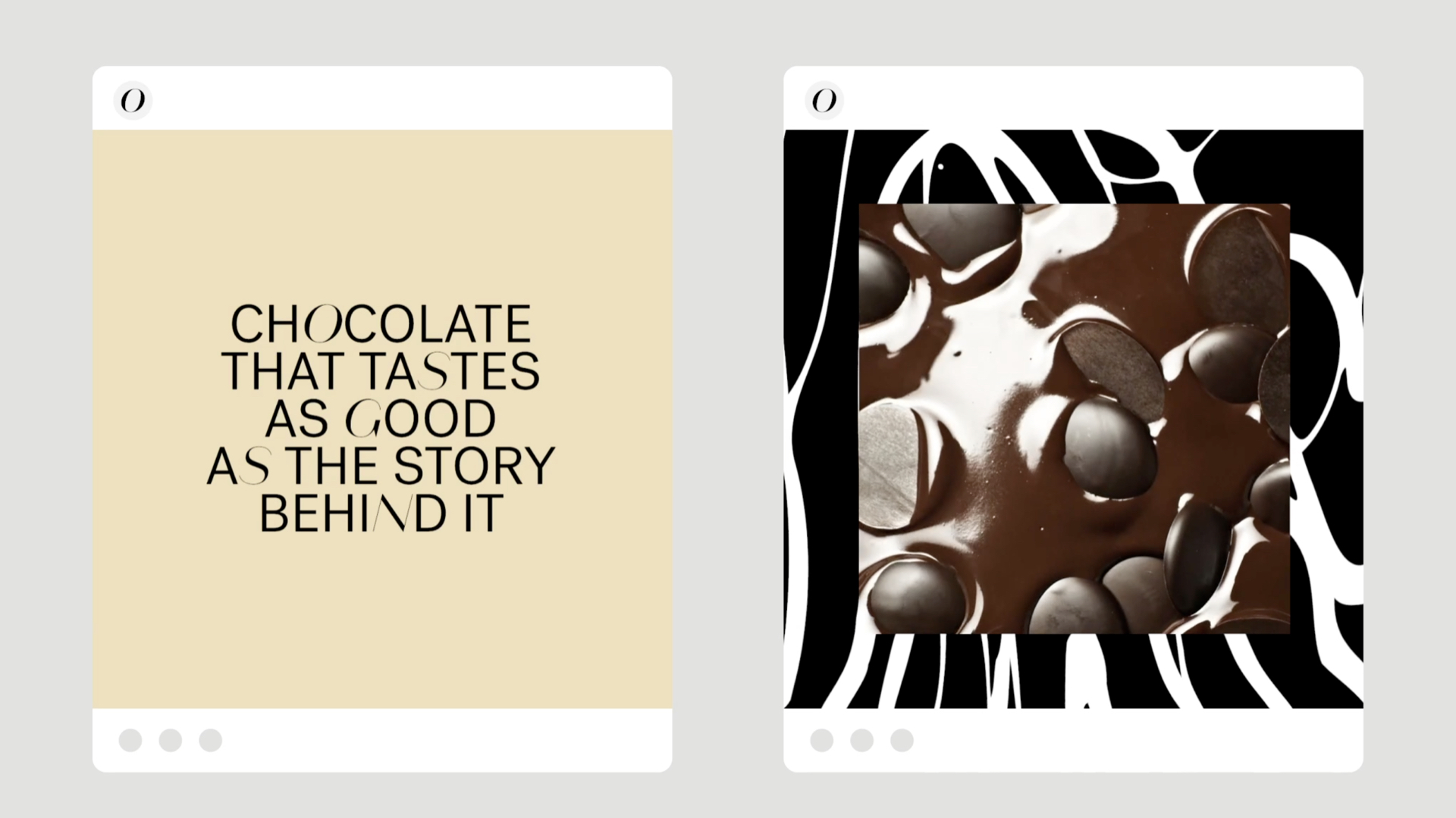
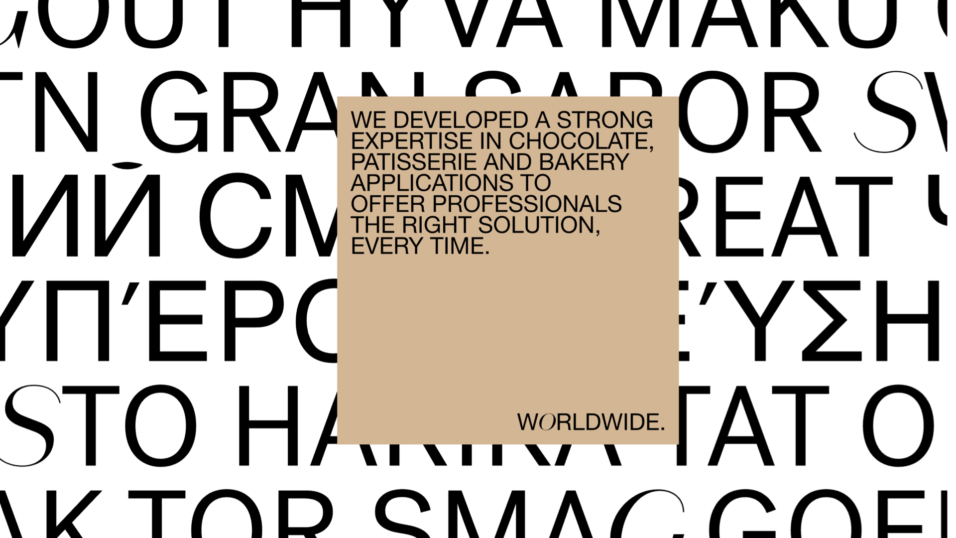
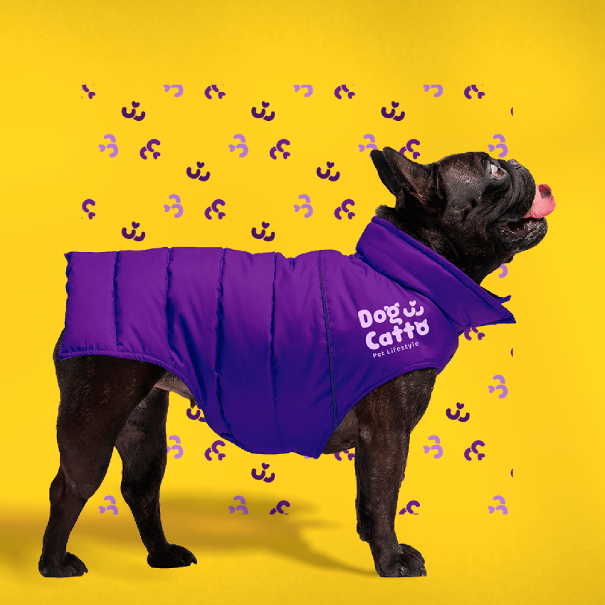
在这个通常以金色和深褐色为主调的行业中,它如一阵清新而多彩的风。Belcolade品牌在巧克力品牌vi设计和巧克力品牌设计上给人一种轻松、艺术和创新的感觉。对品牌重新定位目标进行更紧凑的表述奠定了品牌改造的基础。包括它的宣言、口头表达和动态表达。艺术性的黑白图案构成了其他品牌元素(如图片、视频和标题)的俏皮基础层。这些图案指的是巧克力制作者过程中的一个重要步骤:巧克力的热调温。
In an industry typically dominated by golden and dark browns, Belcolade emerges as a breath of fresh and vibrant air. The brand exudes a sense of ease, artistry, and innovation in the realm of chocolate brand VI design. The concise restatement of the brand's repositioning goals lays the foundation for its transformation, encompassing its manifesto, verbal expression, and dynamic representation. Artistic black and white patterns form a playful foundation for other brand elements such as images, videos, and headlines. These patterns allude to a crucial step in the chocolatier's process: the hot tempering of chocolate.
Via:skinn