EVI
品牌识别
EVI是专为40到50岁的巴西女性开发的化妆品品牌。这个品牌可以作为化妆品vi设计、化妆品品牌设计和化妆品包装设计的优秀案例来欣赏。品牌的创建经历了定义品牌本质、个性和定位的阶段以及标志的设计和其视觉语言。
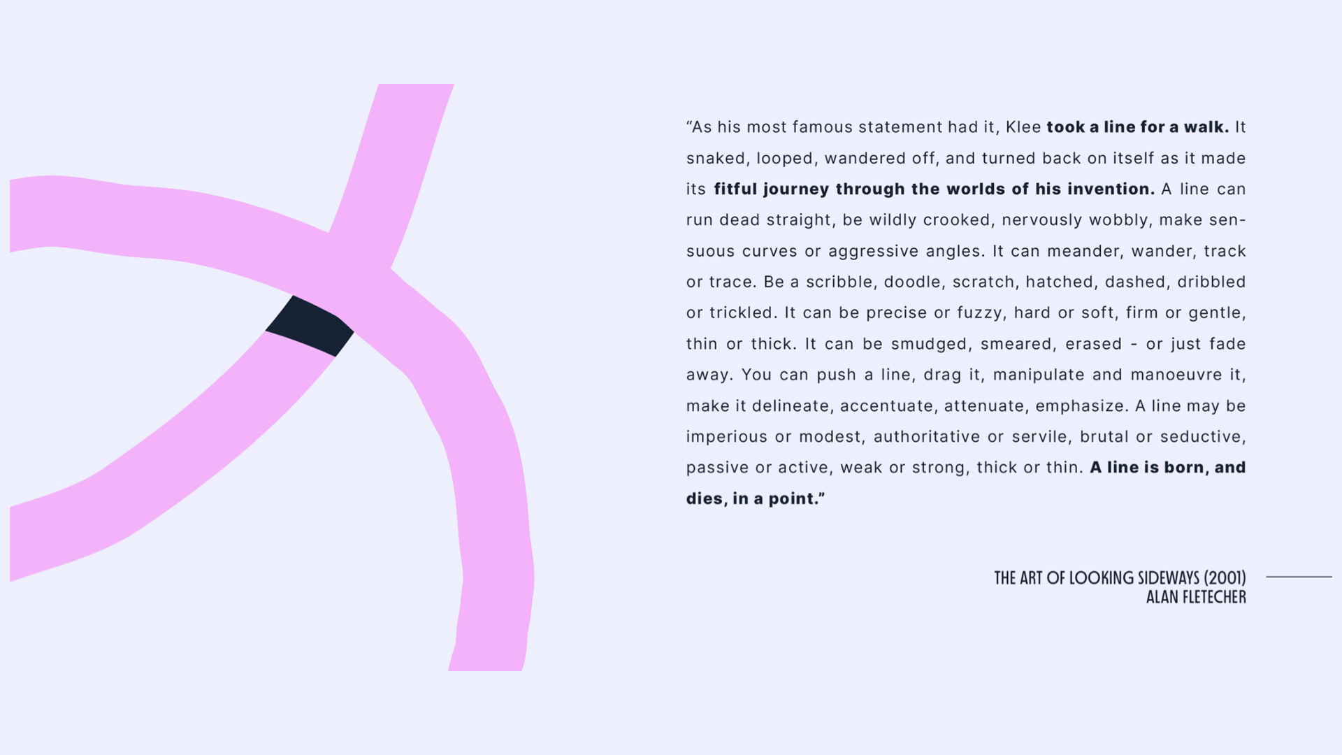
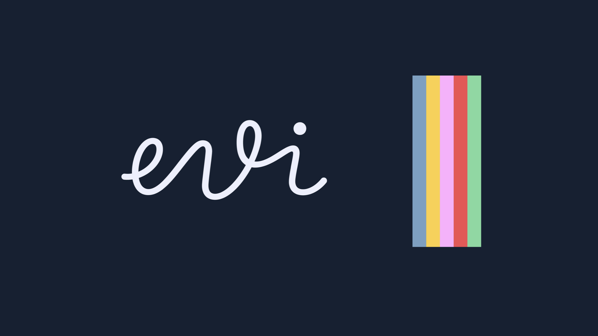
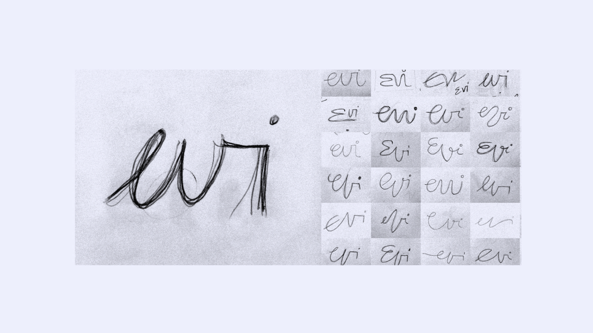
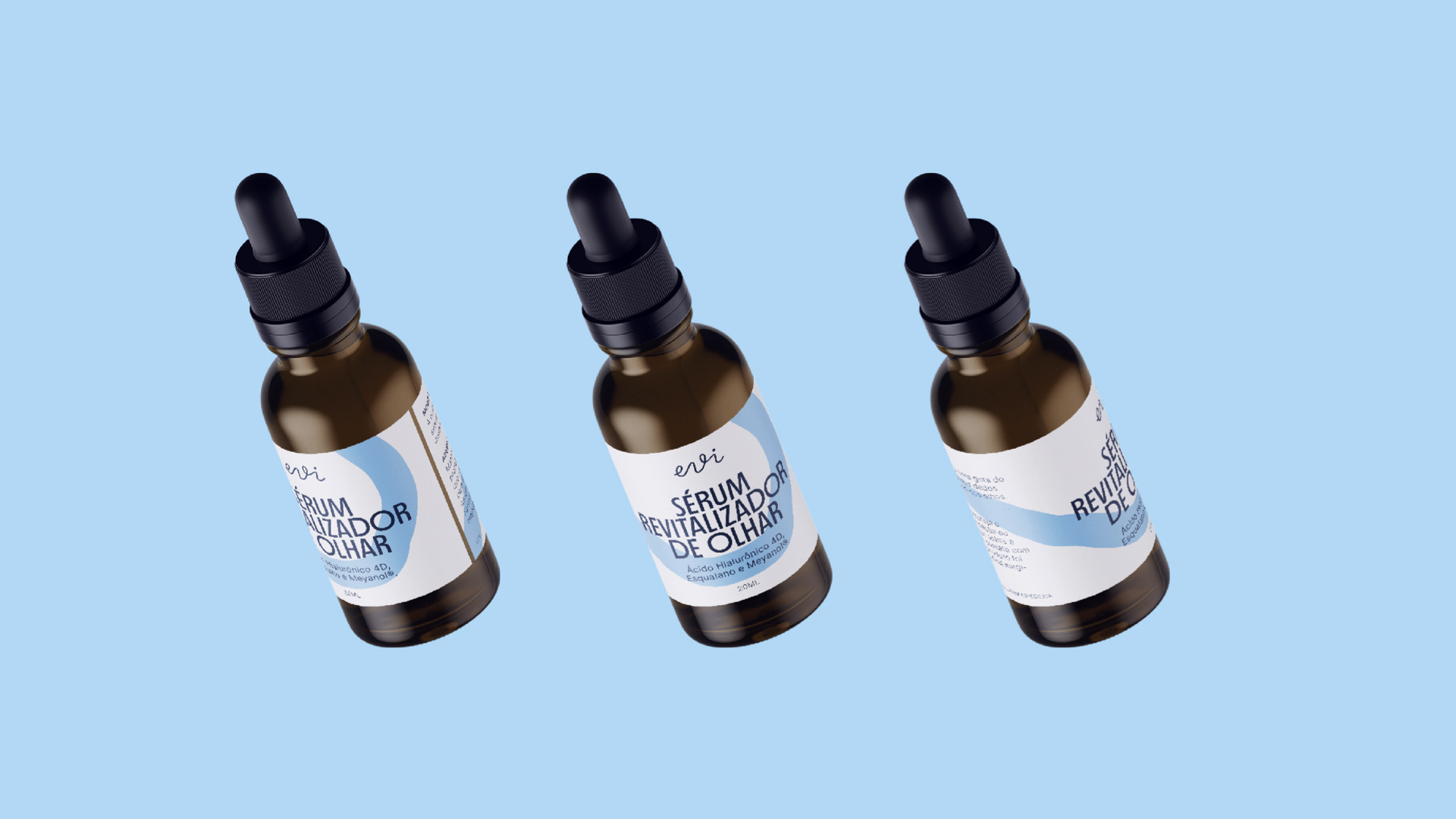
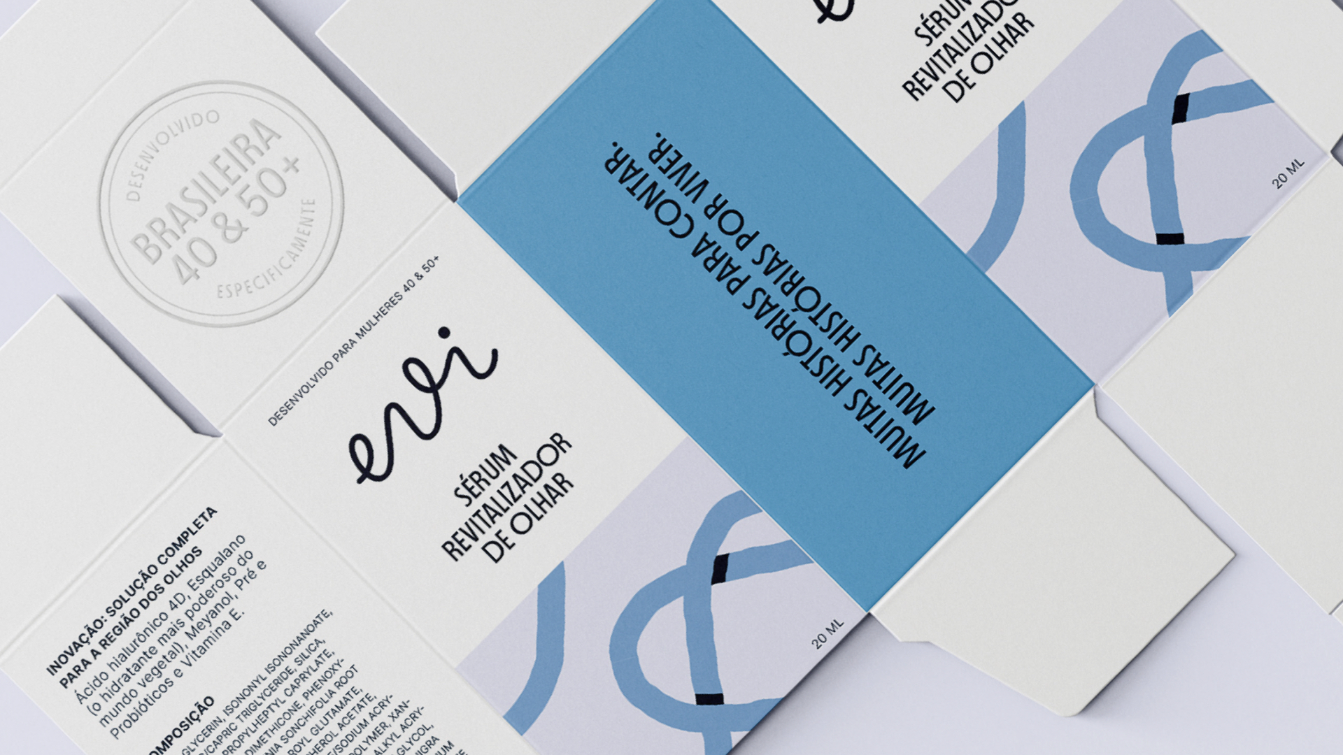
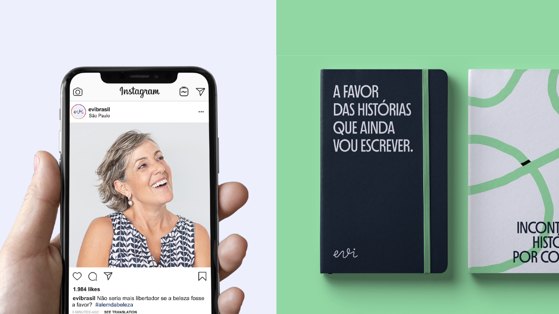
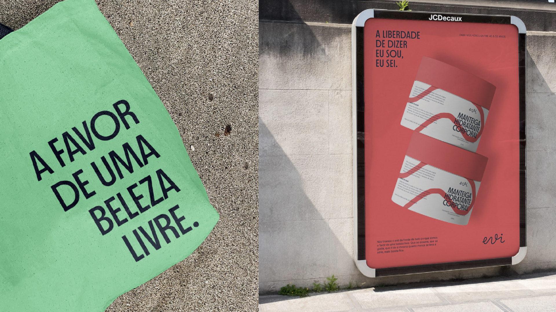
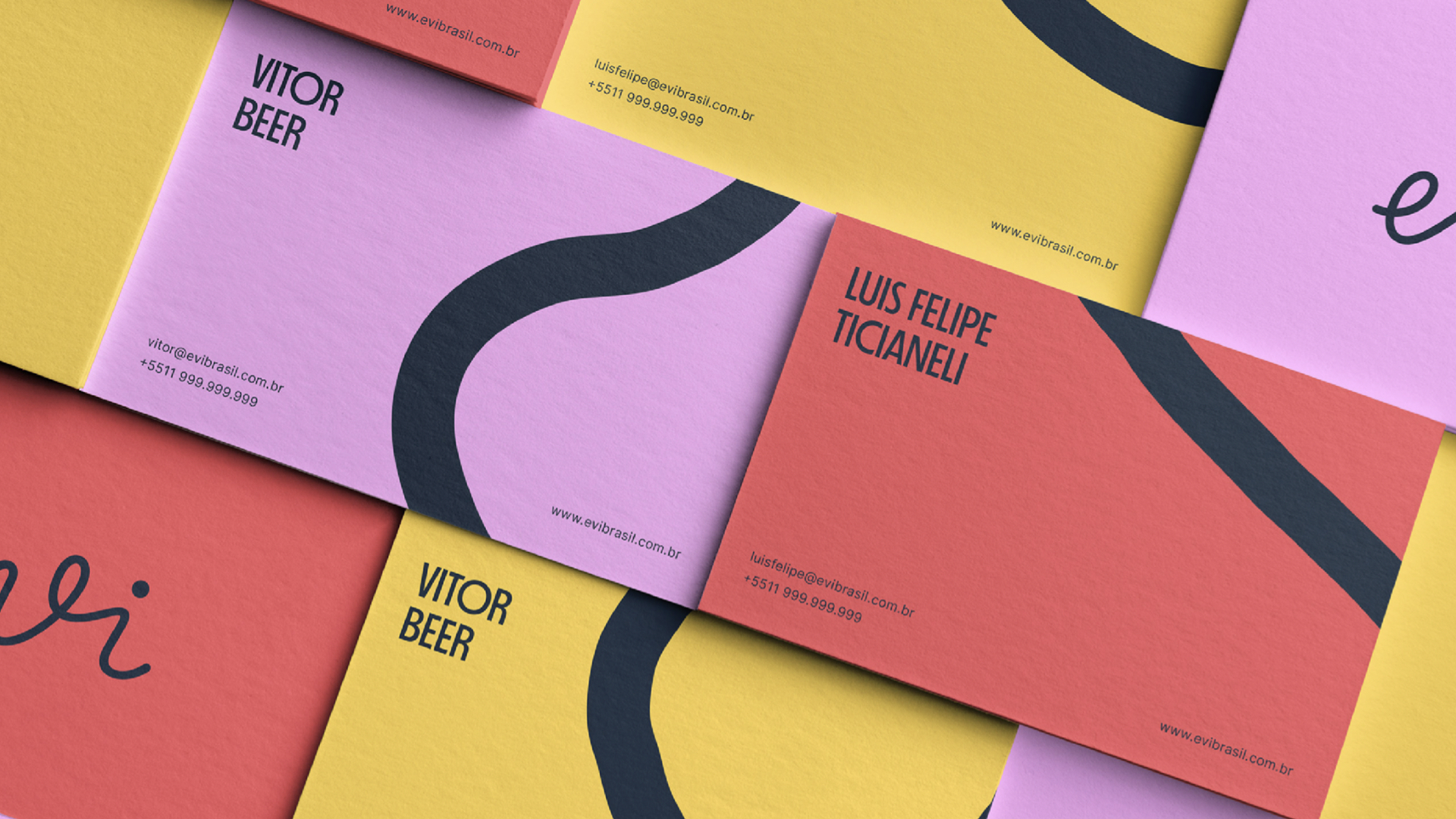
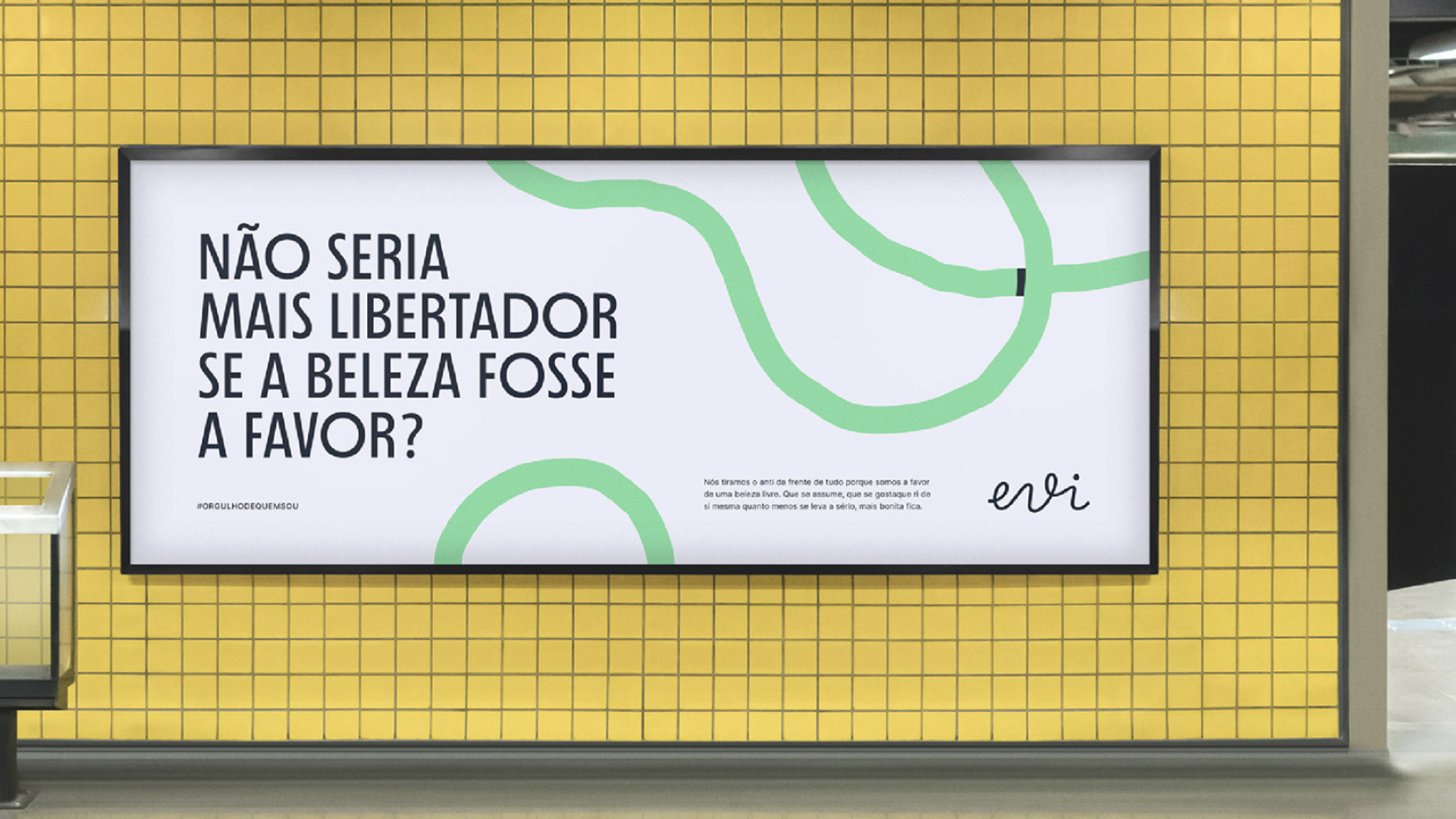
在观察和倾听这些女性时,创始人们意识到市场上的产品并没有以一种亲切和乐观的方式进行交流。相反,它们引起了随着时间推移而产生的紧迫感和沮丧感。化妆品品牌设计过程中,在品牌定位方面,从一个前提出发,即美容产品喜欢反对:抗皱、抗痕迹、抗衰老。作为对此的回应提出一个问题:如果美丽只是支持会不会更自由呢? 然后得到了核心表达——“超越美丽”,使这个化妆品品牌拥有了一种更开放的语言,来自那些拥抱机会,期待生活中最好的人们。标志展现了一个精致而连续的签名,灵感来自每个女性的生活旅程:不是一条直线,而是一条独特的路径,充满细微差别、曲线和故事。在化妆品vi设计的视觉识别中,相同的有机线条通过其粗细和充满活力的颜色展现出生命的轨迹,在所有材料中自由奔跑。图形元素本身包含着无尽的使用可能性,强化品牌的信息,为身份赋予生动而丰富的个性。
EVI is a cosmetic brand developed especially for Brazilian women between 40 and 50 years of age. When observing and listening to these women, the founders realized that the products available on the market did not talk in a welcoming and optimistic way. Quite the opposite, they caused feelings of urgency and frustration over time. The creation went through the stages of defining the brand's essence, personality, and positioning, followed by the design of the logo and its visual and verbal universes. For the positioning, we start from the premise that beauty products love to be anti: anti-wrinkle, anti-signs, anti-aging. As an answer to that, we asked a question: wouldn't it be more liberating if beauty were simply in favor? We then came to the core expression – "Beyond Beauty" – giving the brand a more open speech from those who embrace opportunities and expect the best in life. The logo reveals a delicate and continuous signature, inspired by every woman's life journey: not a straight line, but a unique path, full of nuances, curves, and stories. The same organic lines gain life through their thickness and energetic colors in the visual identity, tracing paths that run freely in all materials. The graphic elements themselves contain endless possibilities of use, reinforcing the brand's message and giving a vivid and rich personality to the identity.
Via:Papanapa