Vivien
品牌识别:
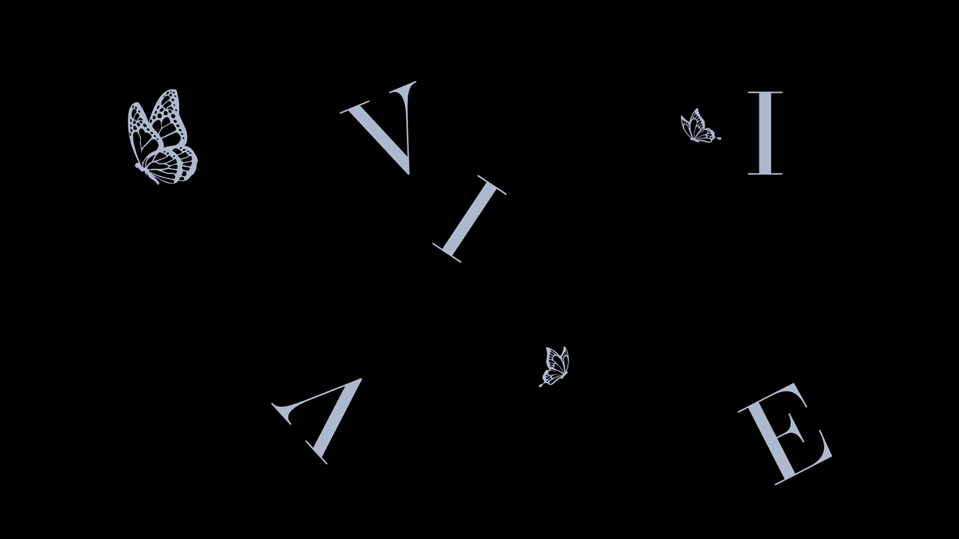
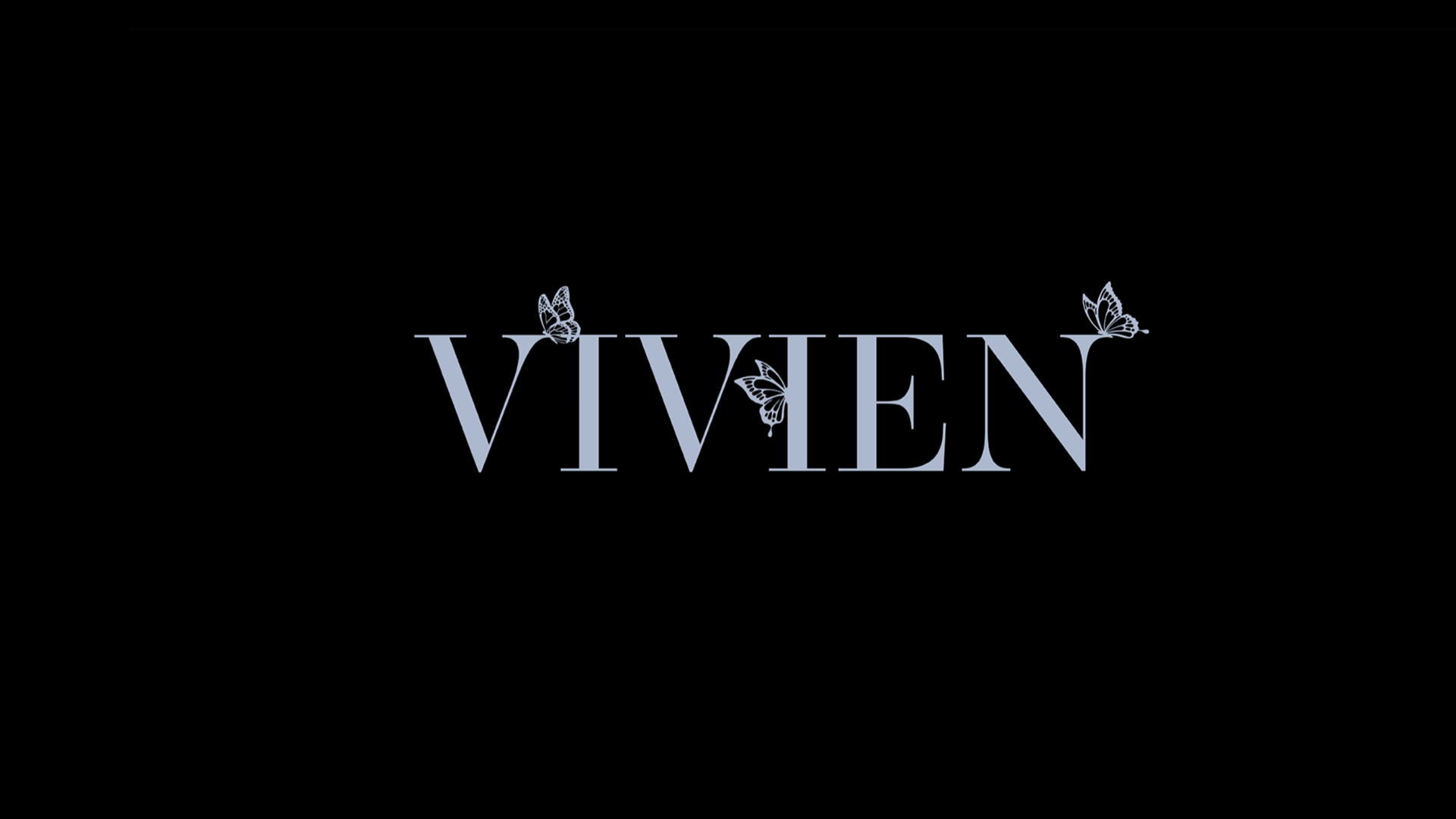
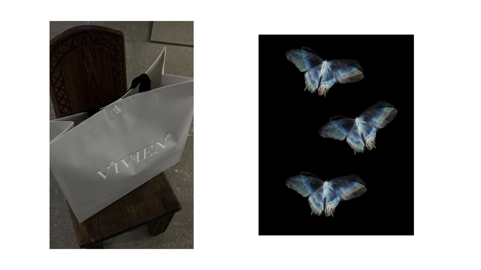
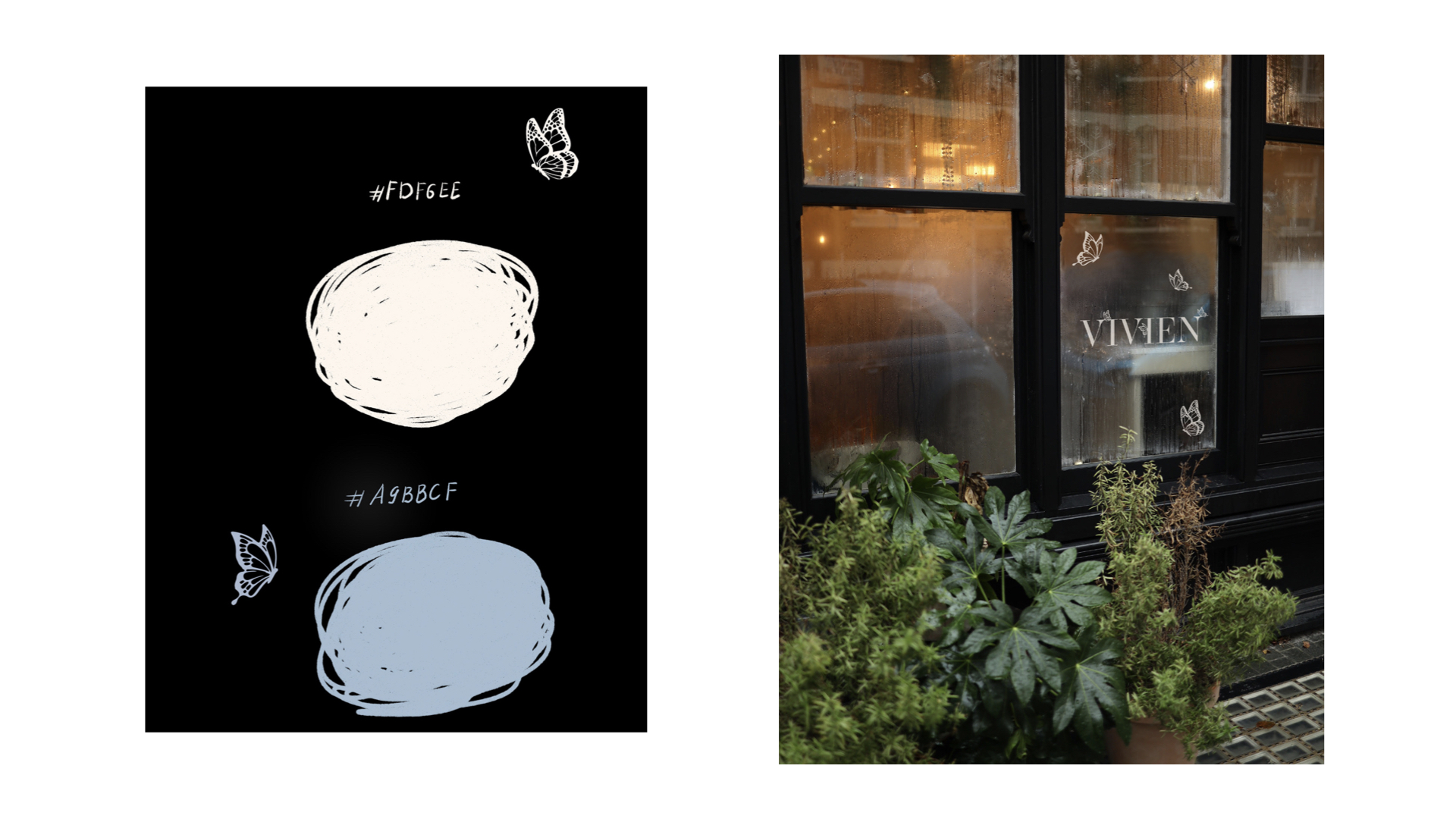
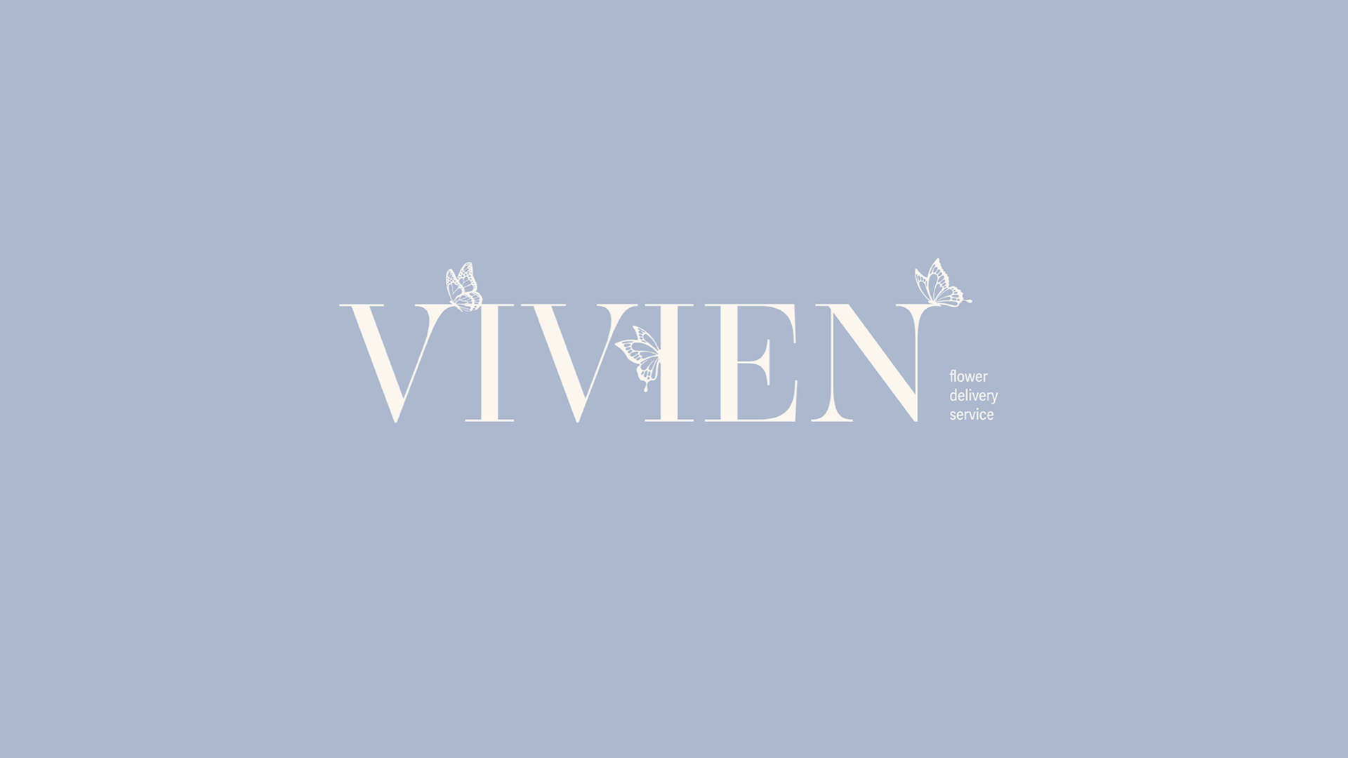
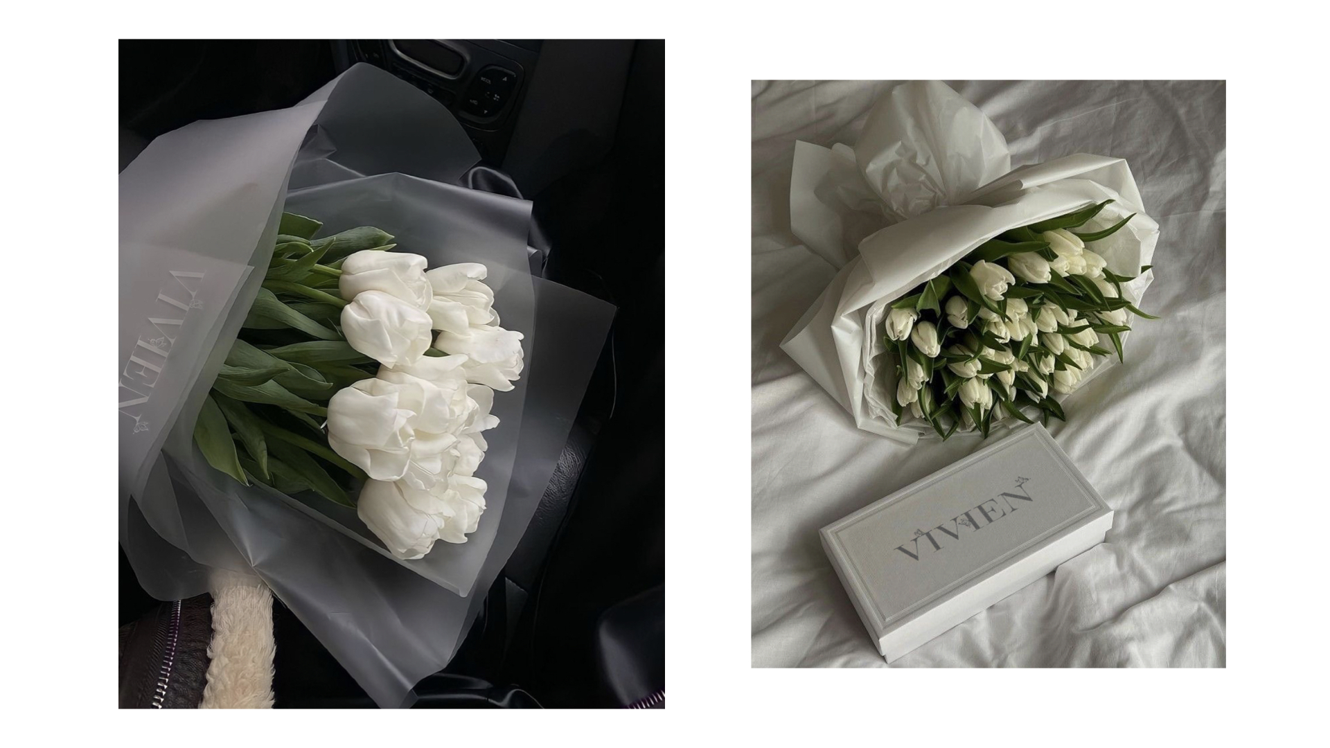
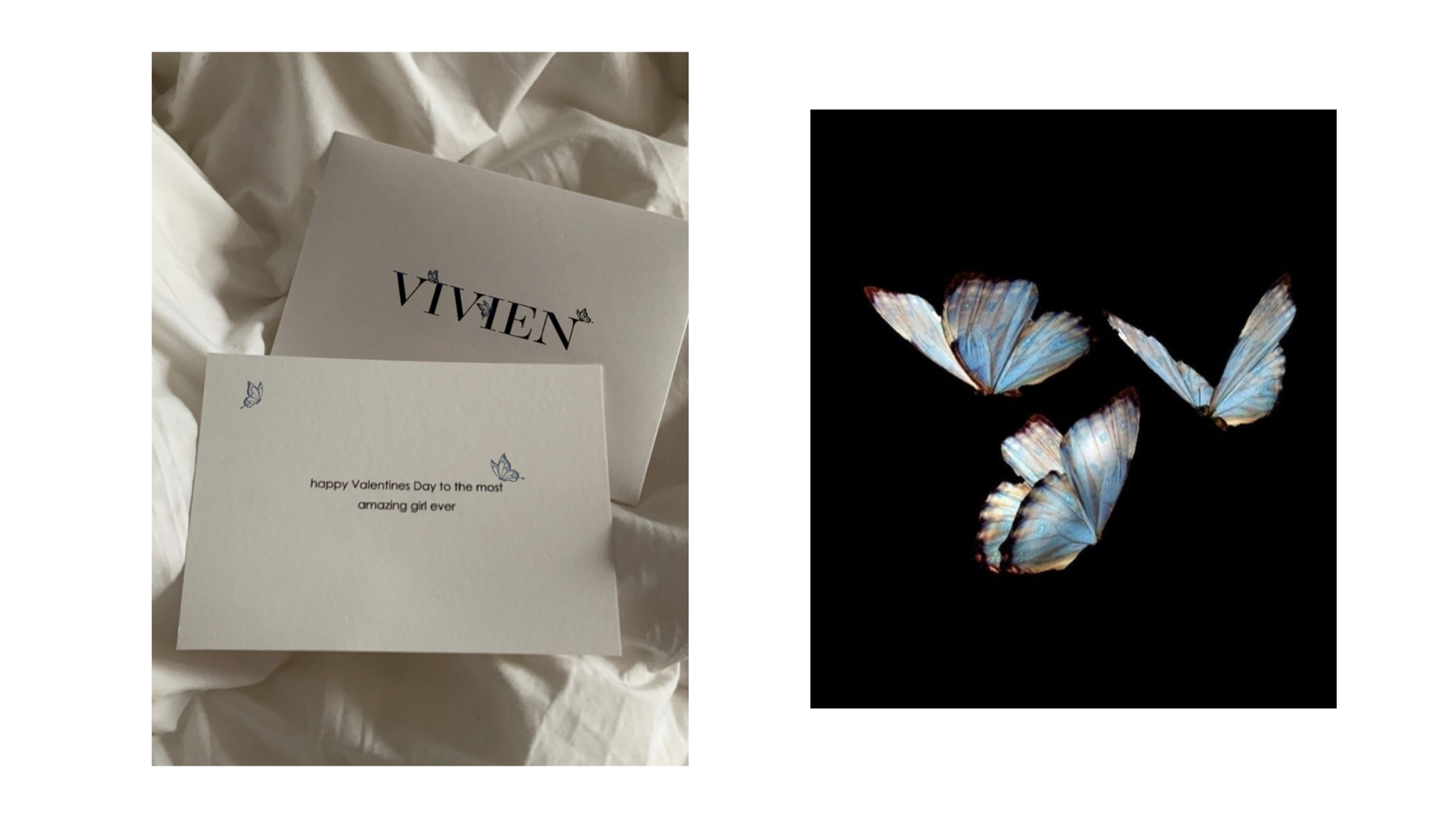
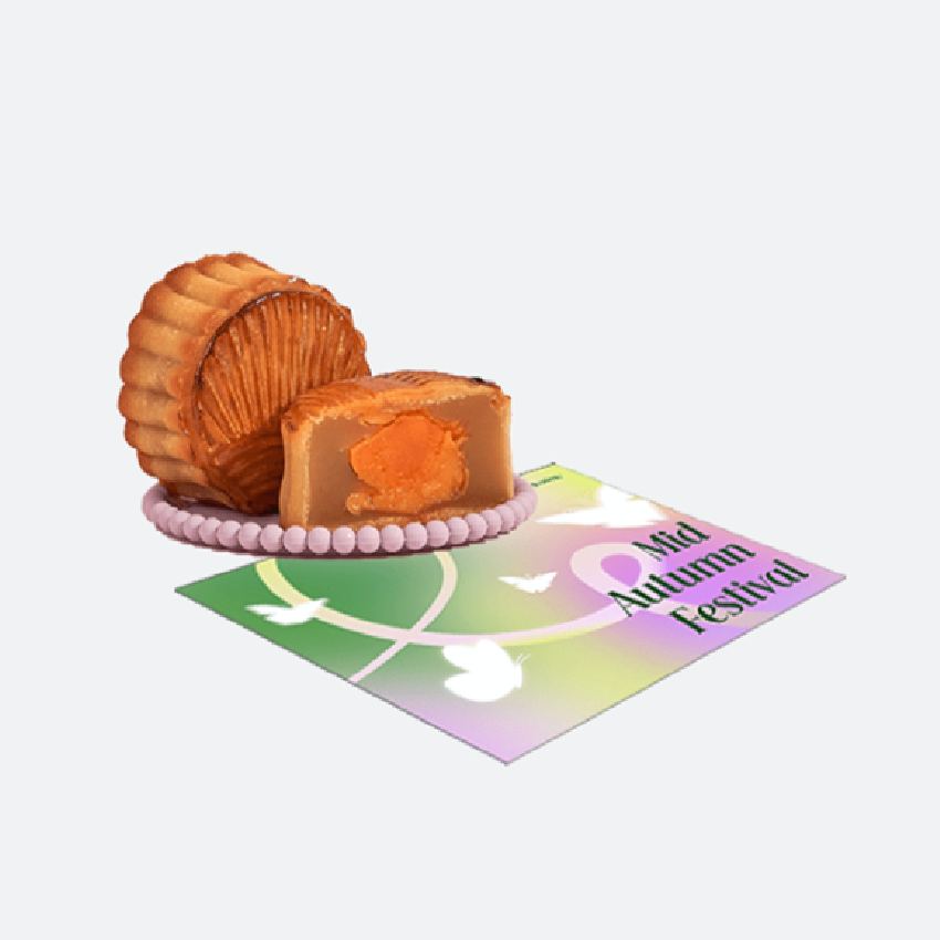
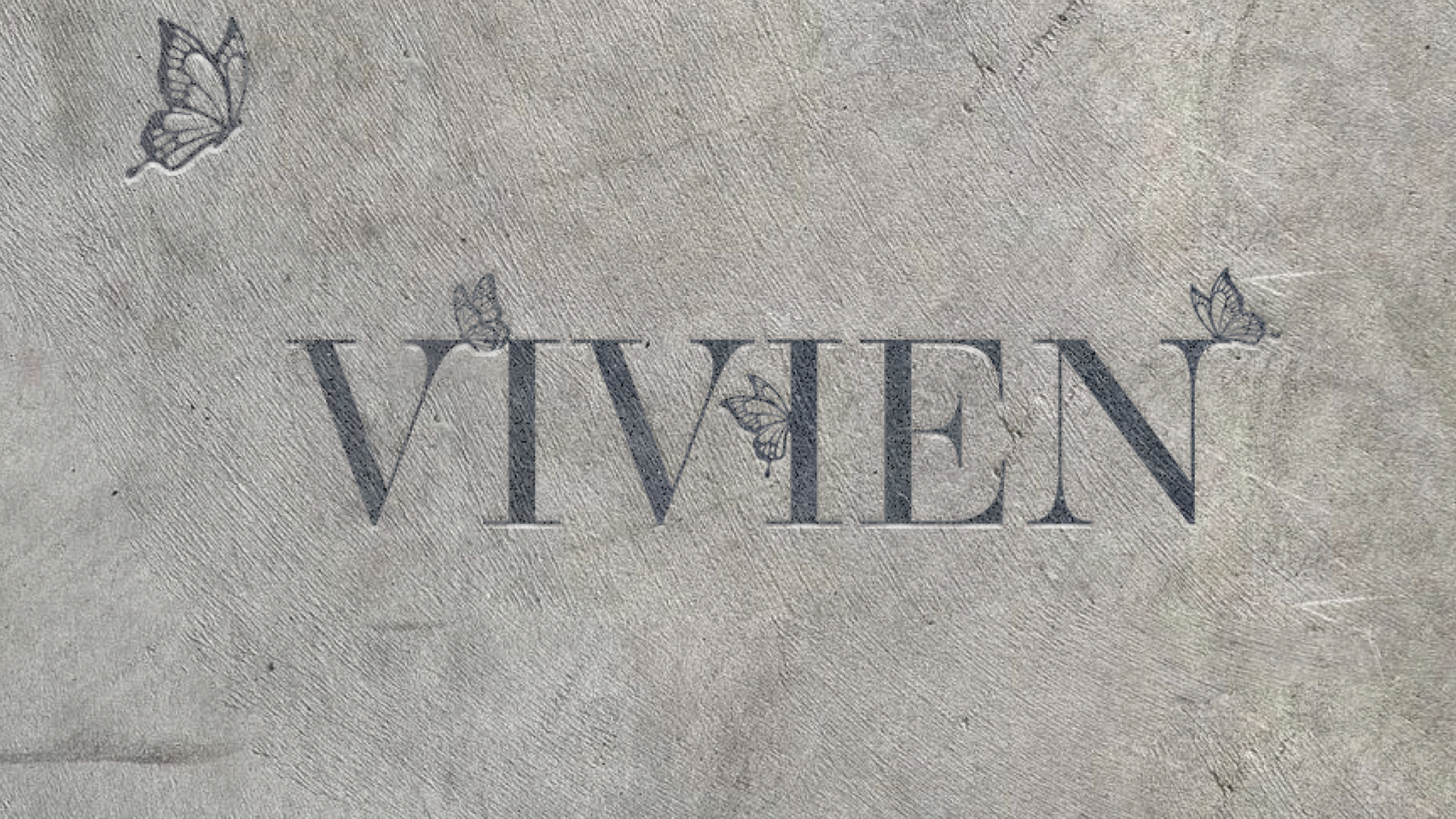
"Vivien"是在莫斯科和圣彼得堡提供鲜花服务的品牌。该品牌在鲜花品牌logo设计和鲜花品牌设计方面选择了一些能够营造轻盈、无重感形象的颜色。该品牌服务的概念在于每个寄送给收件人的花束都充满惊喜和独特之处。花束仅由两个组成部分组成:预算和情感,它们应反映花朵和包装。其他所有内容都保持秘密。 "Vivien"帮助您取悦自己或远在他乡的亲人。 该品牌标识带有图形标志,字体部分的字母是手绘的,通过其结构传达了品牌的精致和风格。图形标志以三只蝴蝶的形式呈现,它们被字母的香气所“吸引”。
a logo with a graphic sign was developed for the service. The letters in the font part are hand-drawn and by their structure convey the localness, status, refinement, and style of the brand. The graphic sign is represented in the form of three butterflies, which are "attracted by the flavour" of the letters. The corporate style conveys the atmosphere of mystery and intrigue. Colours are chosen that create an image of lightness, weightlessness.
Via:KSENIYA VISHNEVSKAYA