Publications
品牌简介
这是一对夫妻建立的品牌,他们在新西兰的群山间捕捉令人惊叹的婚礼瞬间,也在这个美妙的世界其他地方留下足迹。他们这次选择重新塑造他们的品牌形象,希望在婚礼摄影vi设计和摄影品牌设计上呈现出坚实、成熟的感觉,同时需要保持有趣、年轻、随意、现代和简单。这次成功的品牌重塑是上海vi设计公司可以学习的案例。
品牌识别
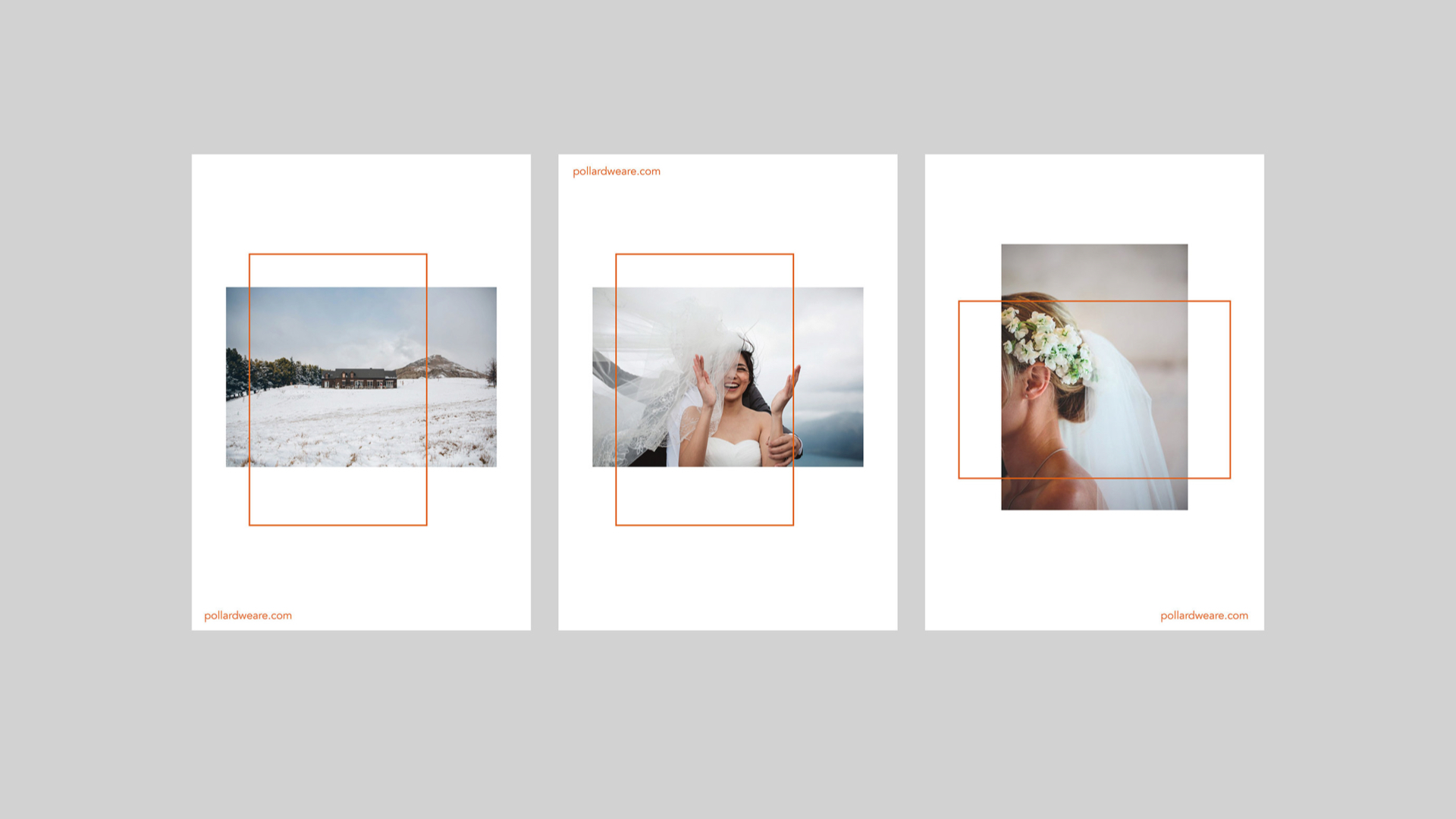
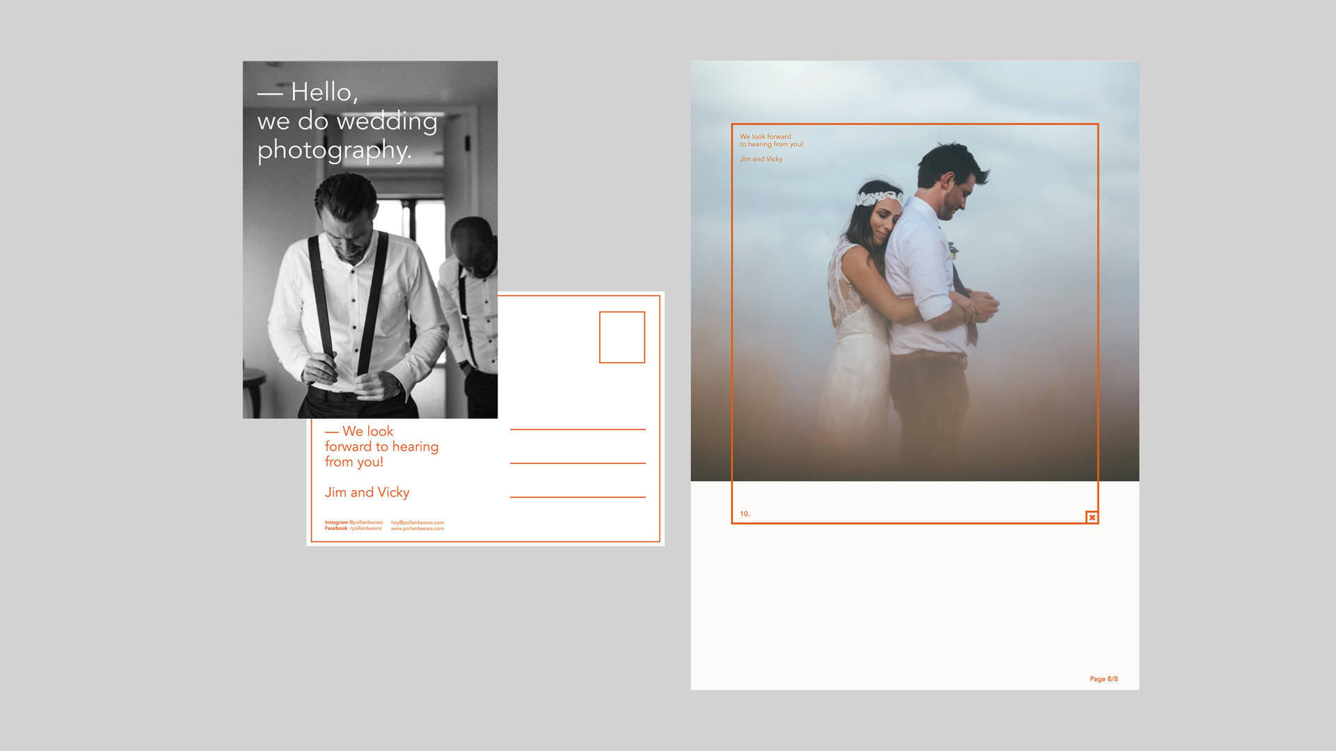
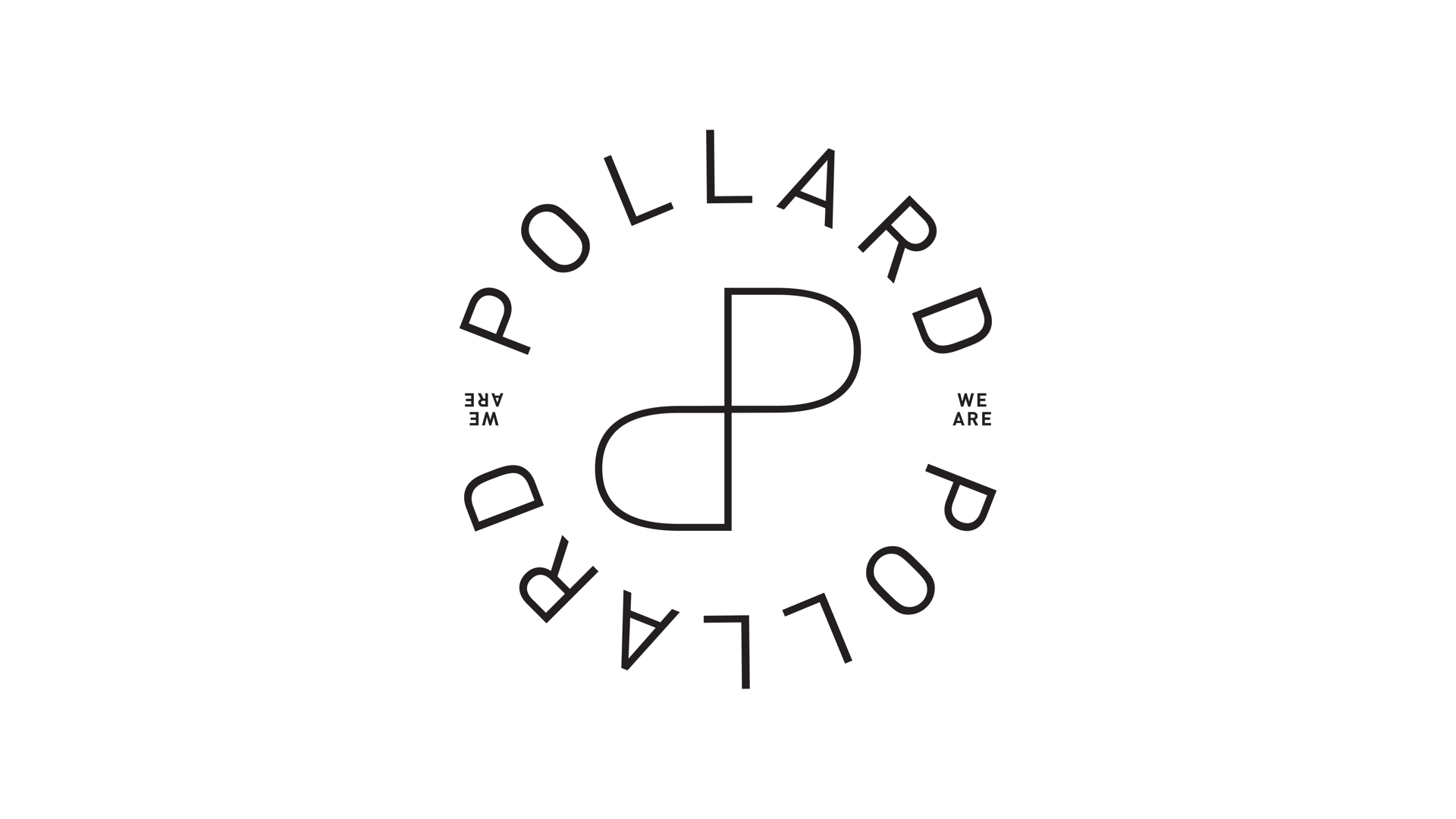
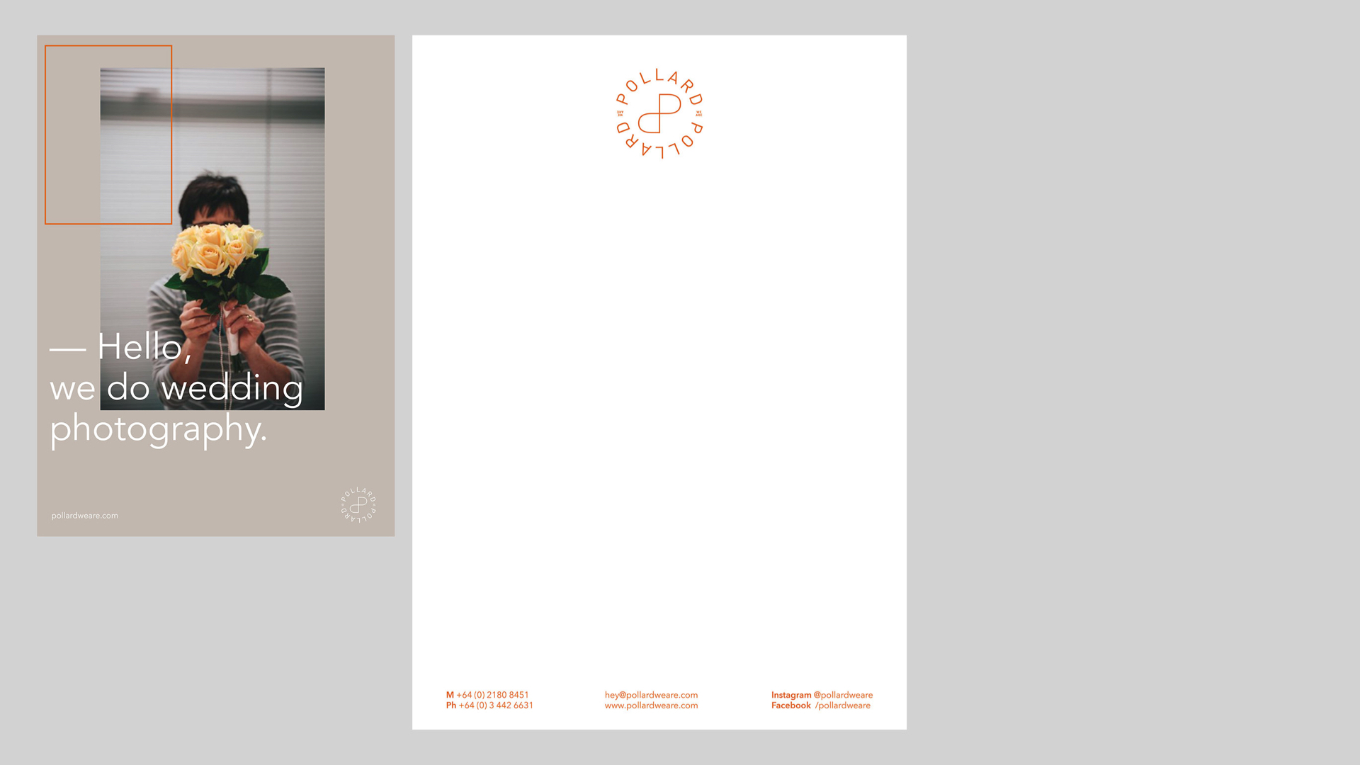
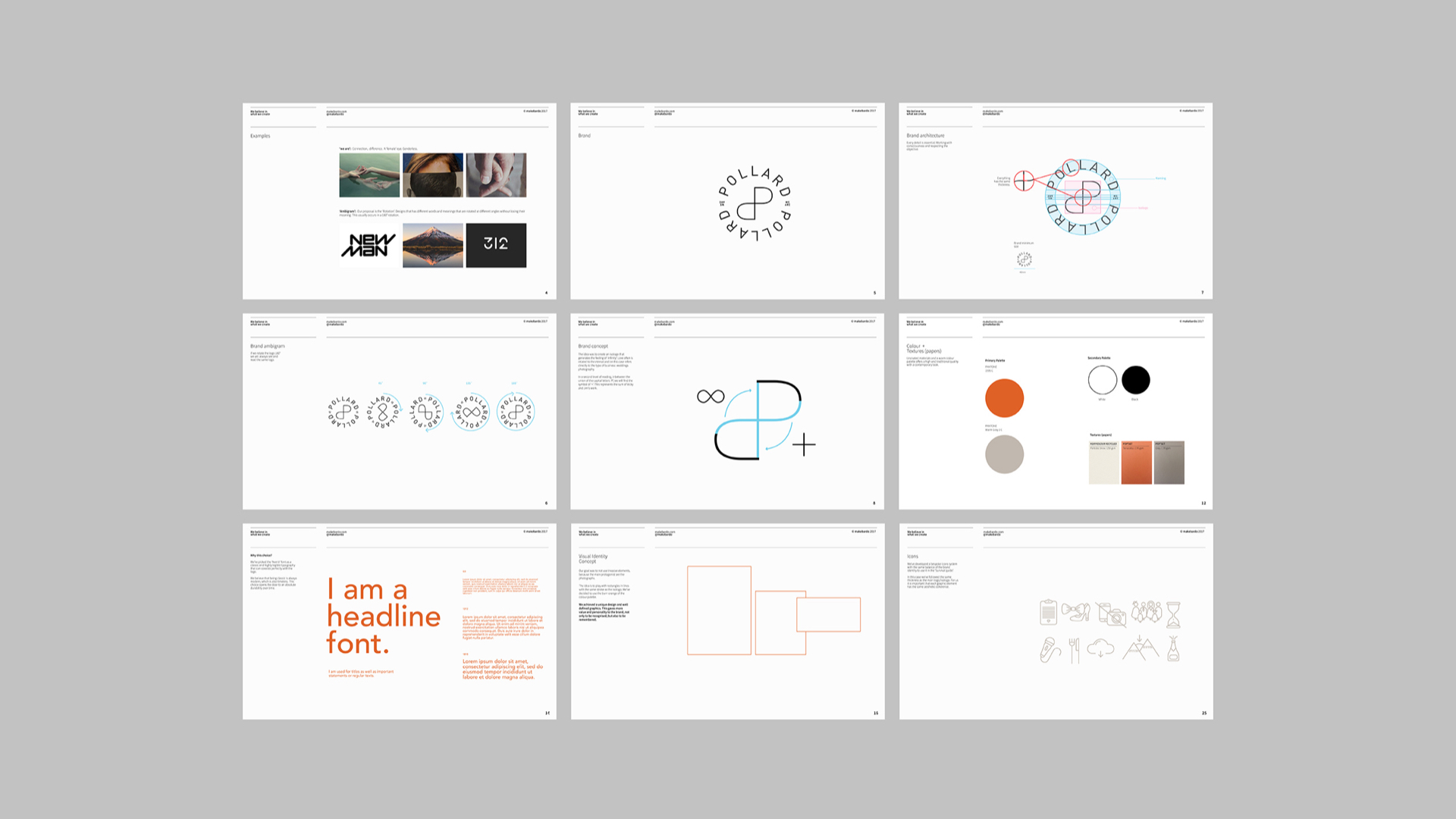
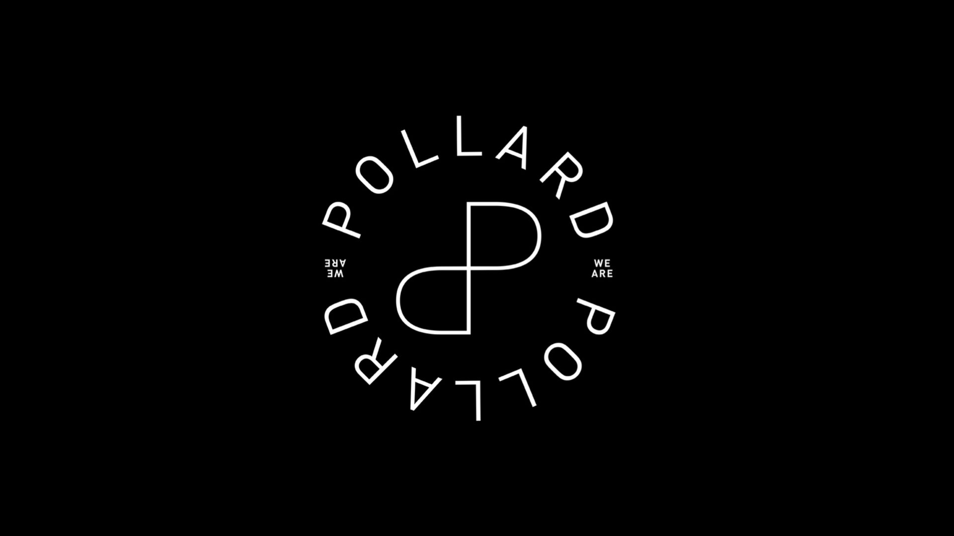
Ambigrams是以至少两种不同的阅读成为可能的方式书写或绘制的单词或短语。在对原始图形进行某种操作后,可以进行第二次阅读。个性是使“Pollard we are”脱颖而出于竞争对手之一的价值观。Vicky和Jim是品牌背后的动力,使用“ambigram”使品牌可以有两种不同的解读但意义相同。这个想法是创建一个产生“无限”的等体标志。爱常常与永恒联系在一起,而在这种情况下直接指的是他们所在行业:婚礼摄影。在第二层次的阅读中,在大写字母'P'的结合部分,您将找到'+'的符号。这代表了Vicky和Jim工作的总和。对于视觉识别概念,目标是不使用侵入性的元素,因为主要的主角是照片。我们的想法是使用与等体标志相同线条的矩形玩耍。我们开发了一个定制的图标系统,具有与品牌识别相同的平衡,可用于“Survival guide”。我们遵循了与主标志/等体标志相同的厚度。对我们来说,每个图形元素具有相同的美学一致性是重要的。
Our strategy was to create an ambigram brand. Why? Because this concept is simple but clever. Ambigrams are words or phrases written or drawn in such a way that they allow, at least, two different readings. The second reading can be done after doing some type of operation with the original drawing. Personality is one of the values that makes ‘Pollard we are’ stand out from the competition. Vicky and Jim, being the forces behind the brand, we decided to use the ‘ambigram’ so the brand can have 2 different readings but meaning the same. The idea was to create an isologo that generates the feeling of ‘infinity’. Love often is related to the eternal and in this case refers directly to their industry: wedding photography. On a second level of reading, in between the union of the capital letters ‘P’, you will find the symbol of ‘+’. This represents the sum of Vicky and Jim’s work. For the visual identity concept our goal was to not use invasive elements, because the main protagonists are the photographs. The idea is to play with rectangles in lines with the same stroke as the isologo. We’ve developed a bespoke icon system with the same balance of the brand identity to use in the ‘Survival guide’. We followed the same thickness as the main logo/isologo. For us it is important that each graphic element has the same aesthetic coherence.
Via:MAKEBARDO