Angelina
品牌识别:
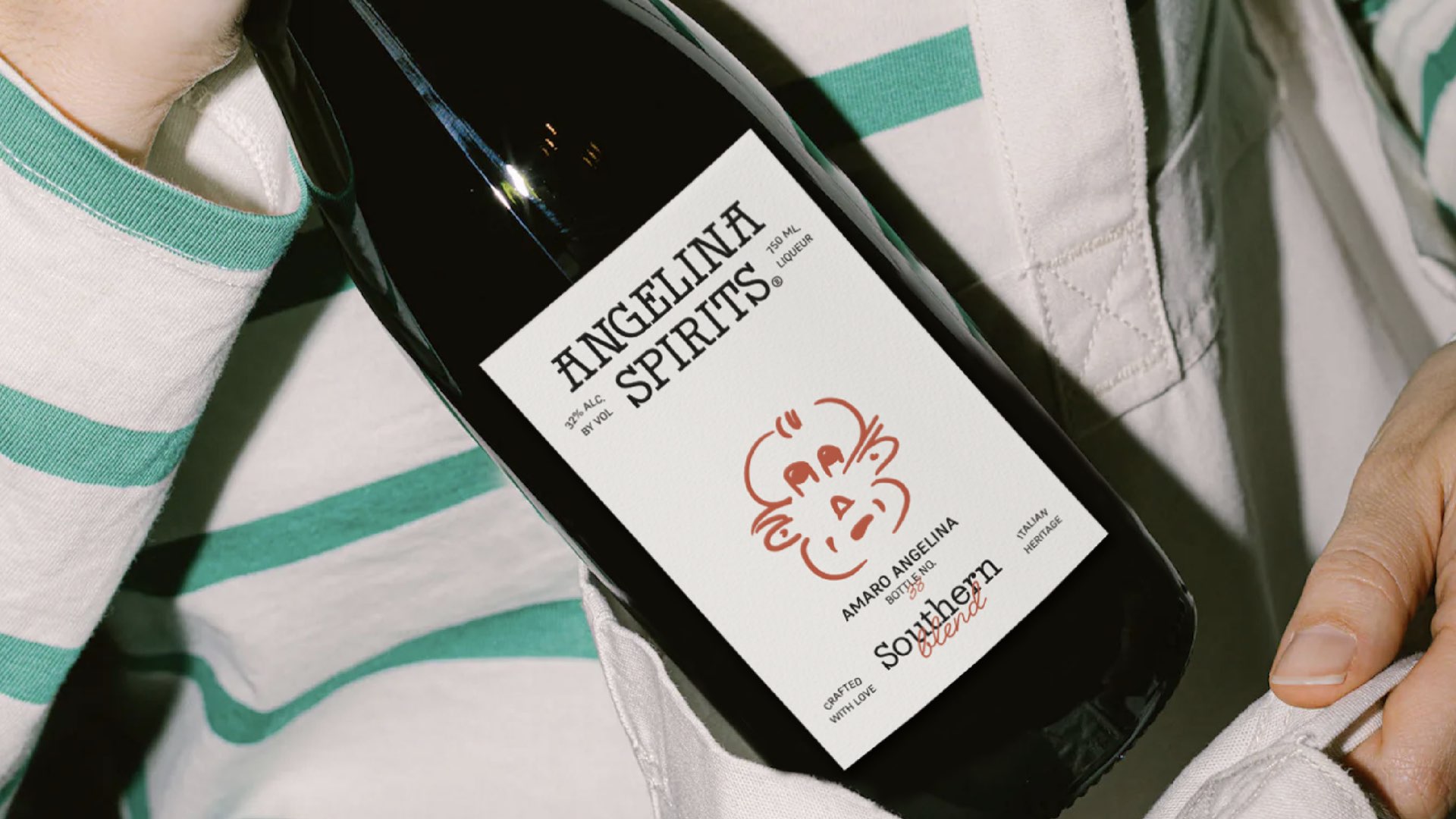
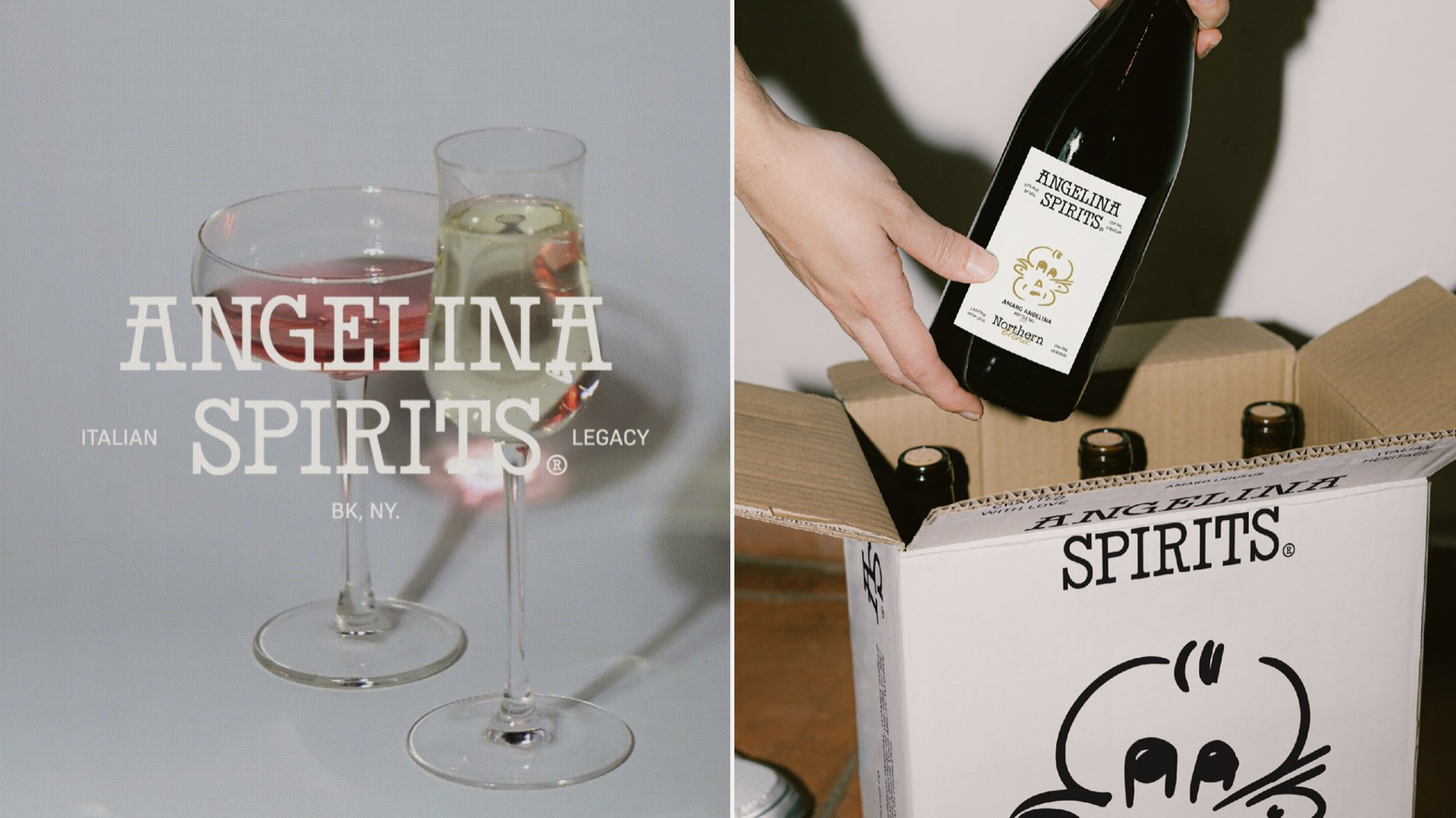
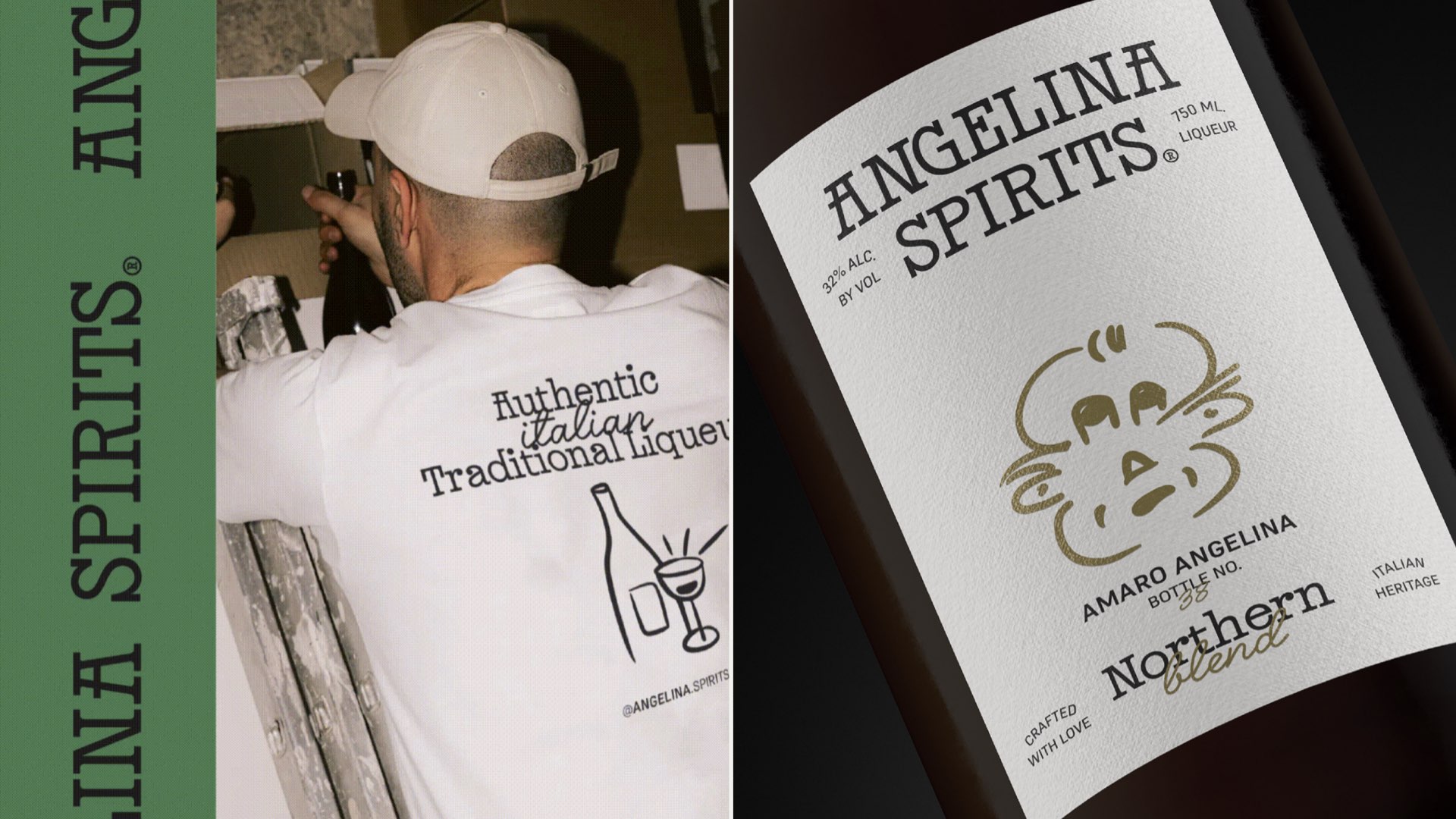
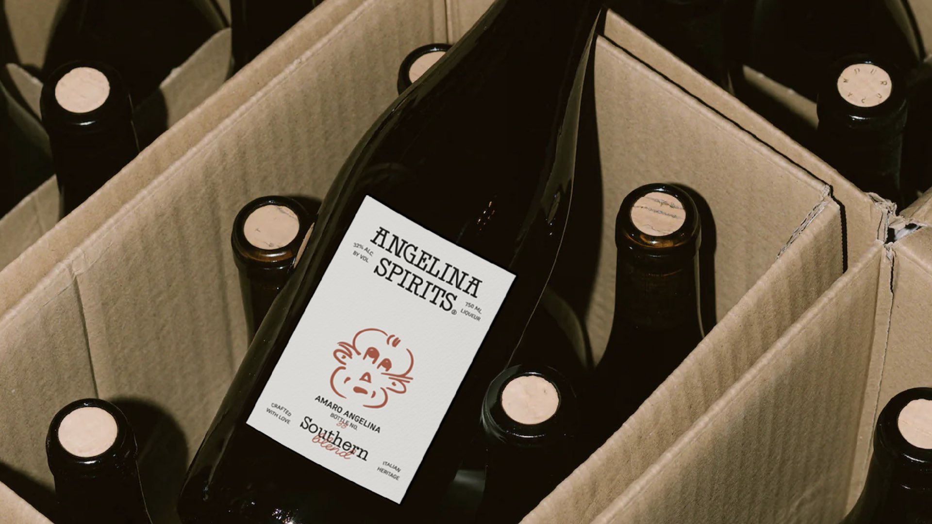
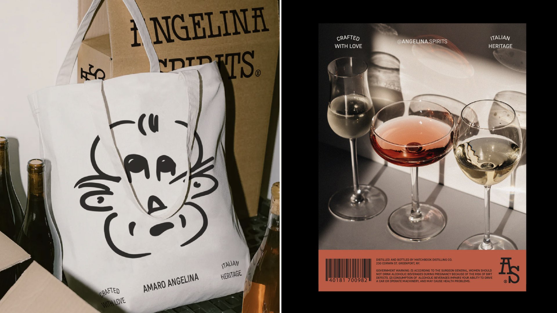
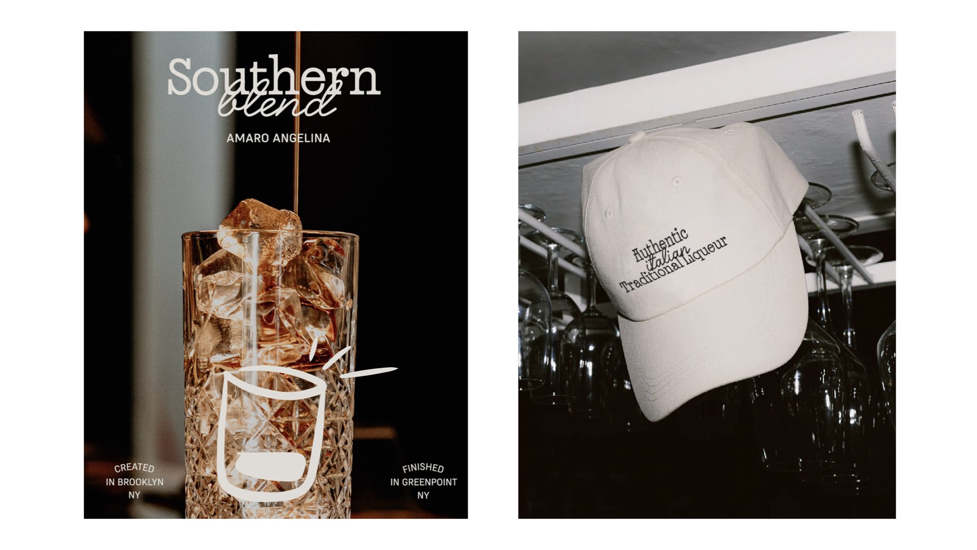
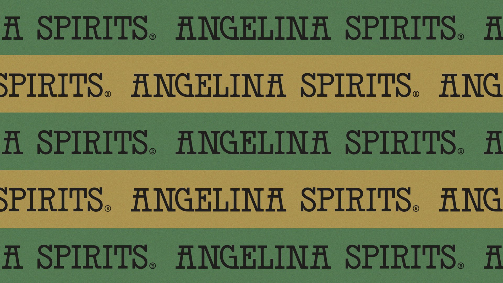
Angelina是一个充满意大利怀旧情感、传统和家族自豪感的品牌,以纪念他们的Nonnos。在酒品牌vi设计,酒品牌包装设计方面,一幅由祖父亲亲自绘制的小肖像是设计身份和品牌包装的起点。这张草图对于家庭来说非常特别,因为它是祖父亲亲手画的,并且经受了时间的考验。在保留精髓的基础上做了一些微调,决定将其作为包装和其他品牌元素的主要传播轴线。主要字体,由Bastarda Type设计的Jazz BT,为品牌增添了完美的触感。该品牌在现代年轻和具有纽约爵士音乐活力的同时,也传承了意大利独特食谱的情感遗产。品牌及其包装旨在给两个世界带来新鲜的视角。
Angelina is a brand that emerges as the perfect excuse to keep a legacy alive. Although Daniel and Sara currently live in Brooklyn, NYC, their grandparents were born and lived in Italy, surrounded by a life full of smells and flavors that date back to the manufacturing of Amaro, a spirits drink that marked the family's life. Now it's grandchildren seek to have a brand full of that italian nostalgia, tradition and family pride for their Nonnos. A small self-portrait illustrated by Nonno himself was the starting point for the design of the identity and its implementation in the brand's packaging. This sketch is very special for the family, since it was a drawing made by the grandfather and that has withstood time. With some tweaks, but maintaining the essence, we decided that it would be the main axis of communication on the packaging and other brand pieces.
Via:Folk Estudio