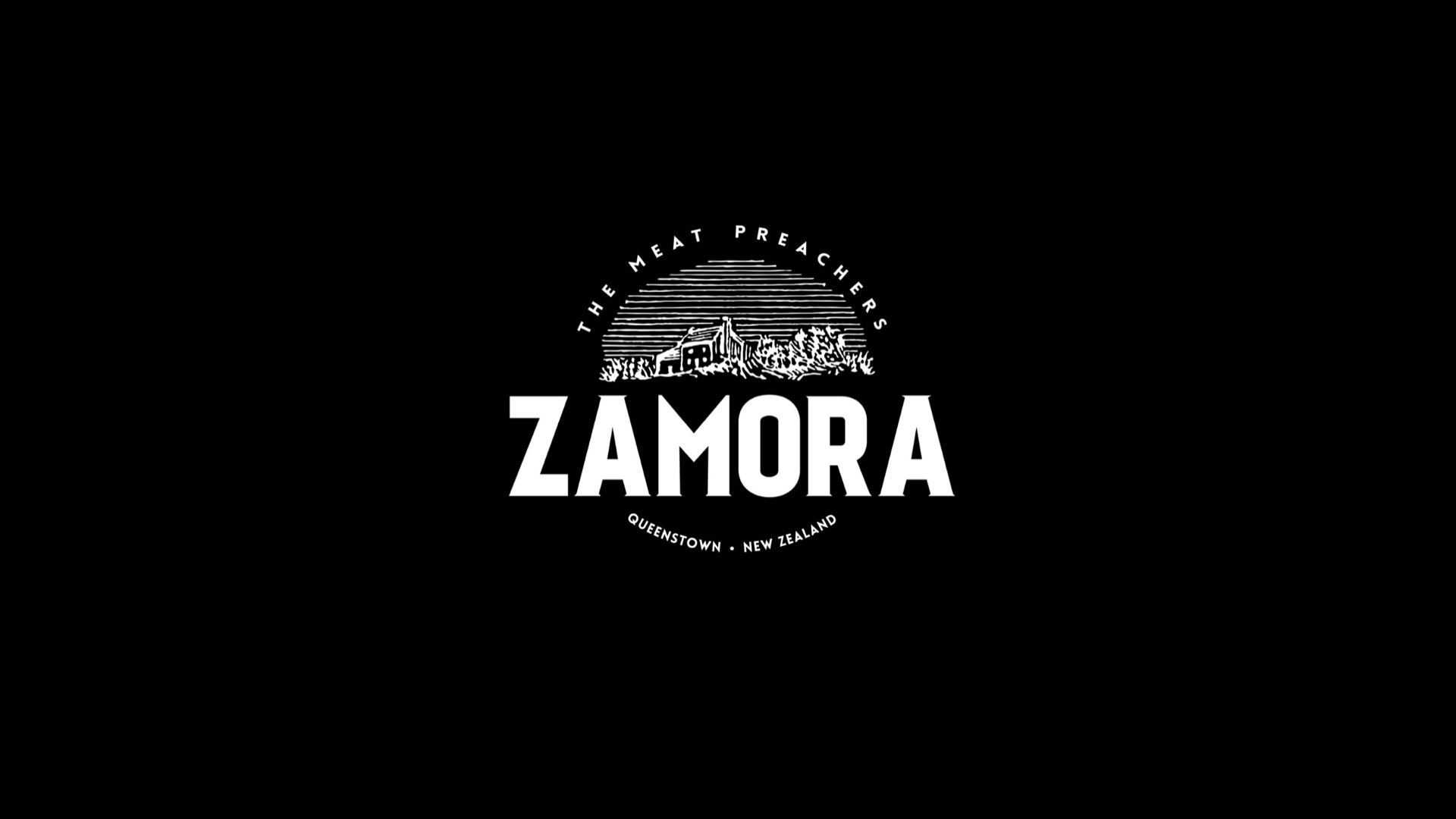
Zamora Homemade
品牌识别:
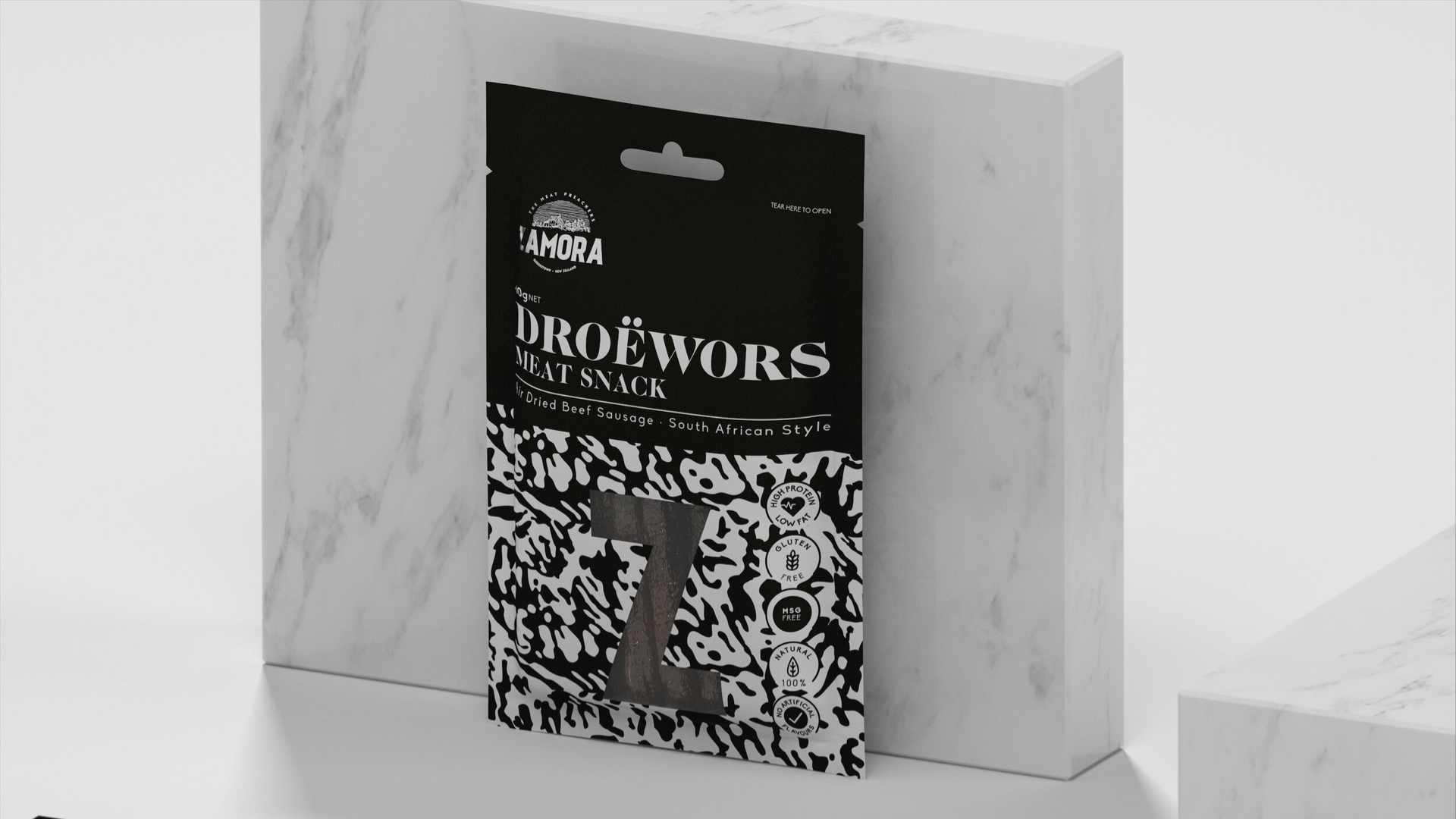
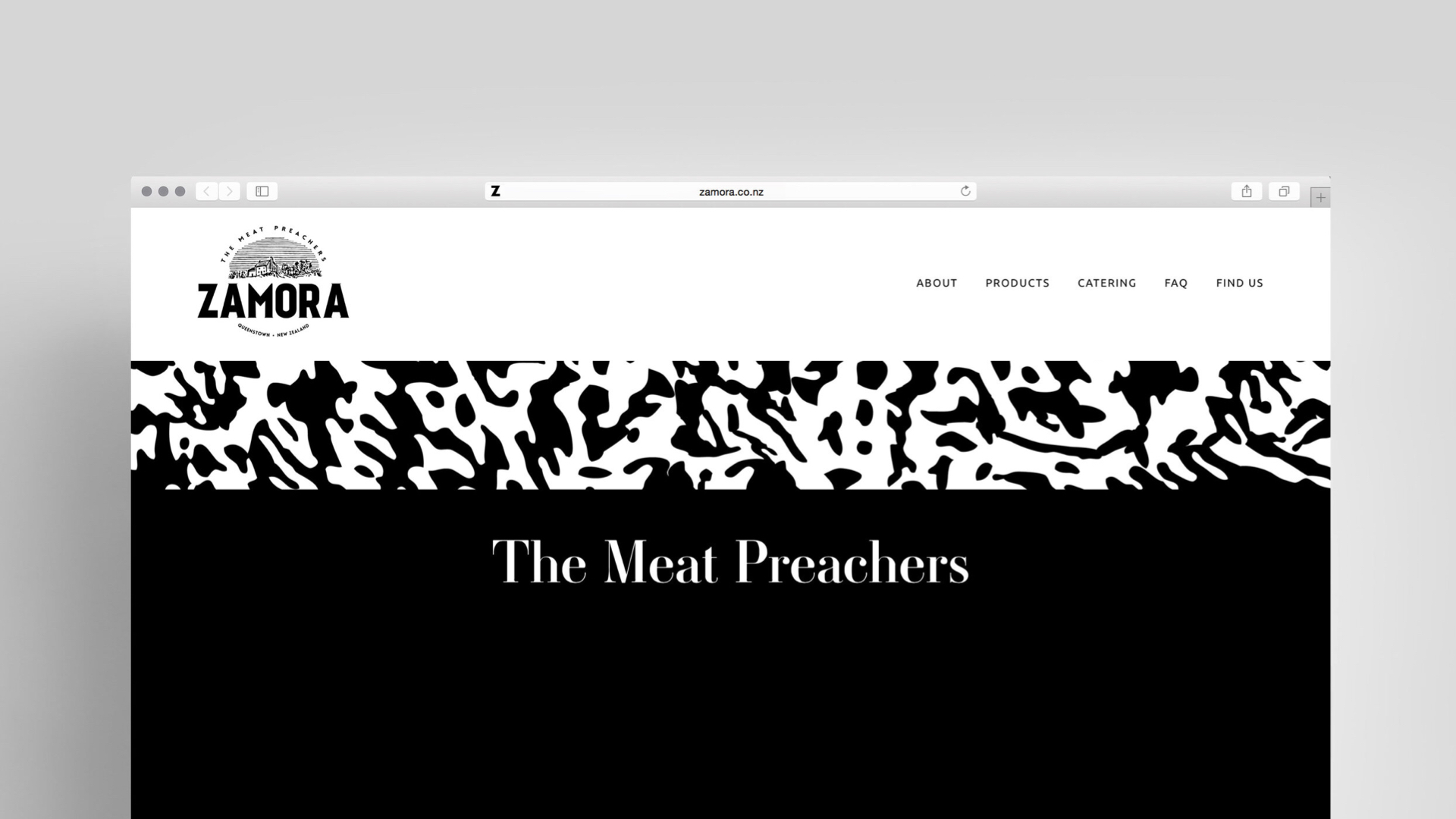
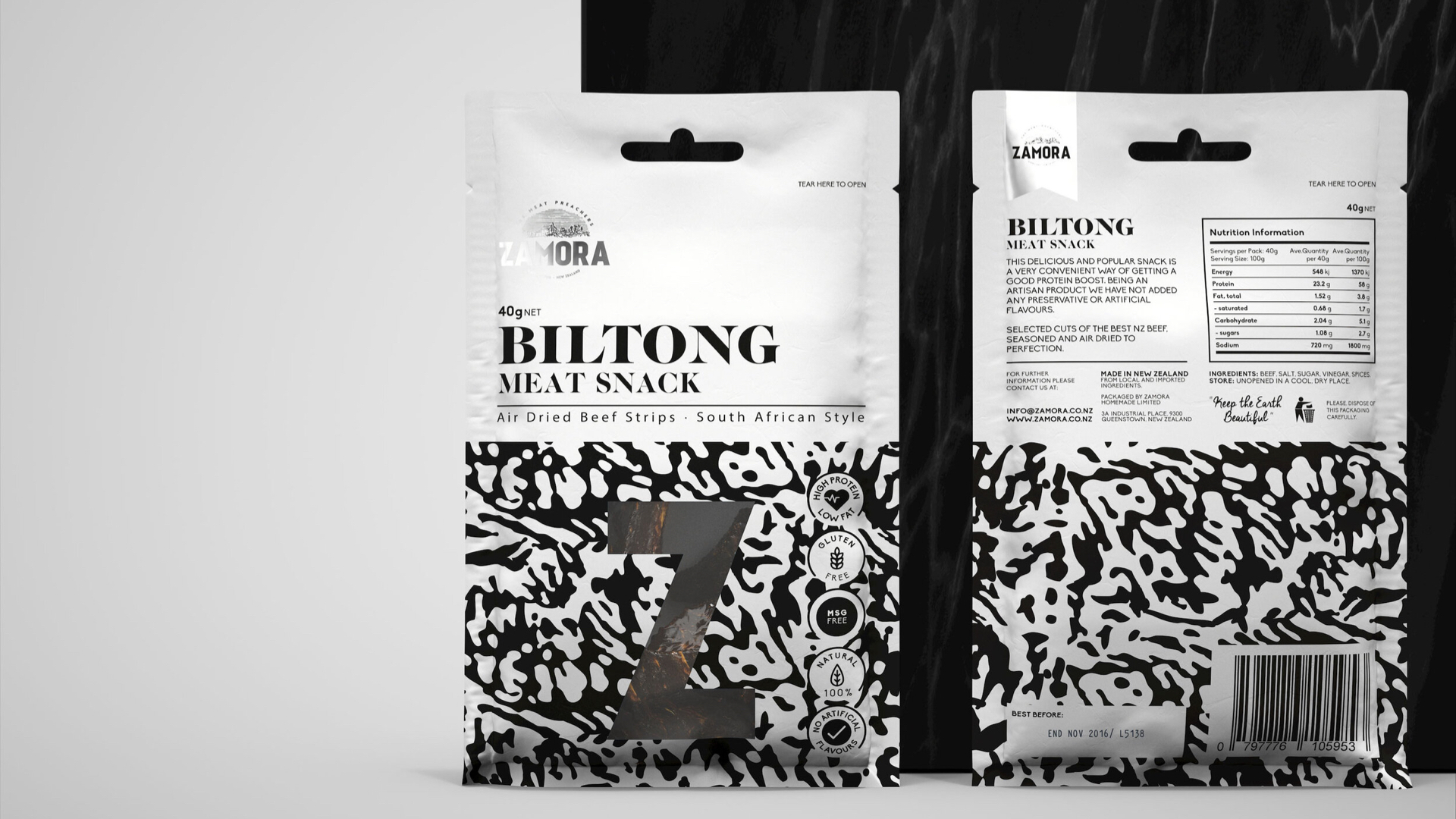
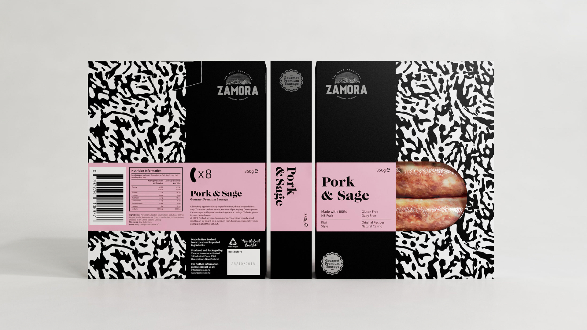
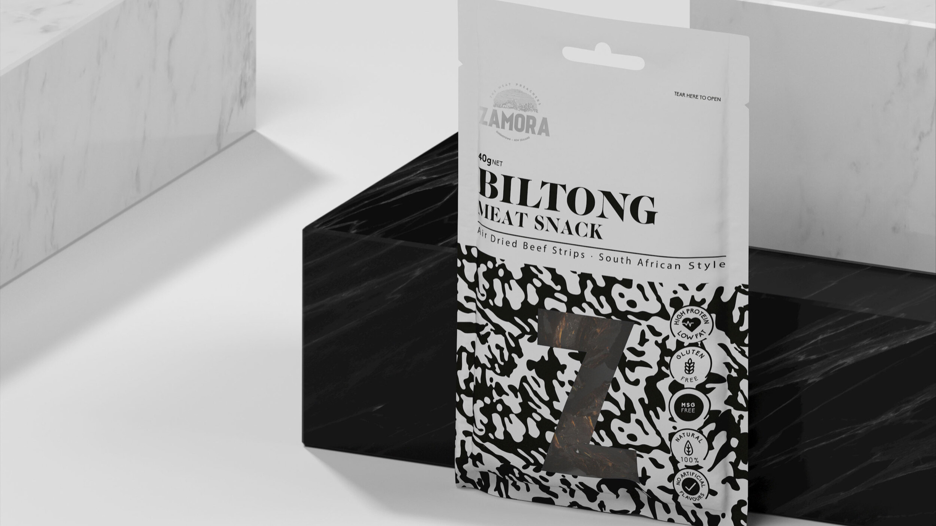
Zamora Homemade是专注于家常食物的品牌。他们在传统食谱中使用天然成分,在食品品牌vi设计的部分加入现代元素。在零食包装设计方面也独具一格。是上海vi设计公司值得学习的案例。Zamora展示的最强烈的一面是对当下的承诺,和从未失去对传统的关注。这是一个追求年轻感,但又明显趋向成熟的品牌。
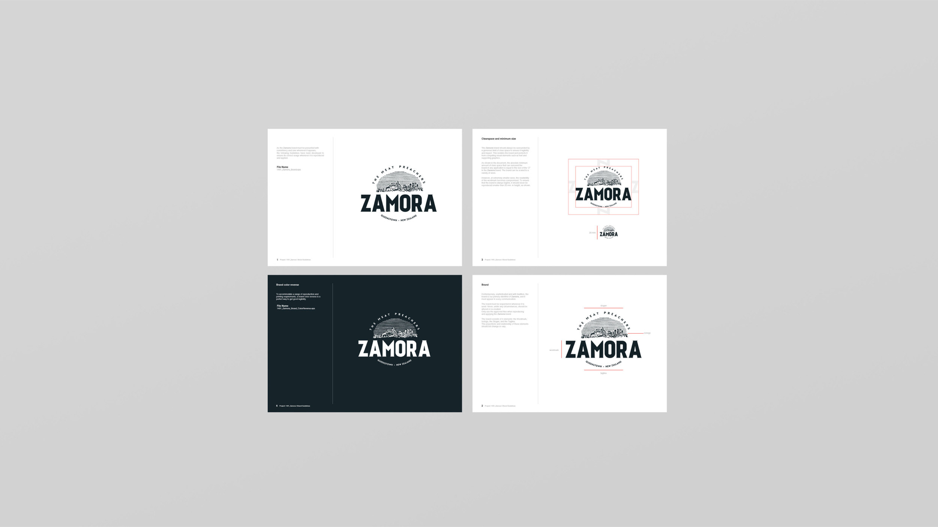
品牌的精神意味着传统和激情。这个在新西兰市场的新品牌是由两位经验丰富的年轻合作伙伴创立的,他们提供高质量手工制作的产品。他们开发品牌身份,并创建适应不同概念格式的包装。这是一个反映了对产品制造的诚实和可靠传统价值的品牌。通过选择成熟的调色板来加强概念,但同时使用宽松而现代的构图形状。 这是一个渴望年轻,但明显趋向成熟和经验的品牌。农场的标志呈现出新鲜感,没有锚定到任何特定的产品,因此在业务扩大时保持了使用品牌的能力。所选字体是无衬线字体,但带有几乎看不见的衬线,以帮助我们表示传统和现代的混合。
Zamora Homemade is all about enjoying homemade food. They use natural ingredients in traditional recipes and add a modern twist. Zamora shows its strongest side is character and commitment with the present, without ever losing sight of its traditions. A brand that seeks to be young, but with a clear trend towards maturity. The spirit of the brand means: tradition and passion. This new brand in the New Zealand market was founded by two young experienced partners that offer a high quality handcrafted product. We were invited to work with them to develop a Brand Identity and create packaging that fits different conceptual formats. Solution: Zamora’s strongest side prevails with character and commitment to the present, without ever losing sight of tradition. This is a brand that reflects the values of honesty and proven tradition in caring for the manufacture of its products. The concept is reinforced by selecting a mature colour palette but with the use of shapes in a loose and modern composition.
Via:MAKEBARDO