KOKORO
品牌识别:
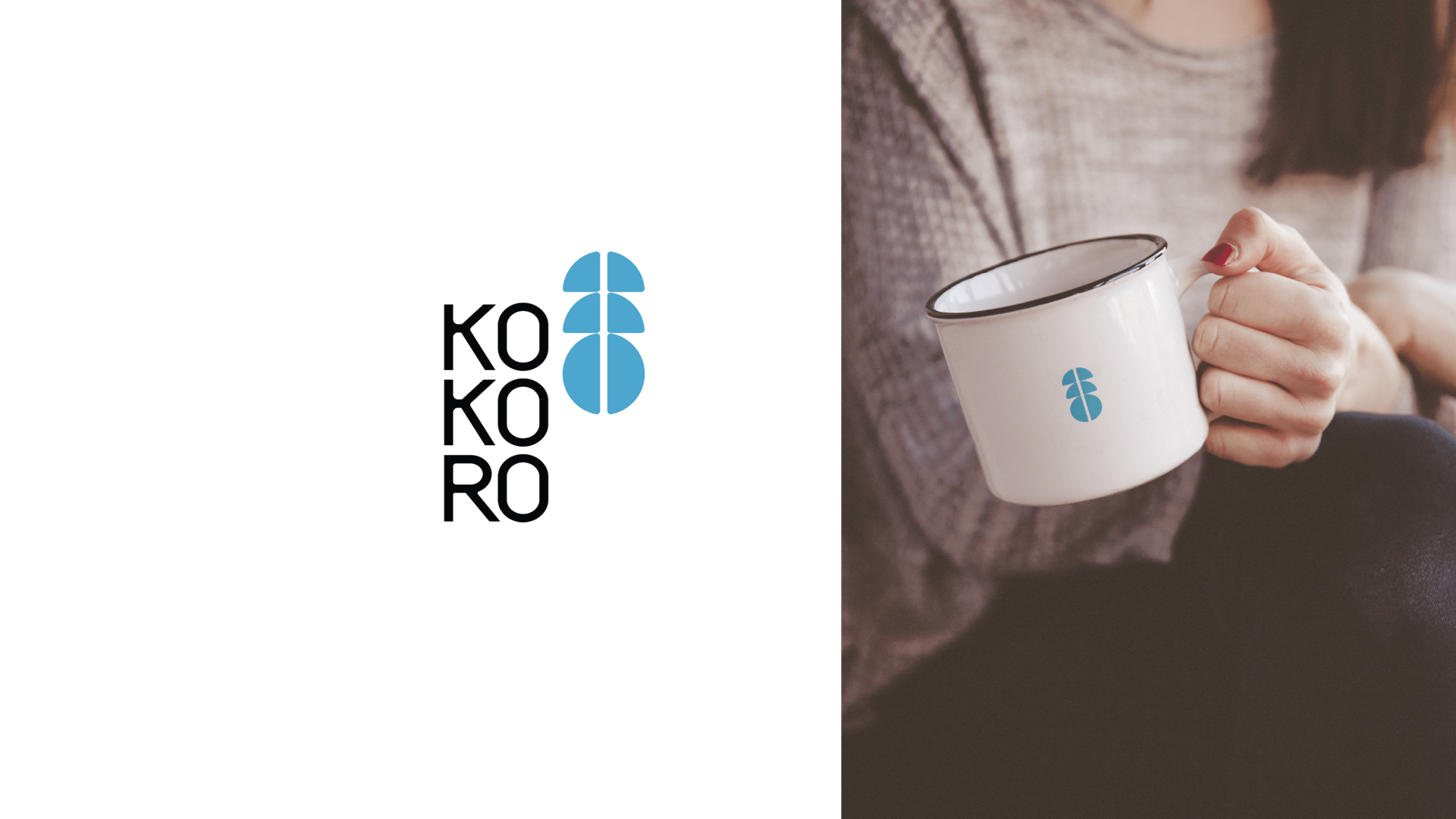
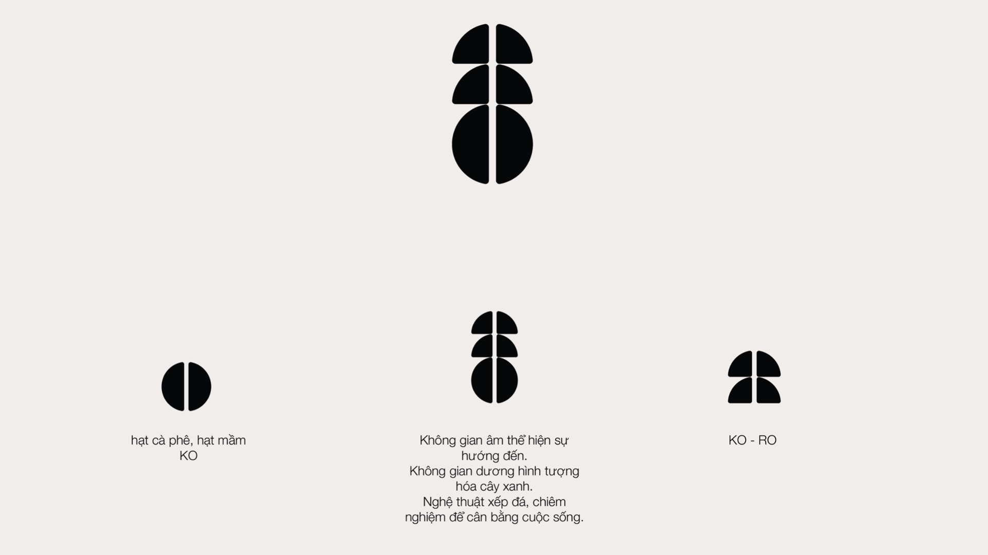
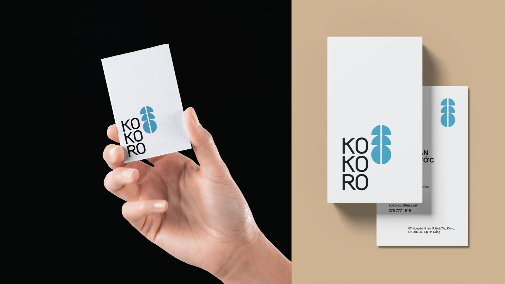
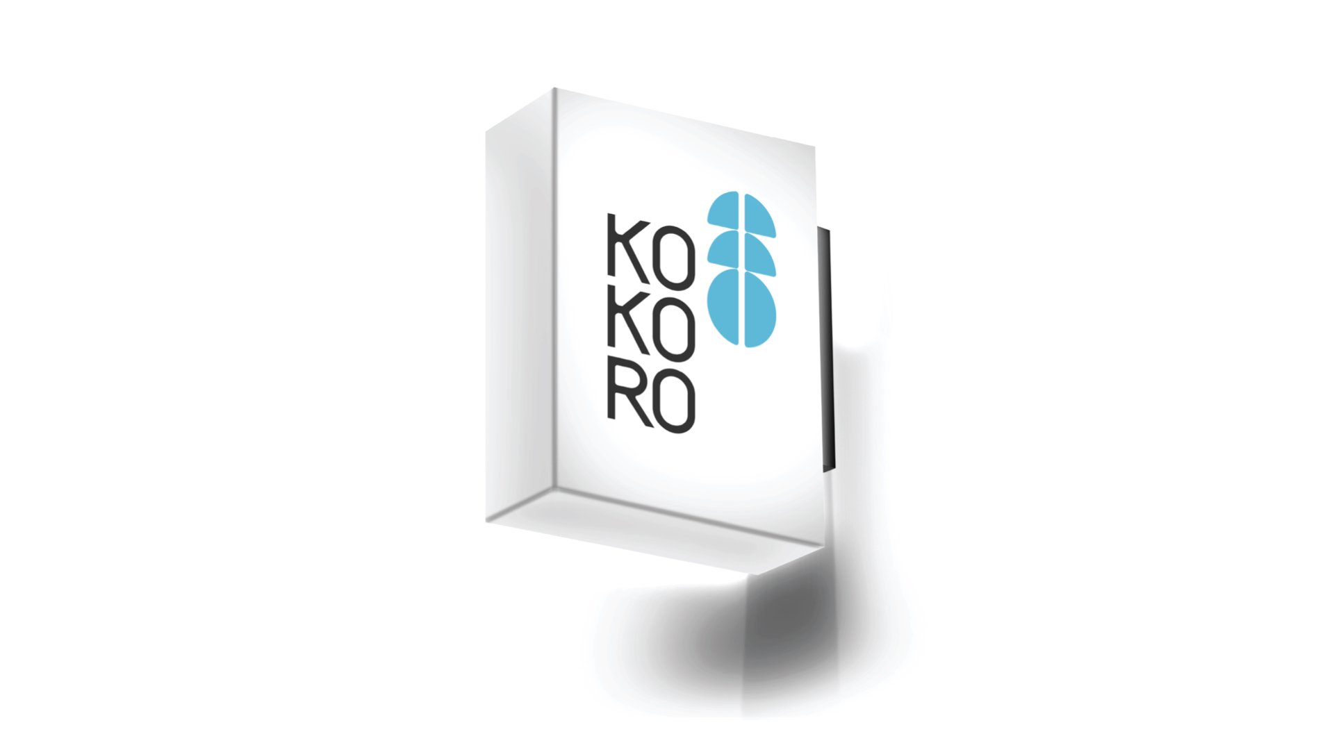
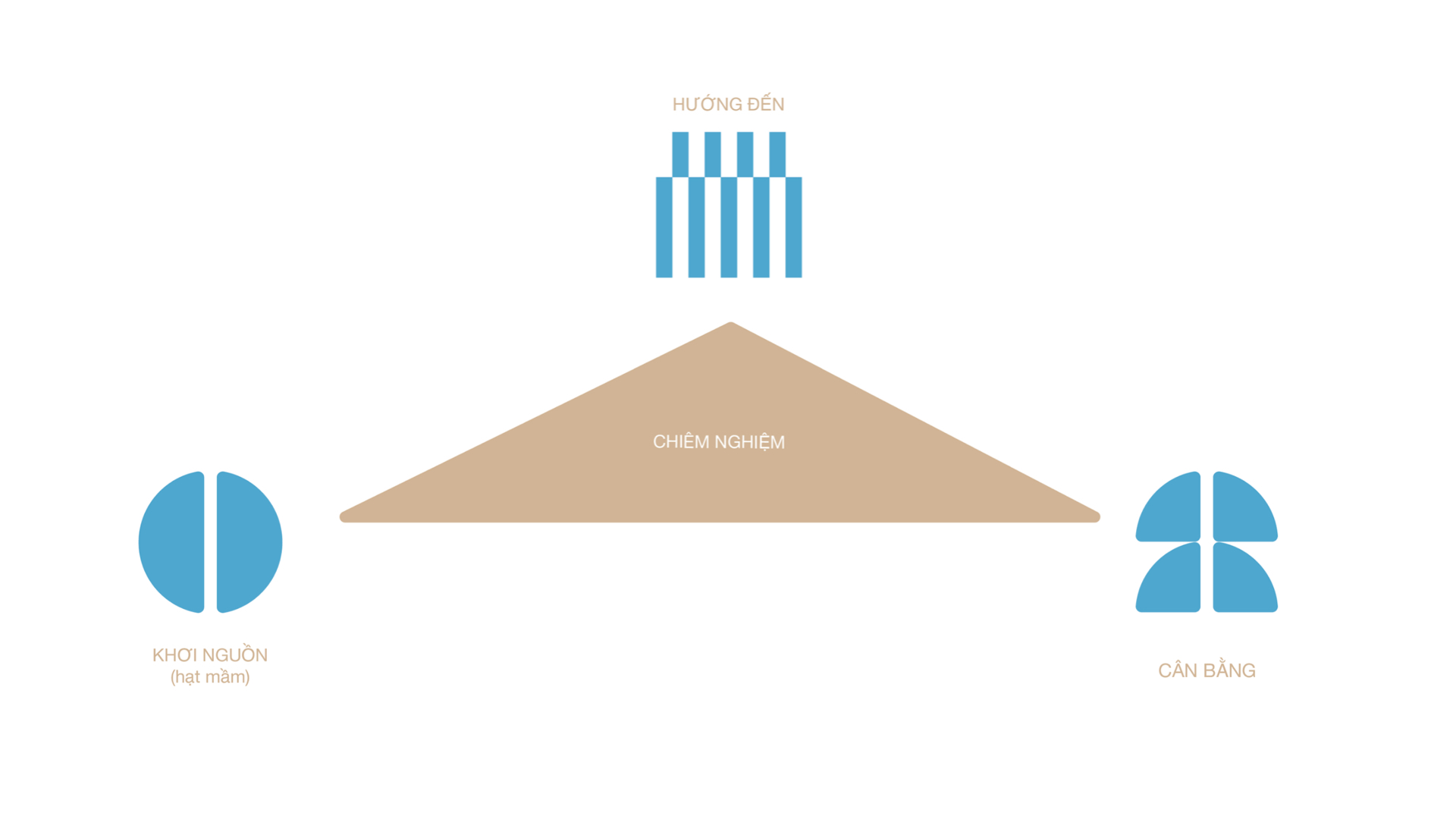
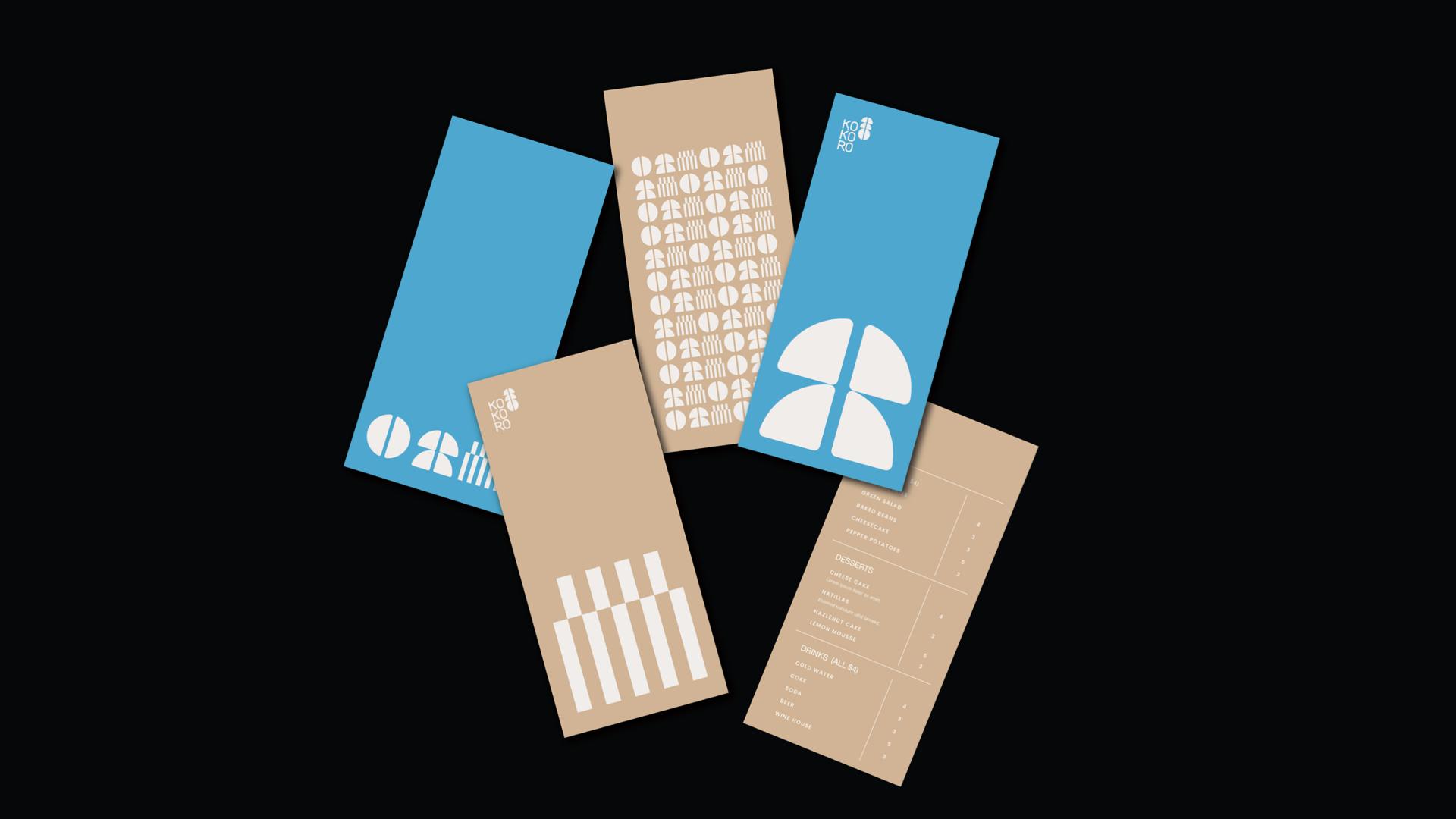
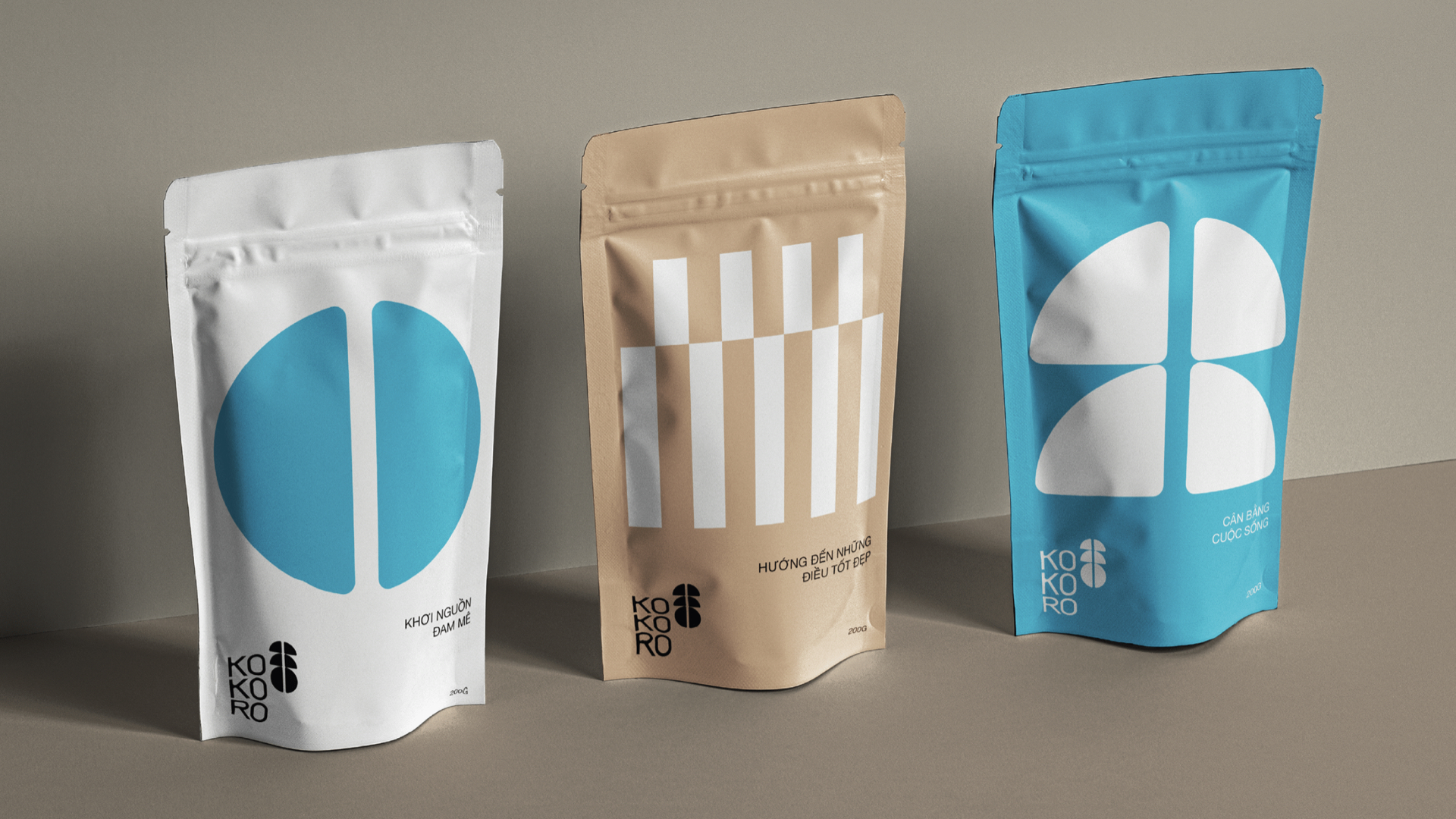
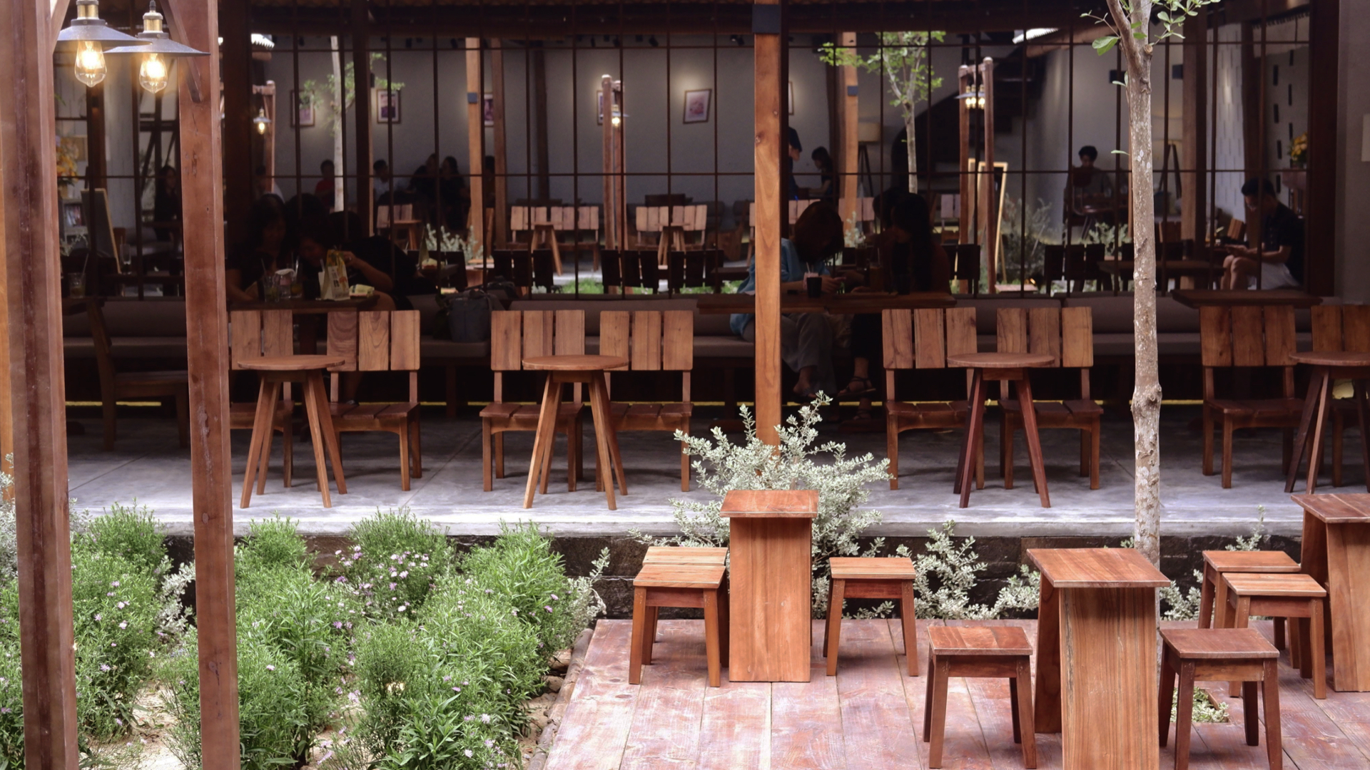
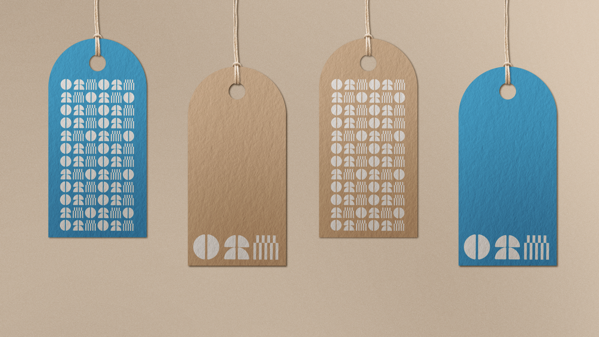
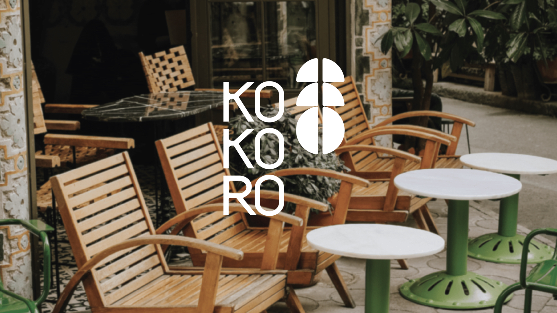
咖啡馆在自然空间中提供产品的新体验,通过咖啡和茶结合,融入同一绿色空间。该品牌发展的主要是“走向绿色”。这就是为什么品牌在品牌识别方面选择了负空间。在咖啡品牌vi设计,咖啡品牌logo设计上,品牌将含义组合在一个符号中。KOKORO的意思是灵魂。标志结合了咖啡豆和负空间,展示品牌形象,同时也体现了品牌的口号是“绿色生活”。KOKORO不仅仅是一个绿色、安静的咖啡馆,它还可以在其他地方找到。在这里,您将体验到饮品和绿色空间的新鲜感。经过几天的紧张工作之后,绿色空间将帮助你治愈破碎的灵魂。
The primary goal of brand development is to create a simple logo. Approachable, moving towards green. That's why I chose negative space in brand identity. This allows us to combine meanings into one symbol. KOKORO means "heart/mind/soul" in Japanese, representing the soul. Therefore, the logo combines coffee beans and negative space, showcasing the image of green, its direction, while also reflecting the brand's slogan "Green Life". The color choice aligns with the brand. KOKORO is not just a green, quiet café; it can also be found elsewhere. Here, you will experience the freshness of drinks and green spaces. After several days of intense work, the green space will help heal your broken soul.
Via: Horus Agency