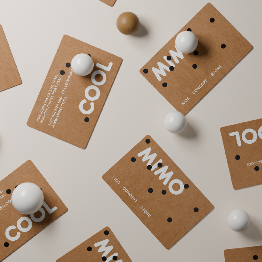
Backstage
品牌识别:
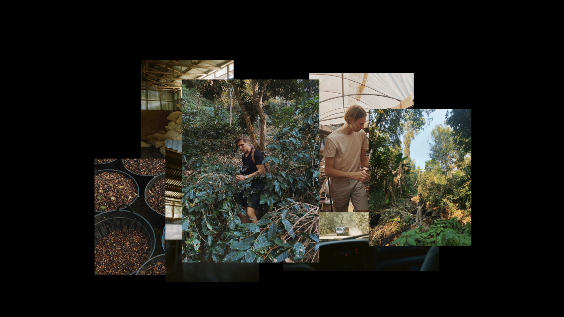
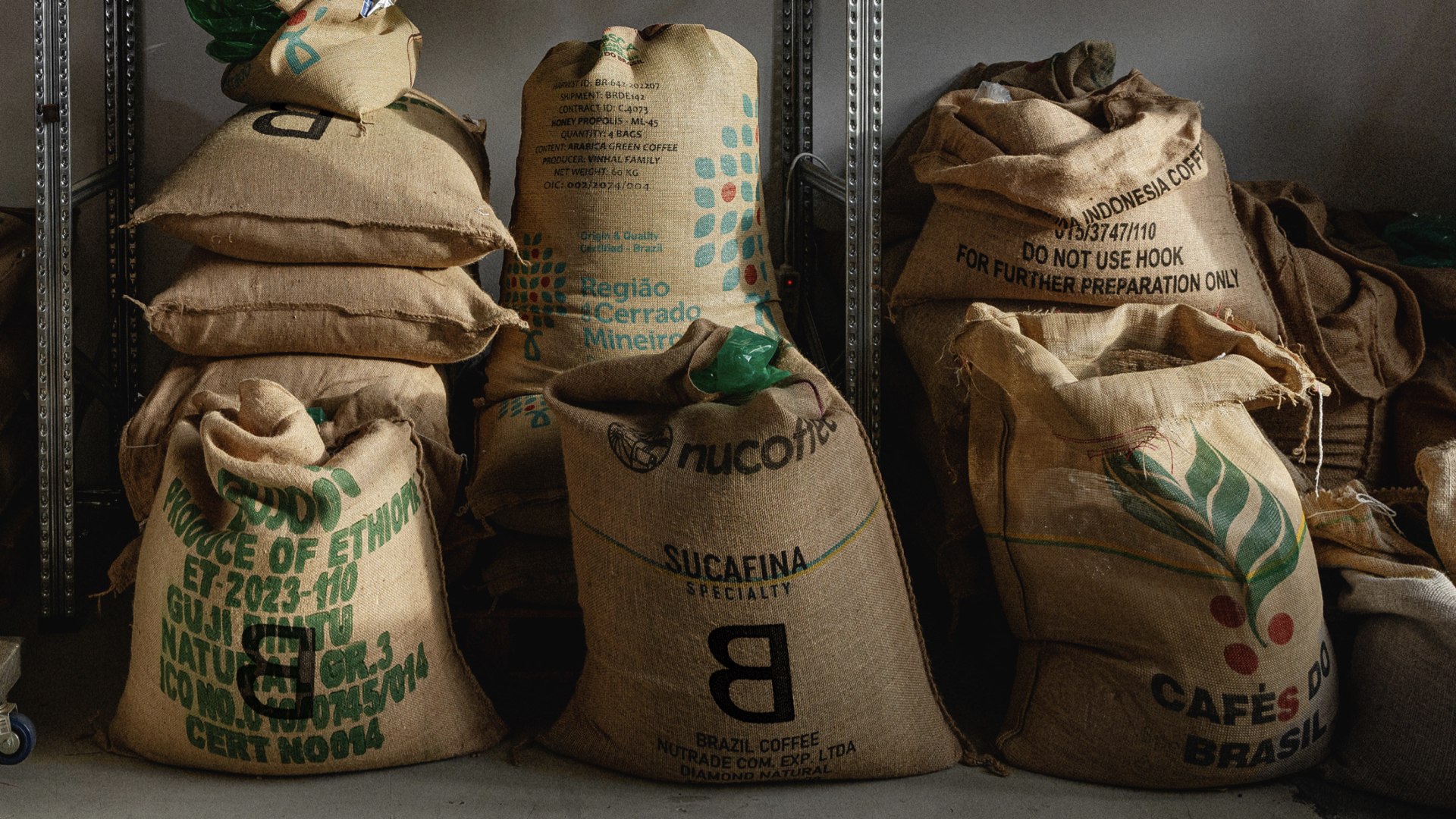
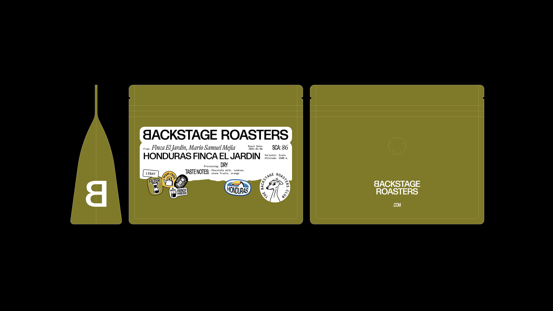
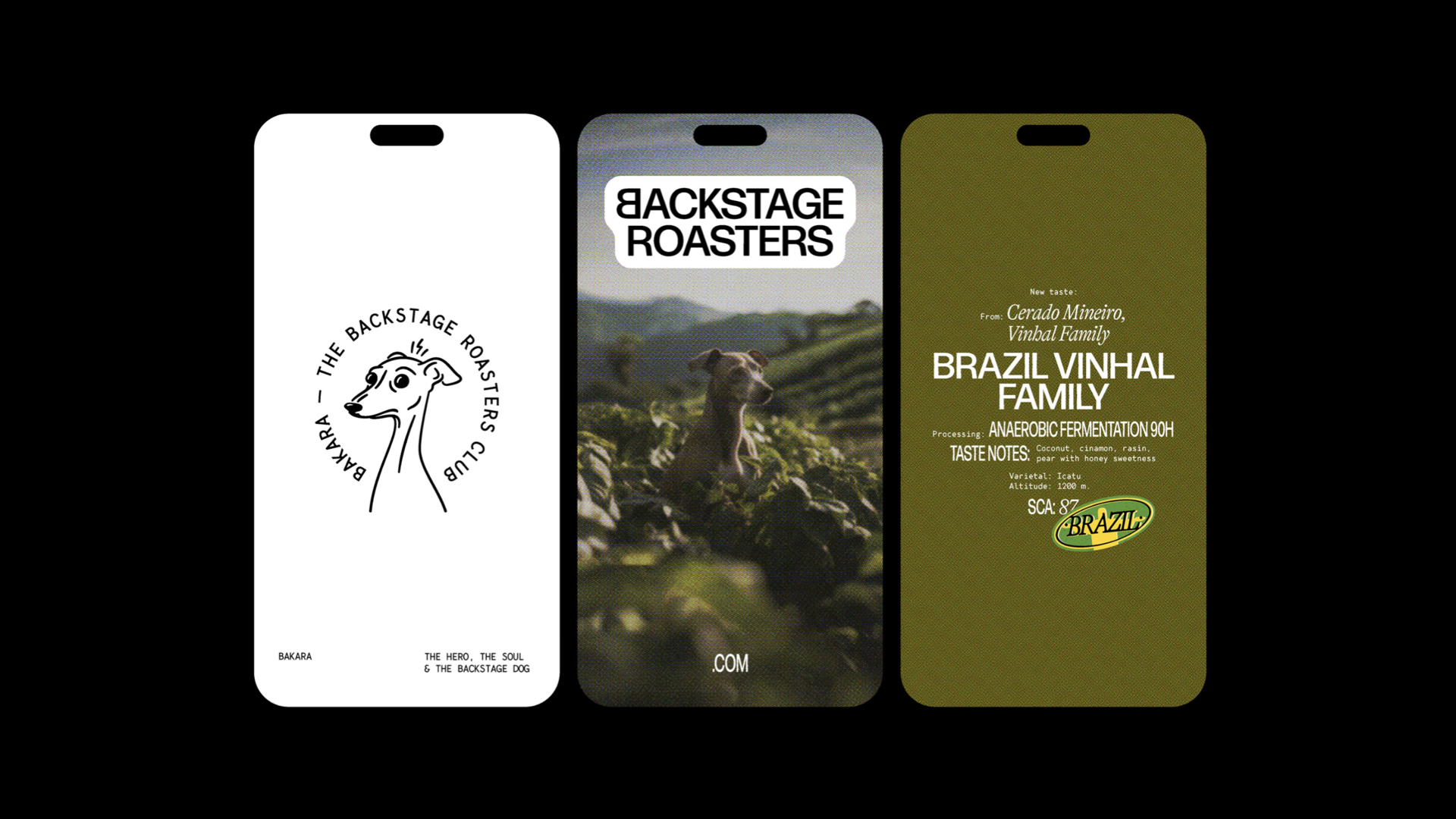
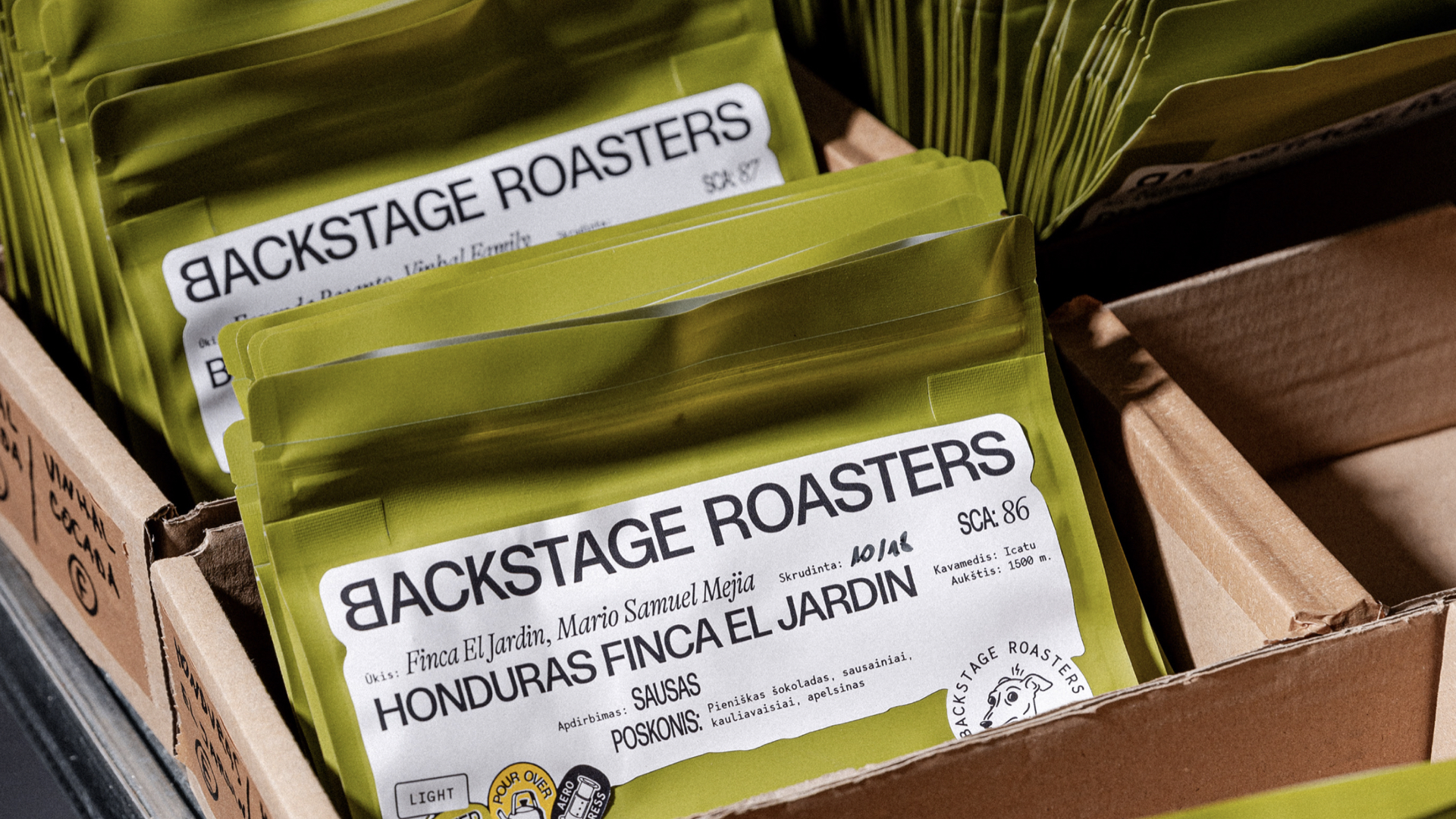
Backstage是一家独特的咖啡烘焙工坊,重视并培养与其咖啡与每个人的关系,从农民到出口商,再到顾客本身。他们是探险家,他们的探险不仅仅局限于咖啡本身。为了提供最有趣的口味,Backstage前往世界最遥远、最奇特的角落,寻找新的配方和咖啡品种,以扩大立陶宛的特色咖啡爱好者的圈子。设计师们在1960年代的电影海报中找到了灵感,特别是那些描绘勇敢的寻宝冒险家涉足新土地的海报。在咖啡品牌vi设计,咖啡品牌包装设计方面,以土色调的字体风格和海报式的布局、以及古老照片的融合形式呈现出来。
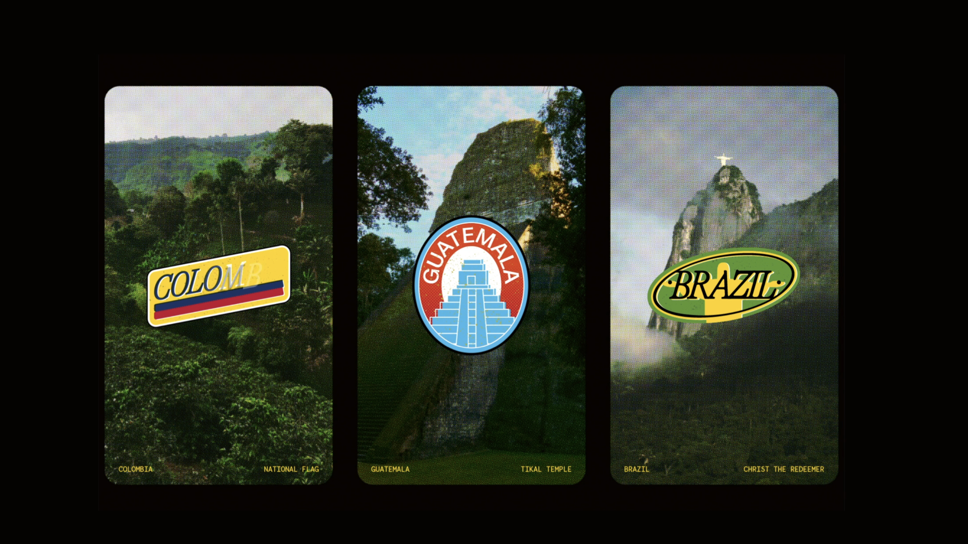
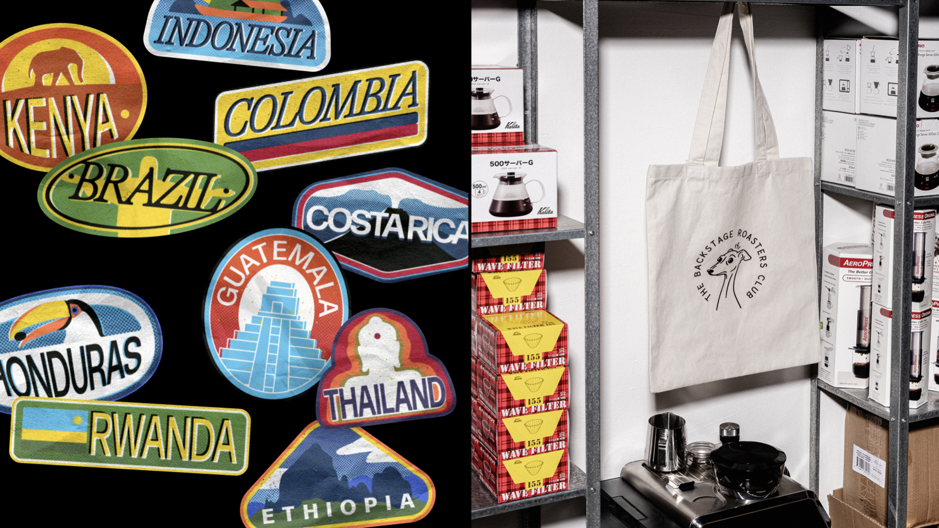
为了进一步增强身份的叙事性——十个独特的贴纸,每个都带有一个吸引人的符号,代表着咖啡的原产地,更强调了Backstage作为探险家的整体外观。这些独立的贴纸被视为与咖啡多样化的文化遗产有形的联系,就像从访问过的国家收集的纪念品一样。一个巧妙结合的独特字体三重奏有效地展现了关键信息,确保咖啡爱好者能够轻松识别Backstage的咖啡并发现新的口味特点。最后,标志——一个风格化的“B”——作为一个微妙而强大的象征,暗示了咖啡制备的神奇发生在幕后。这和每一个身份元素都代表了Backstage急于分享他们的故事。
Backstage’s travels have connected them with farmers, emphasizing the importance of their relationship, transparency, cultural immersion, and understanding the entire process of bean cultivation. Hence, the idea of a new identity naturally arose from the desire to showcase that Backstage Roasters are curious travelers. The identity became a blend of adventure, exploration, and storytelling. During our research, we found inspiration in 1960s film posters, particularly those depicting intrepid treasure seeking adventurers venturing into new lands. These posters resonated with the essence of Backstage, now reflected in an earthy color palette, eclectic typography styles and poster-like layouts, and the incorporation of vintage photographs.
Via: andstudio agency