Sano
品牌识别:
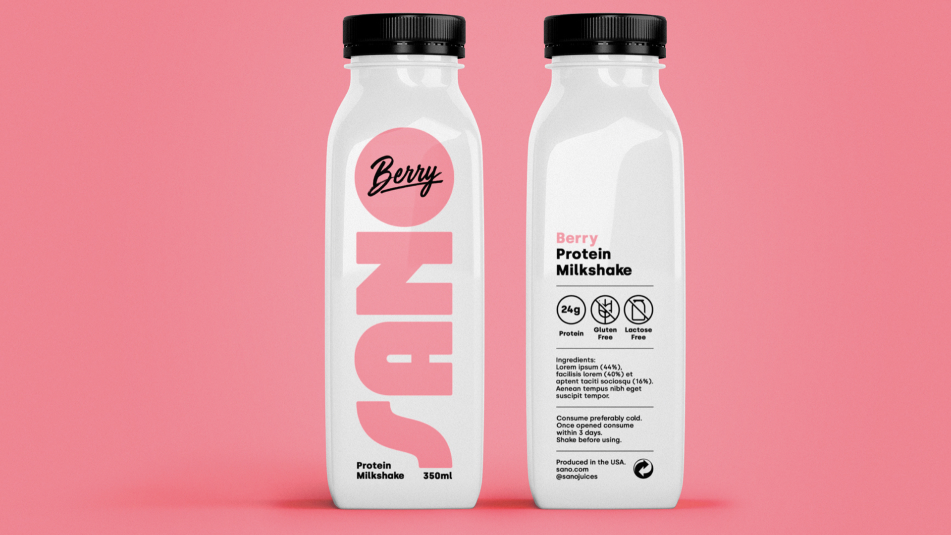
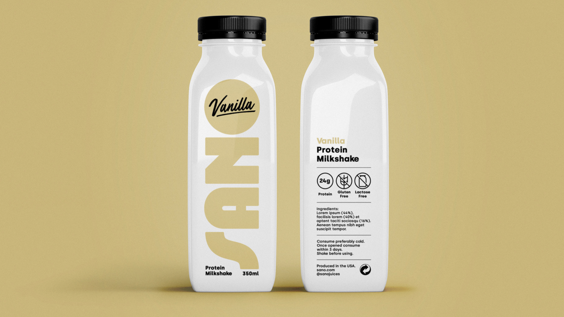
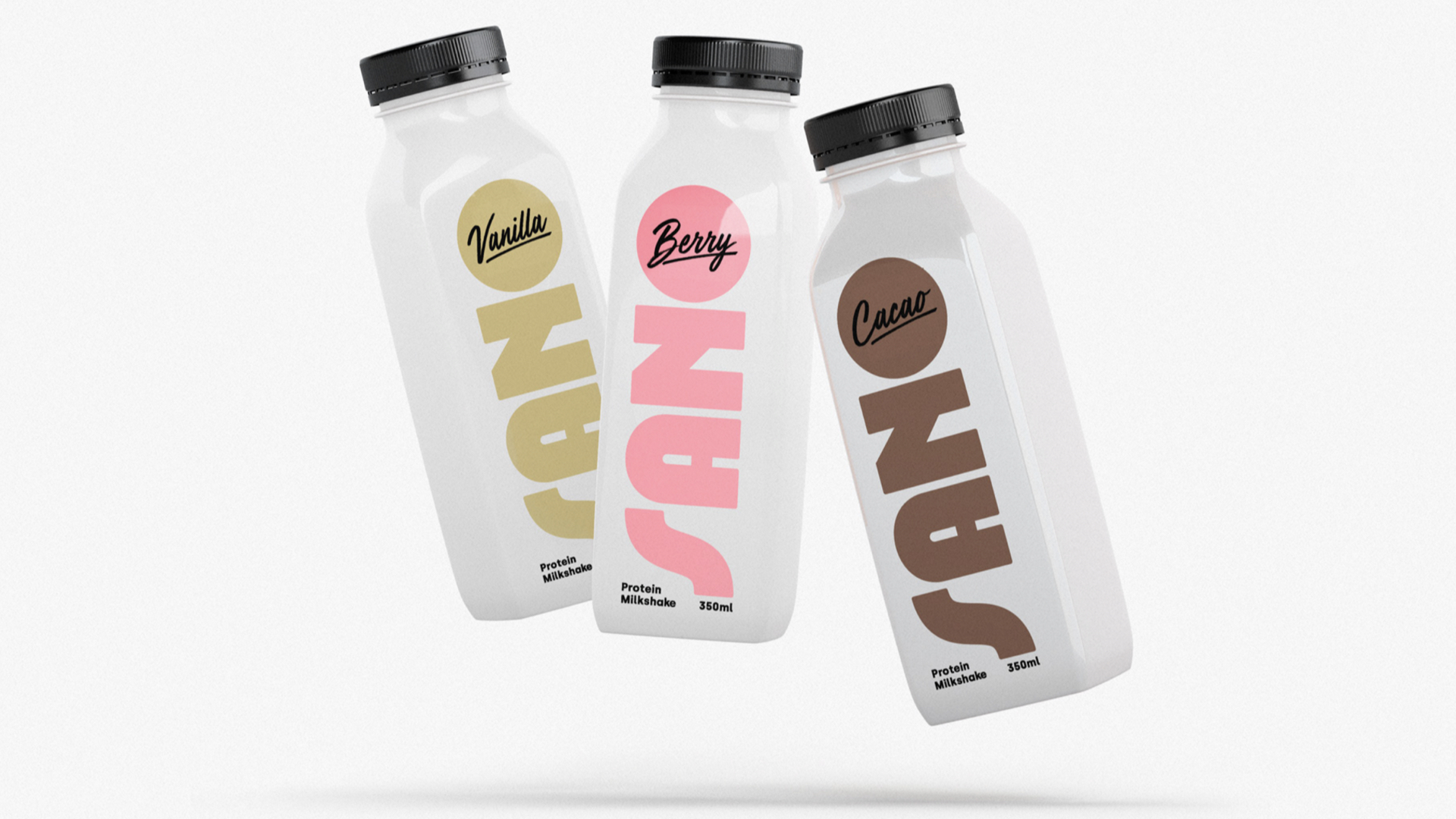
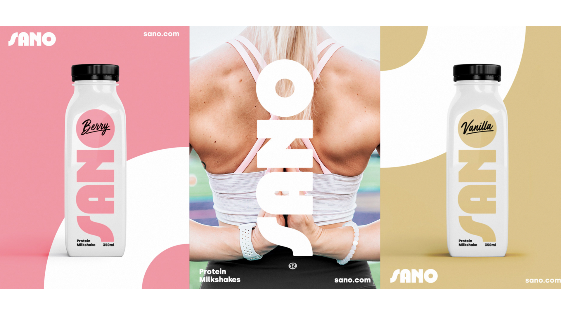
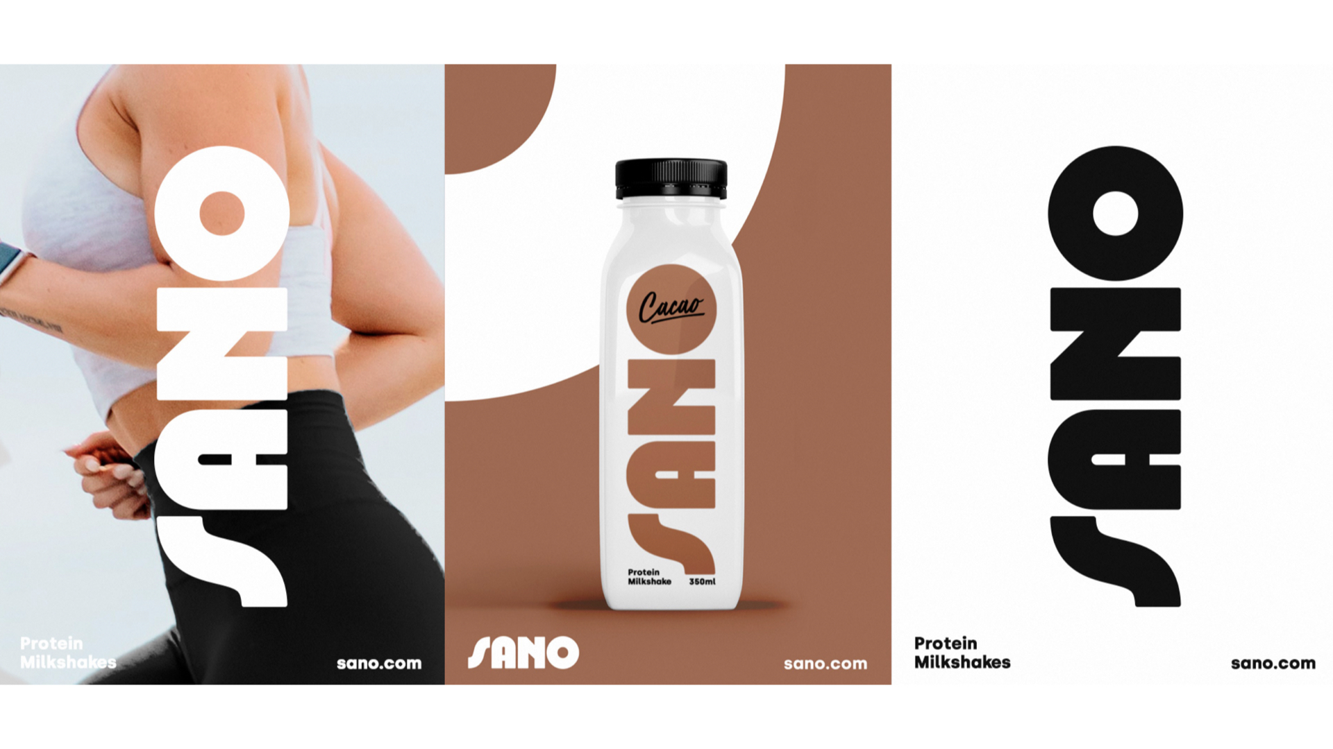
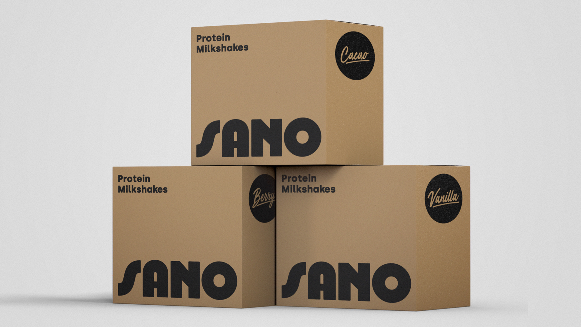
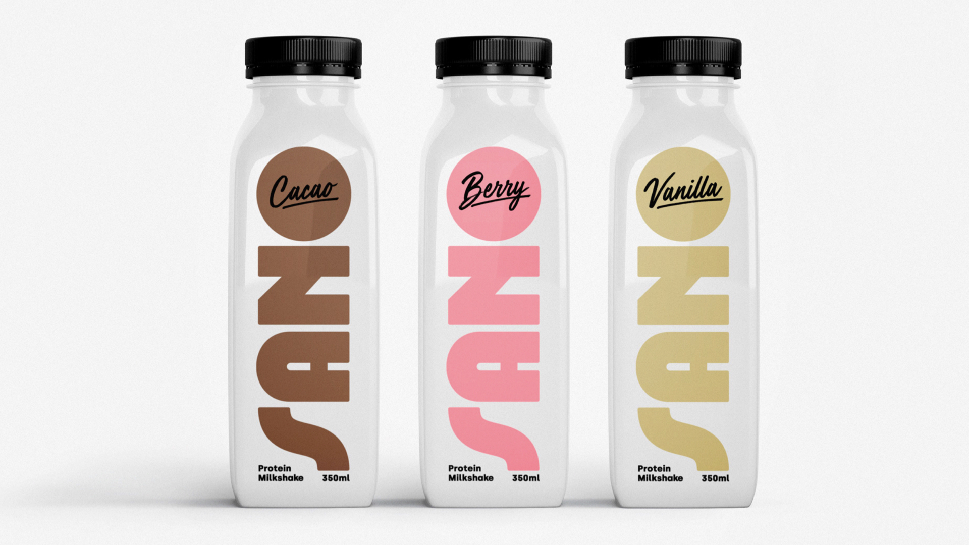
Sano是一个关于生产蛋白奶昔的品牌。在健康食品品牌vi设计和健康食品包装设计方面呈现一种轻松快乐的风格。品牌的视觉形象采用极简和清晰的设计,旨在在销售场所中脱颖而出,与其他相关产品形成鲜明对比。Sano的目标是吸引热爱运动、追求健康生活方式的年轻女性。色彩搭配使用了柔和的色调,代表品牌各种口味的味道。
Sano is a personal project for a non-existing brand that produces proteinmilkshakes. The brand visual identity has been designed following a minimaand clean approach in order to stand out in the selling places among otherrelated products. Sano aims to appeal to young women that are into sportsand have a healthy lifestvle. The color palette uses pastel shades to representeach one of the flavours of the brand.
Via:Jose Manuel Vega