Remix
品牌识别:
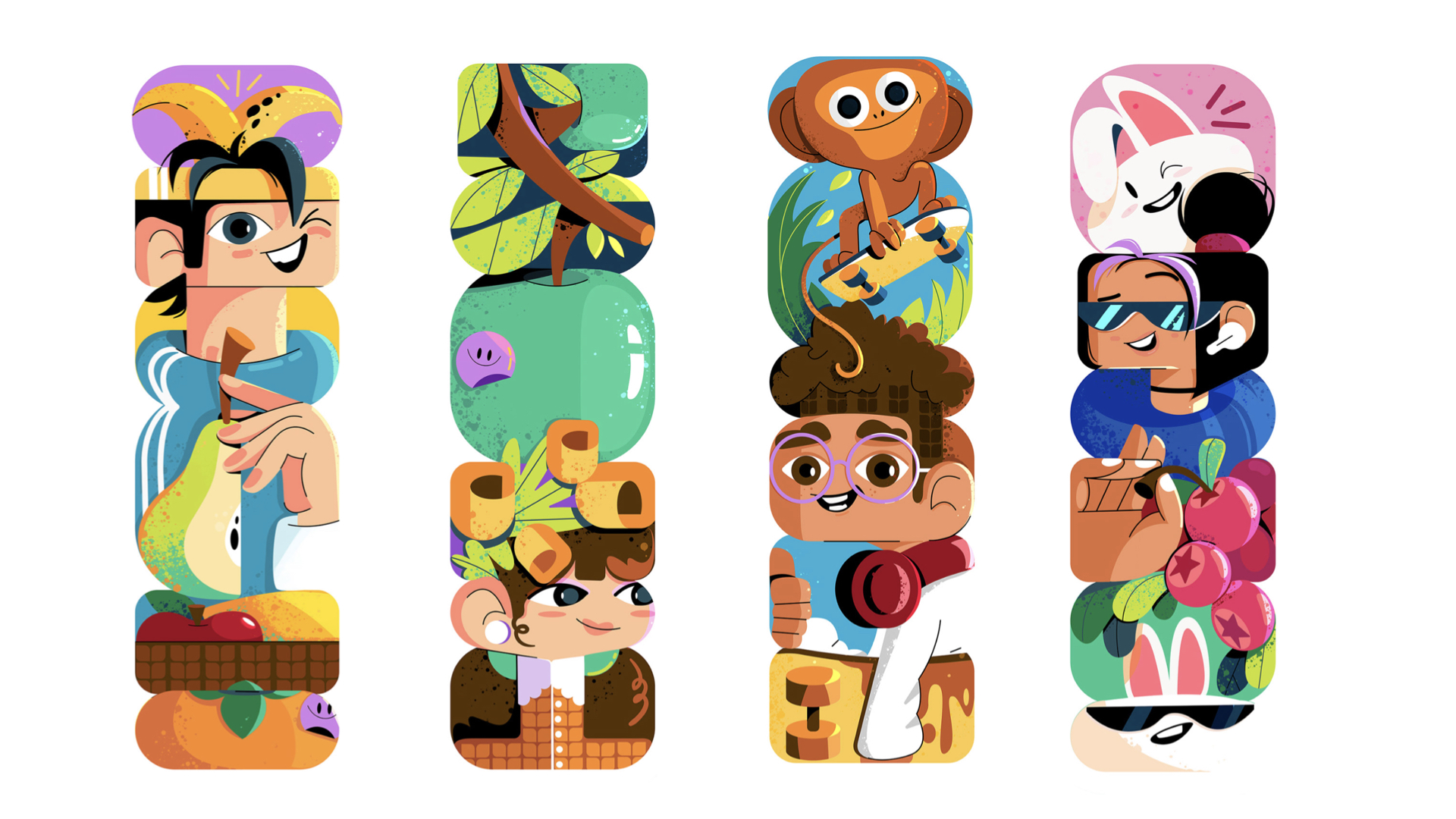
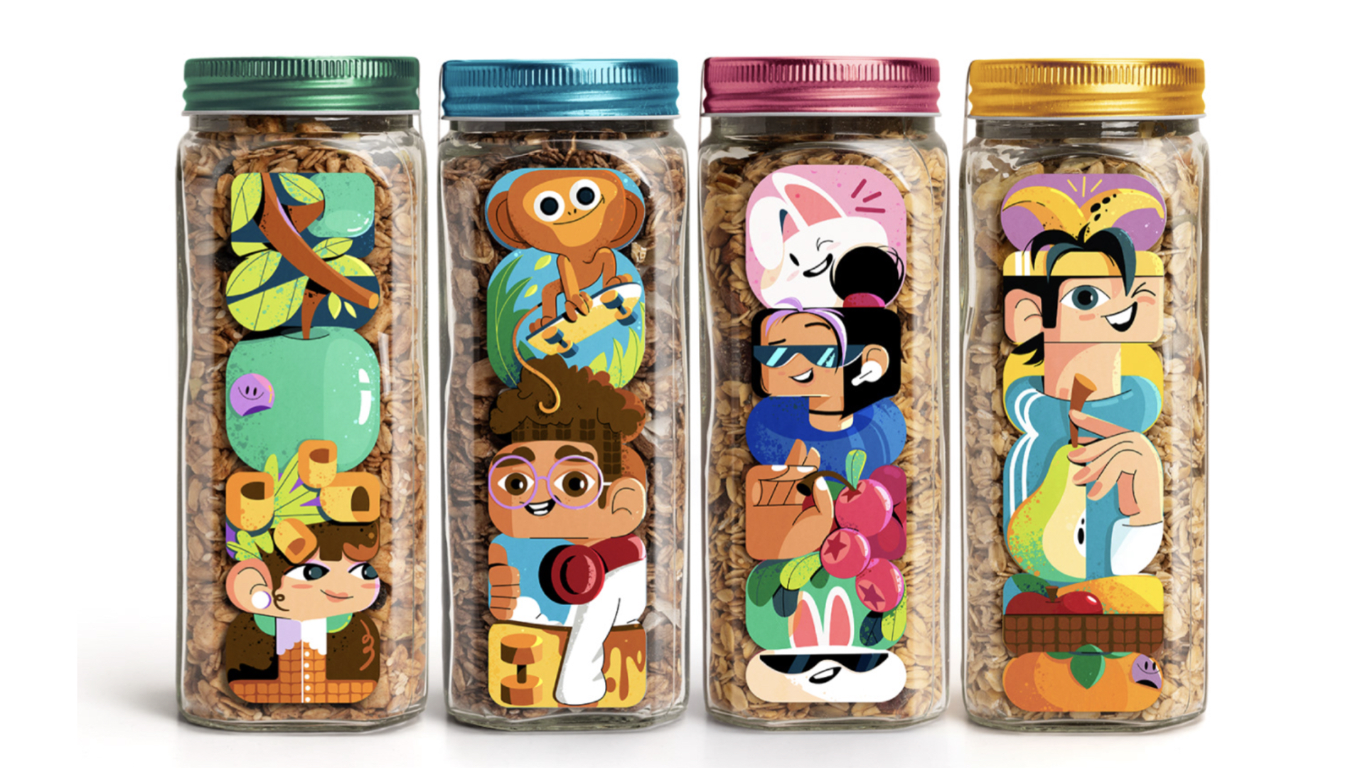
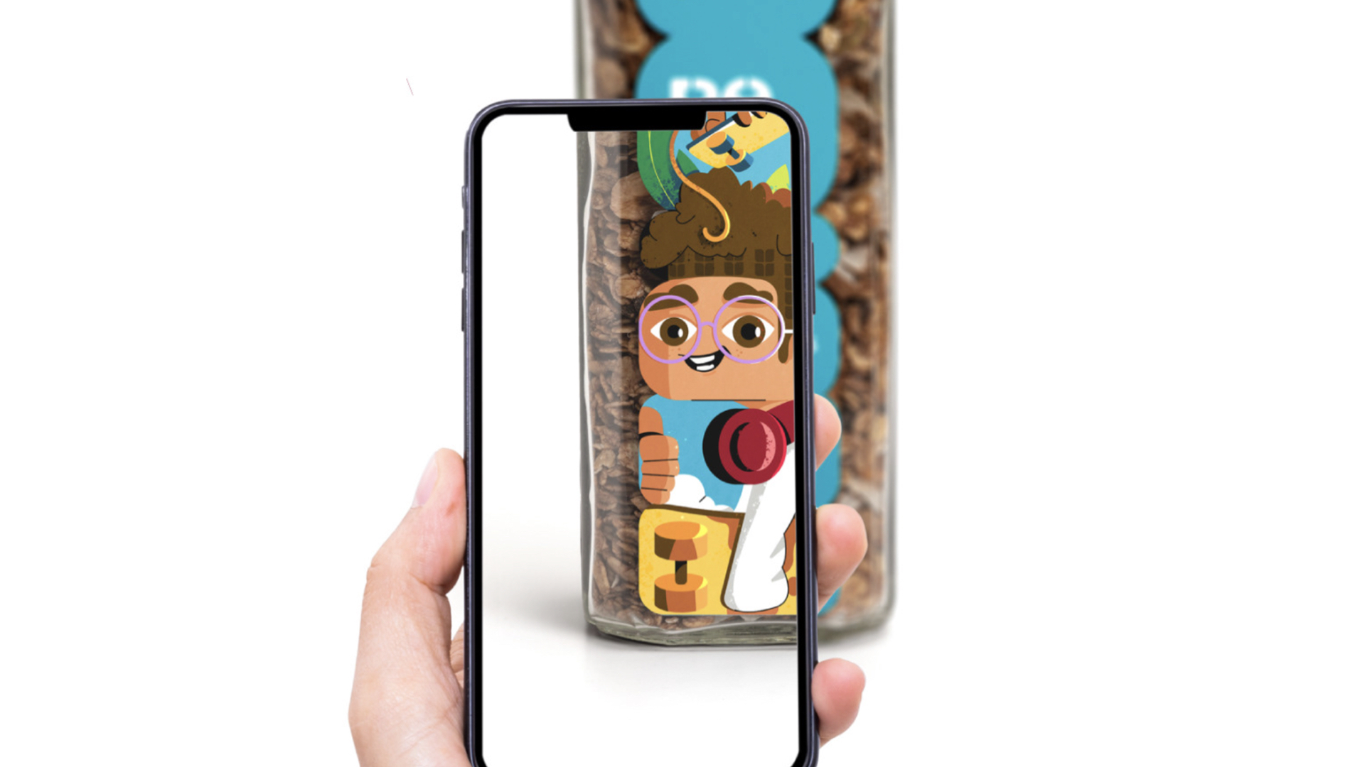
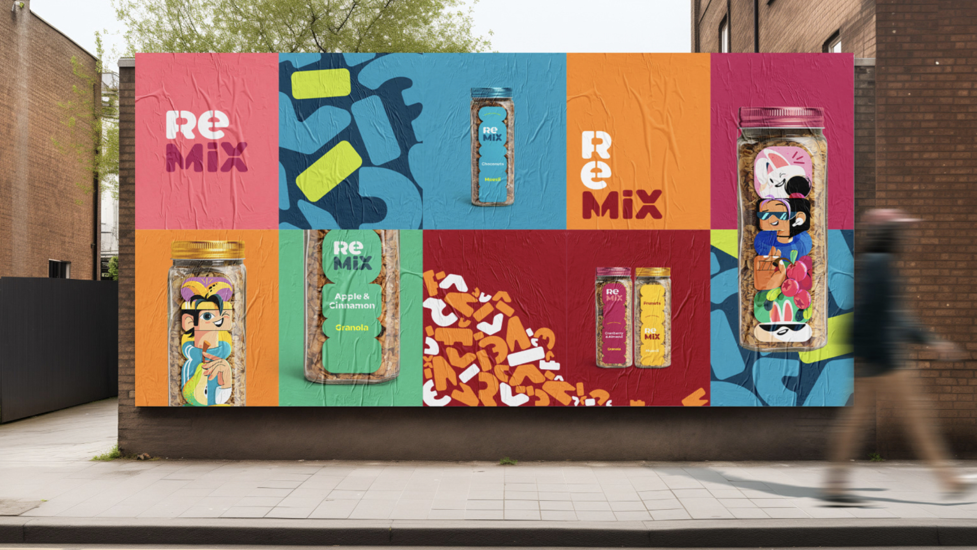
Remix是一家谷物麦片公司,旨在创造各种新颖独特的谷物混合产品,引入了“Remix”这个名称来代表他们独特的混合口味。类似于DJ重新混音音乐一样,Remix将基本谷物重新演绎成引人入胜的谷物麦片组合,引起了消费者的兴趣。在健康品牌vi设计,健康品牌包装设计也体现了公司追求美味配方时的俏皮创意精神。
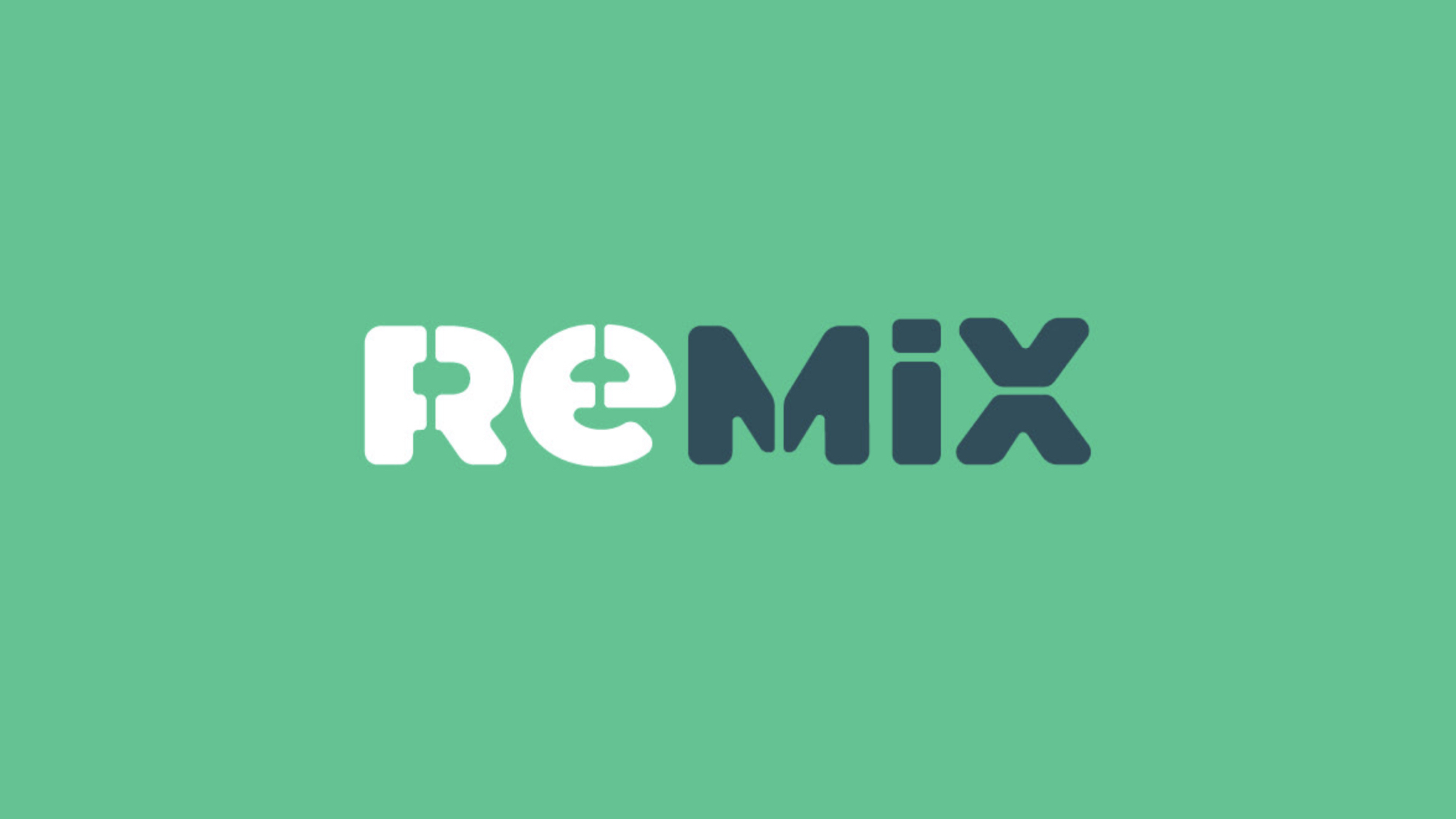
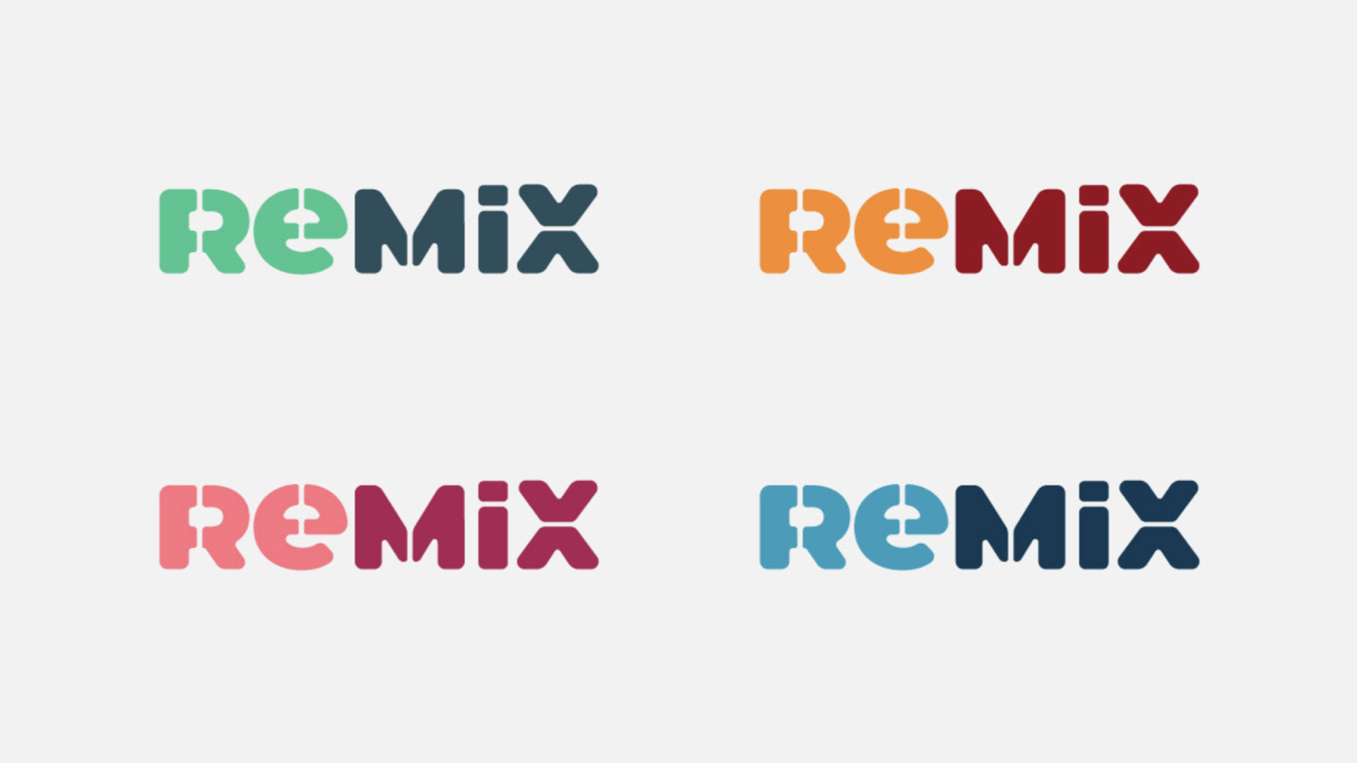
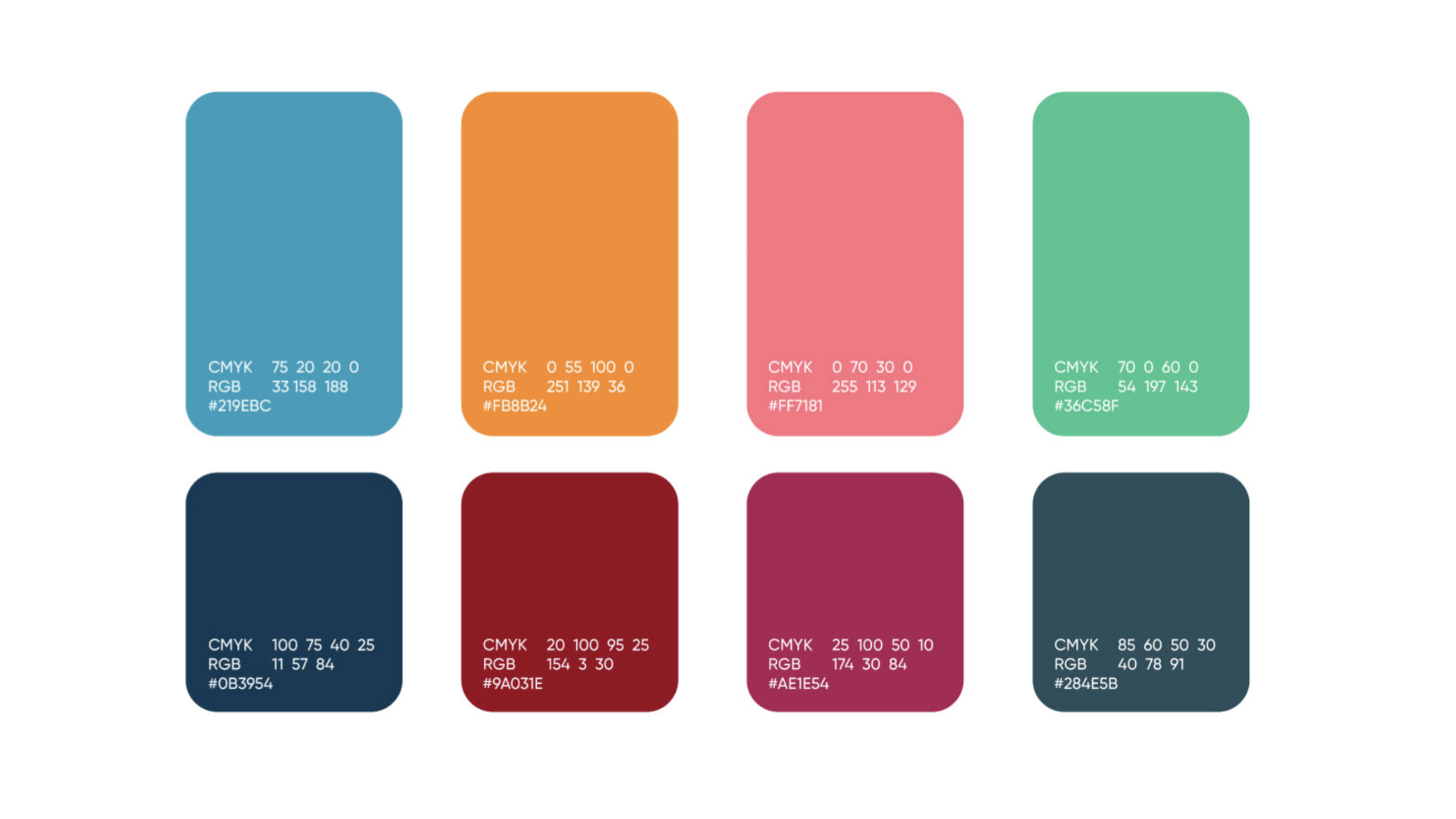
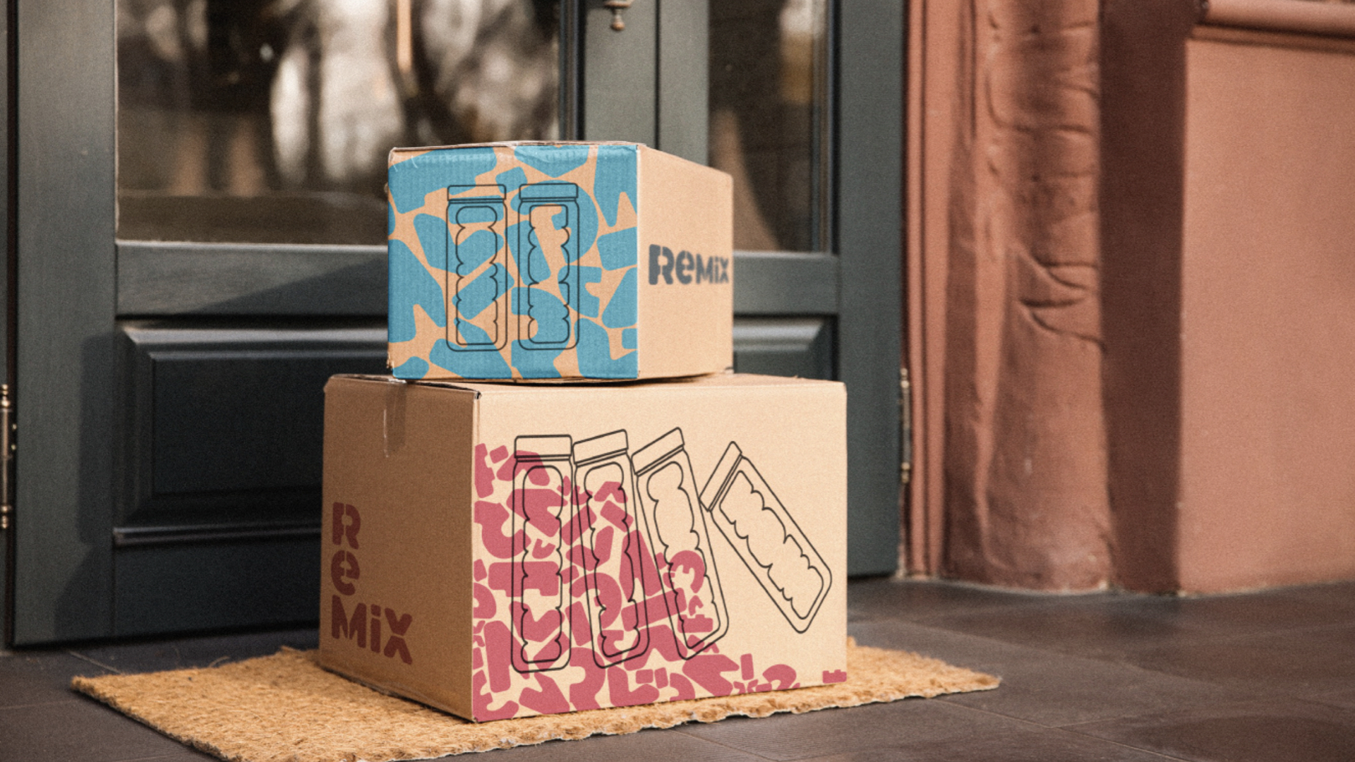
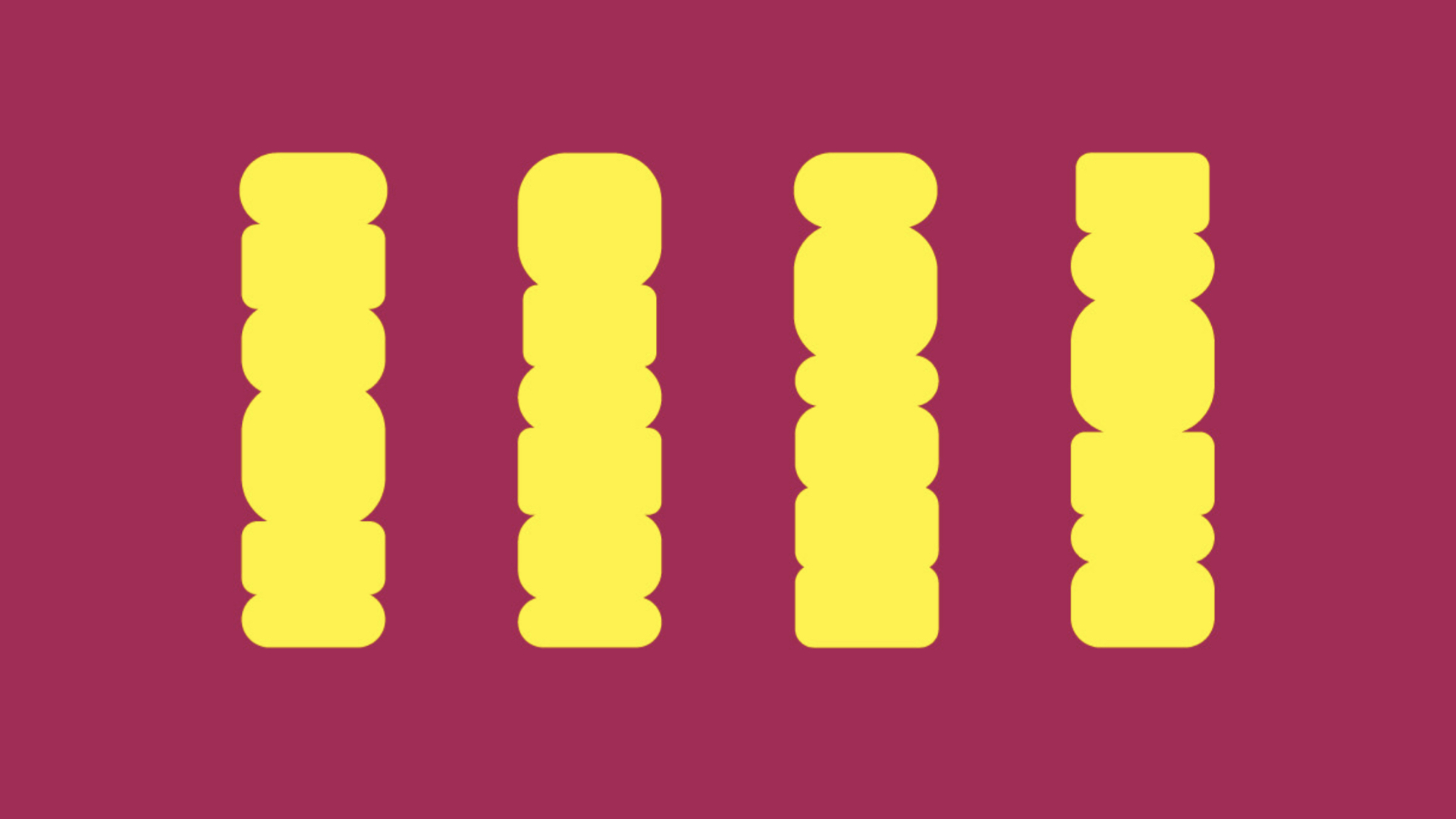
混合的概念也体现在视觉识别中。标志由不同形状的图形组合在一起形成Remix的名称。就像谷物麦片本身一样,这些形状通过不同的方式混合在一起,形成了一个动态的图案,呼应了无拘无束混合的概念。这种多功能的形象反映了品牌在制作谷物麦片时的玩味、大胆和创造力精神。
Remix is a granola and muesli company aiming to create diverse new and unique cereal blends. We decided to use this innovation proposition as the core concept for the brand. We introduced the name “Remix” to represent their distinct mixes. Similar to a DJ remixing music, Remix reinvents basic grains into appetizing granola and muesli combinations that intrigue consumers. The energetic name encapsulates the playful, creative ethos of the company as they pursue flavorful recipes. The mixing notion also features in the visual identity. The logo comprises varied shapes combined together to form the Remix name. Like the cereal itself, these shapes create a dynamic pattern by blending together in different ways, echoing the concept of unconstrained mixing. This versatile identity mirrors the brand’s spirit of playfulness, boldness, and creativity in crafting granola.
Via:Sina Sankar