One More
品牌识别:
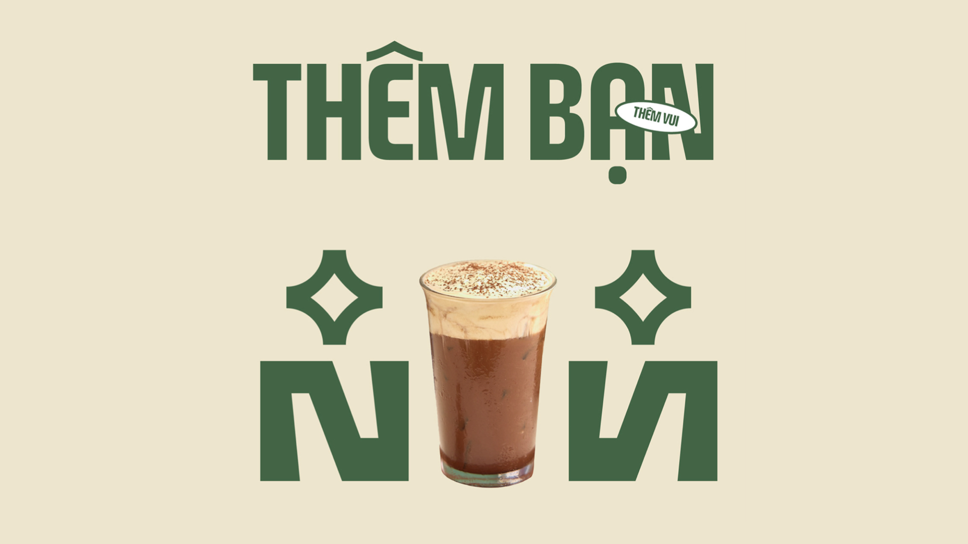
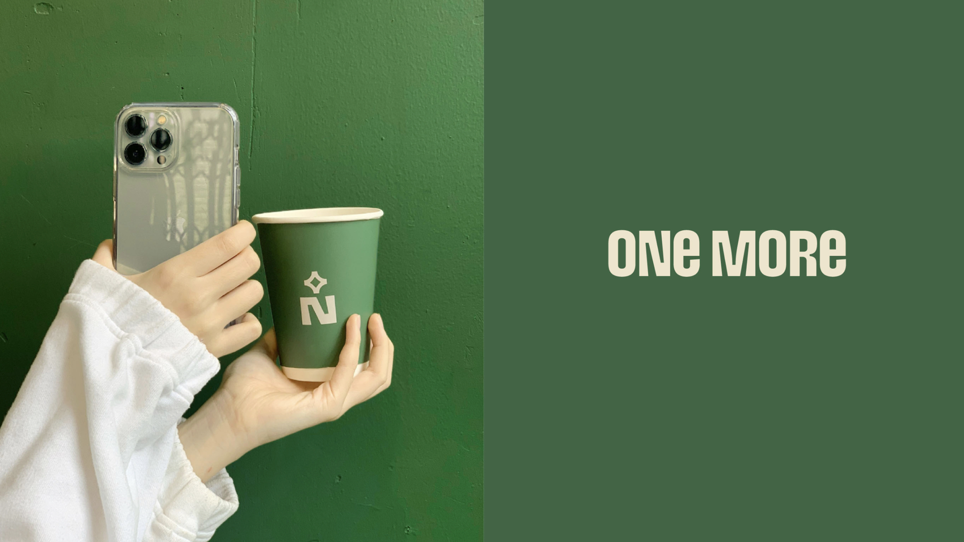
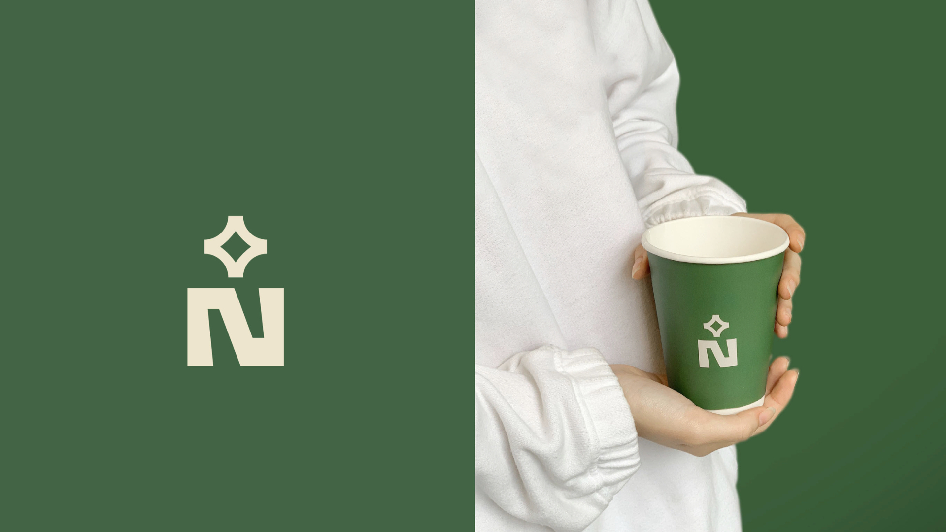
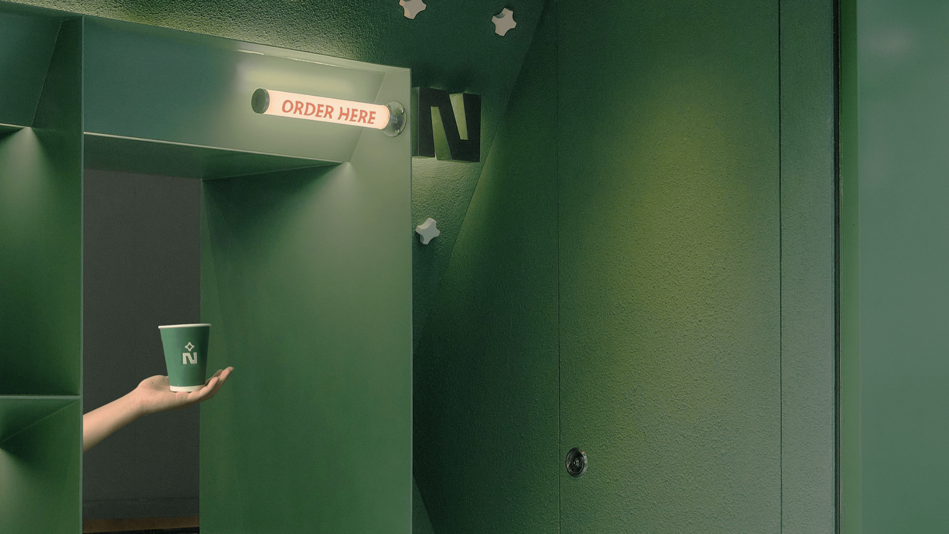
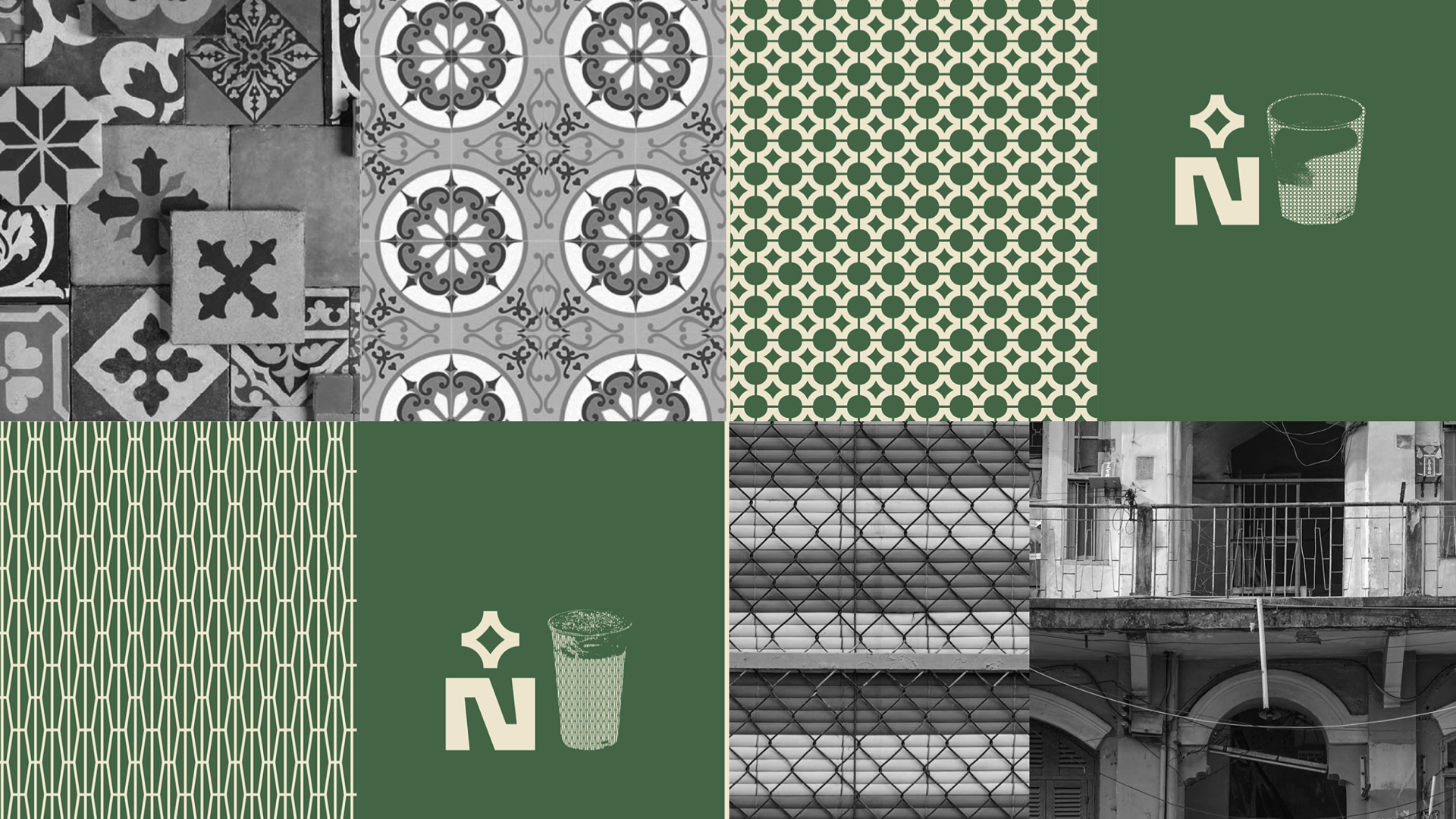
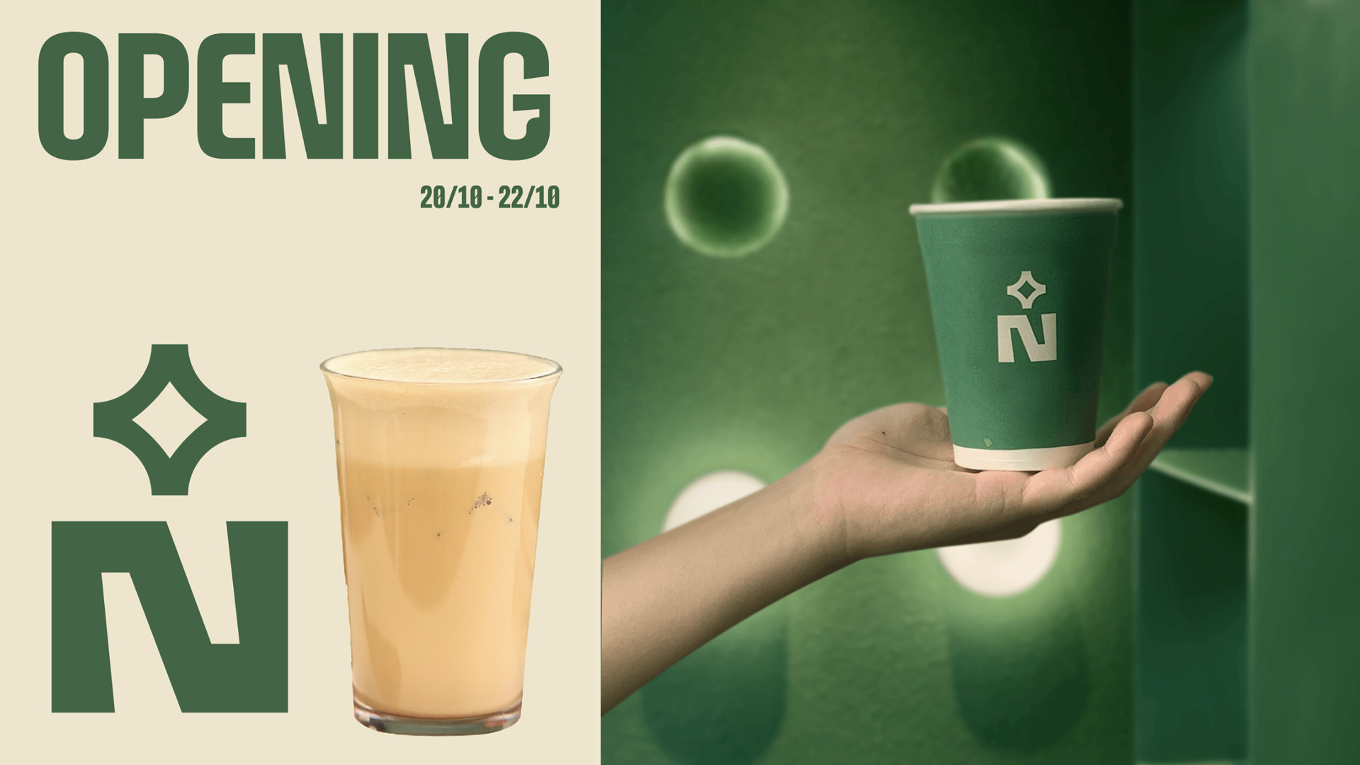
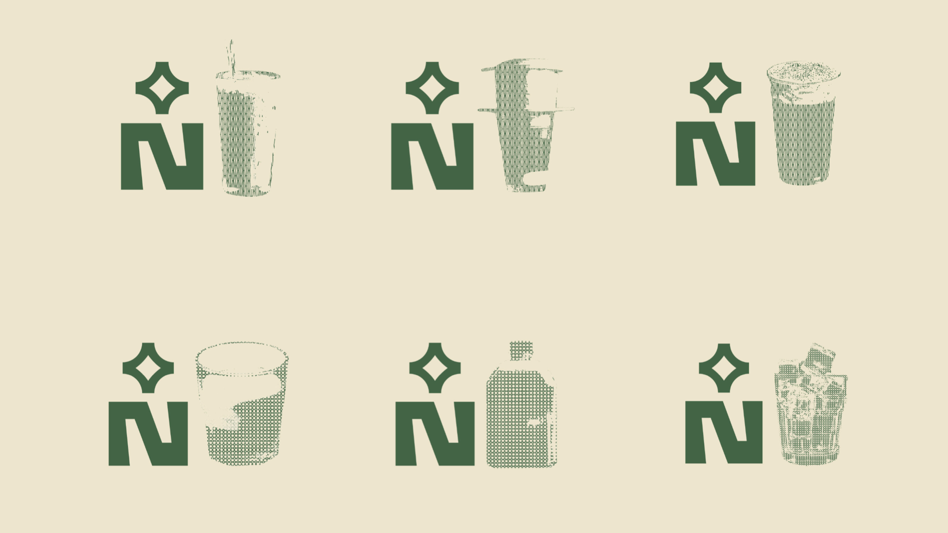
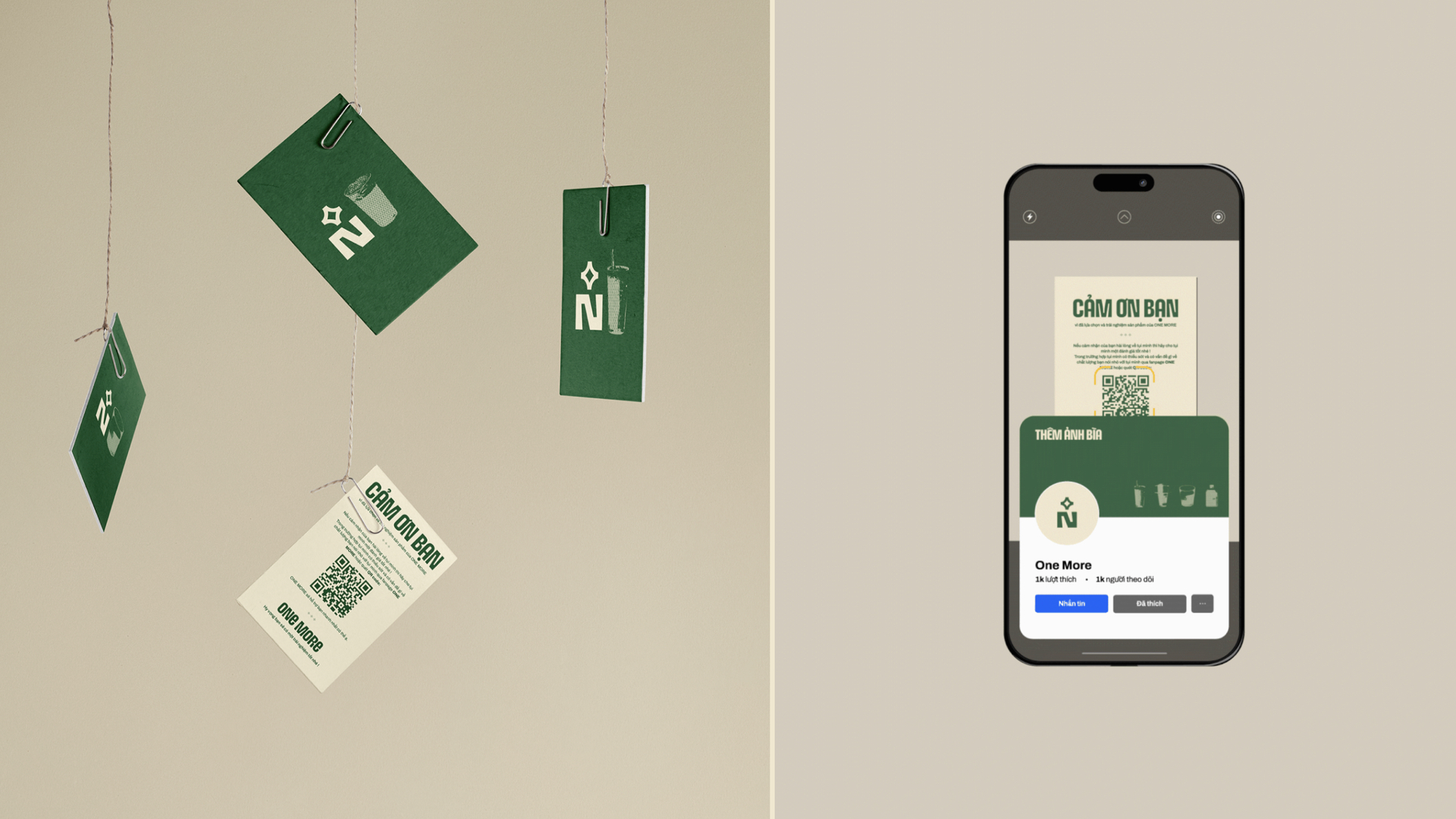
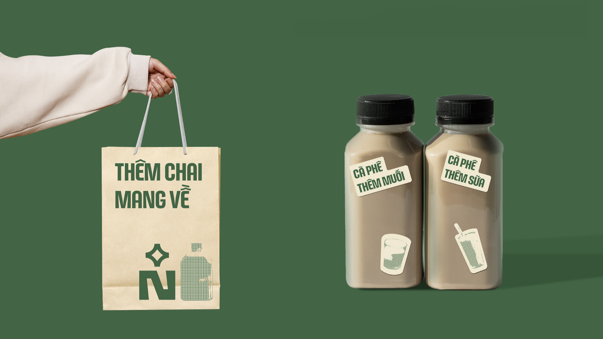
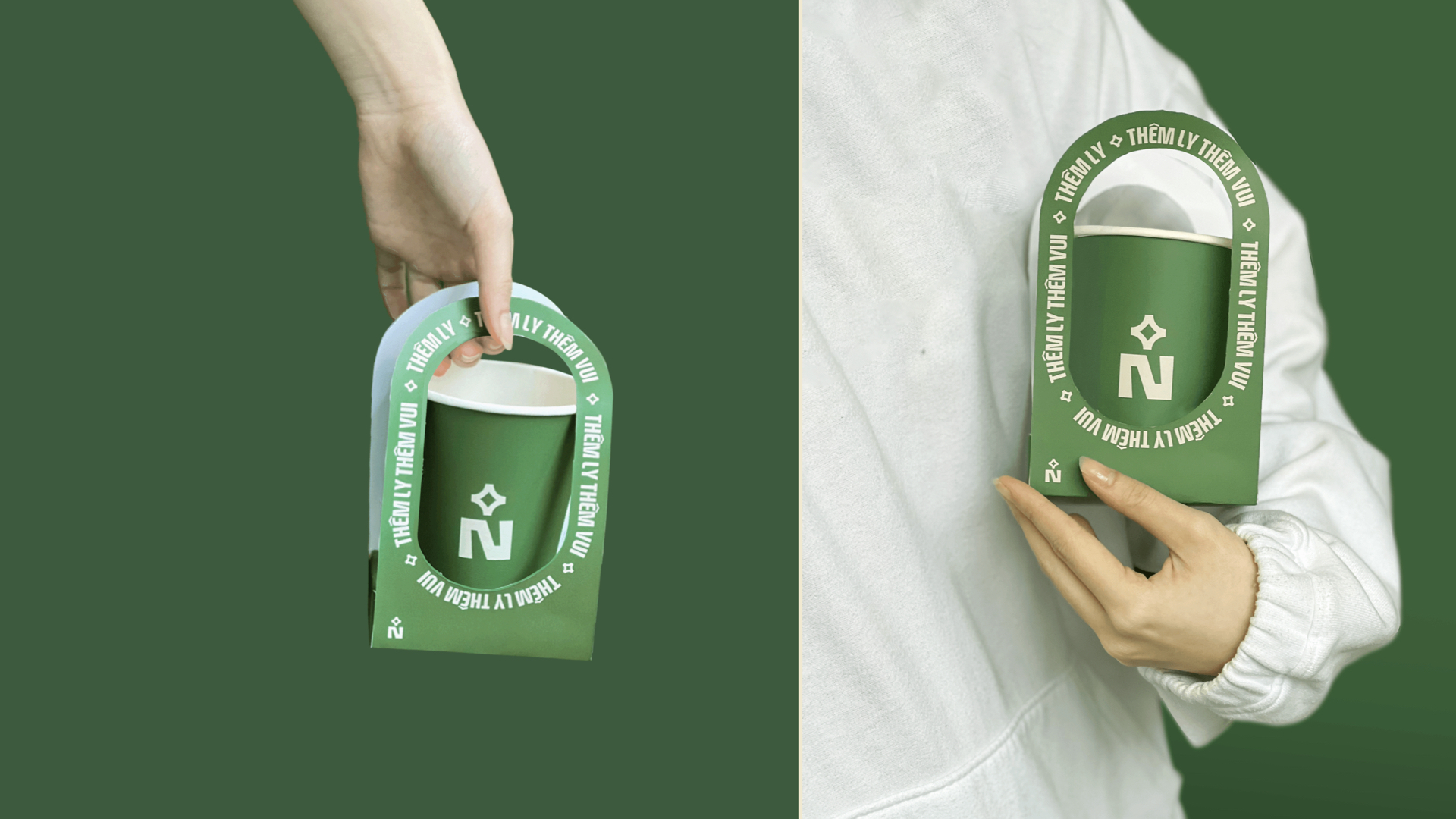
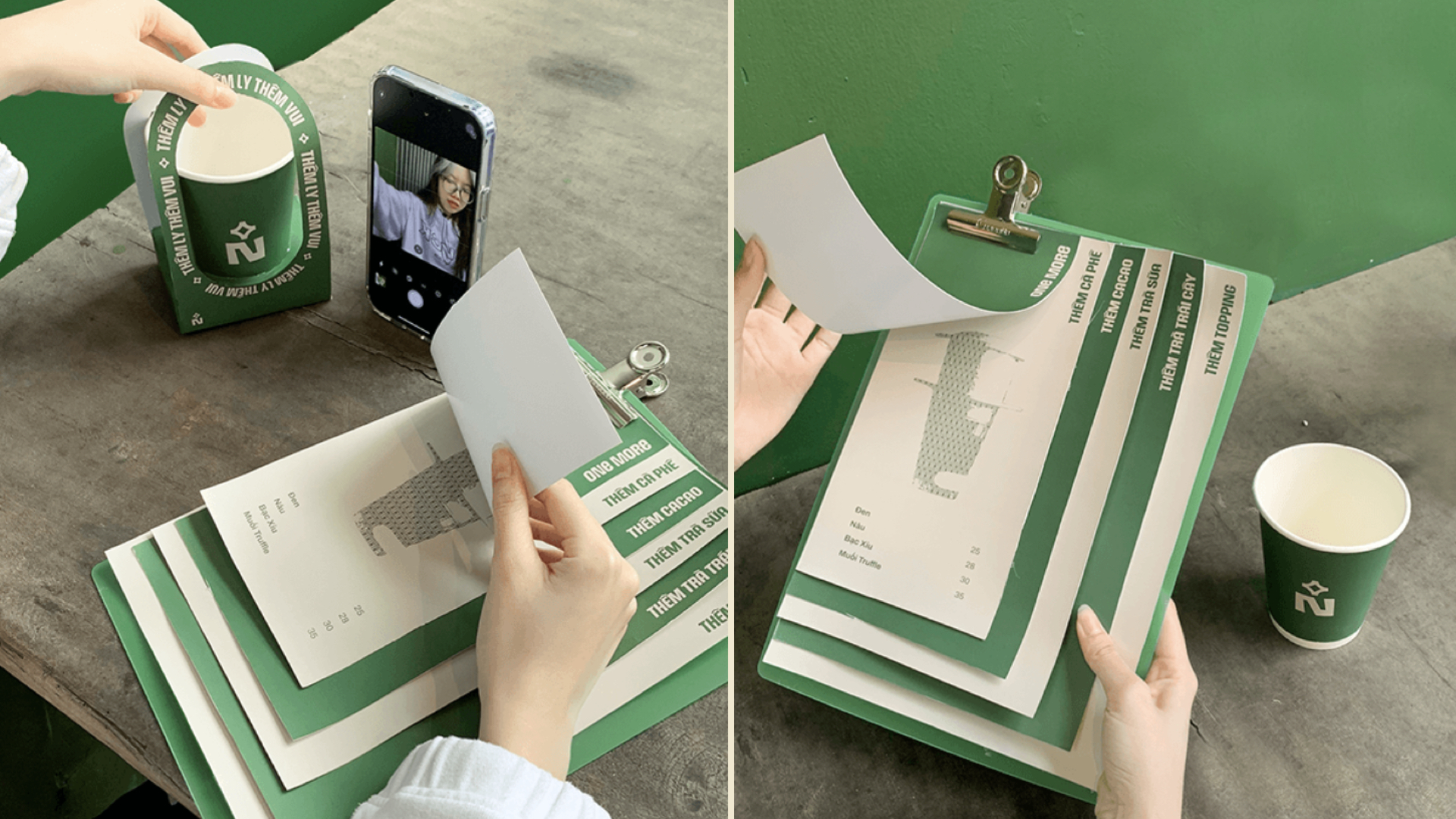
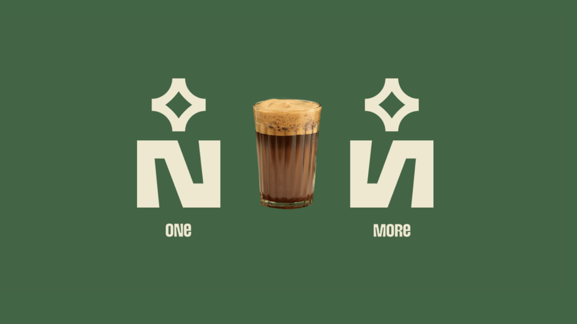
一家位于区中心小巷的咖啡品牌,咖啡品牌vi设计,咖啡包装设计方面选择了“绿色”为主色调,One More希望向每个人传播象征着越南农产品的能量。该品牌相信带给顾客的每一款产品都将是一次探索越南农产品风味的旅程。运用了一些越南文化中的文化元素,所有这些元素共同为品牌创造了独特的图形元素。在数学中,N代表自然数,意味着连续和永恒持续。+N表示渐进和无限增长,象征着发展和One More名称的含义。我们在字母N中融入了经典和现代的元素。标志还代表了品质的形象和人们享受饮品的场景。人们与饮品的联系,品尝不同的味道。
One More - A take away store located in a small alley on Quang Trung street right in the center of Go Vap area. With a pretty appearance and the main color tone being "GREEN" - One More wants to spread to everyone "GREEN ENERGY" to symbolize the energy of Vietnamese agricultural products. The brand believes that each product we bring to customers will be a journey of discovery about the flavors of Vietnamese agricultural products.
Via: Ceris Creative