Uoga Uoga
品牌识别:
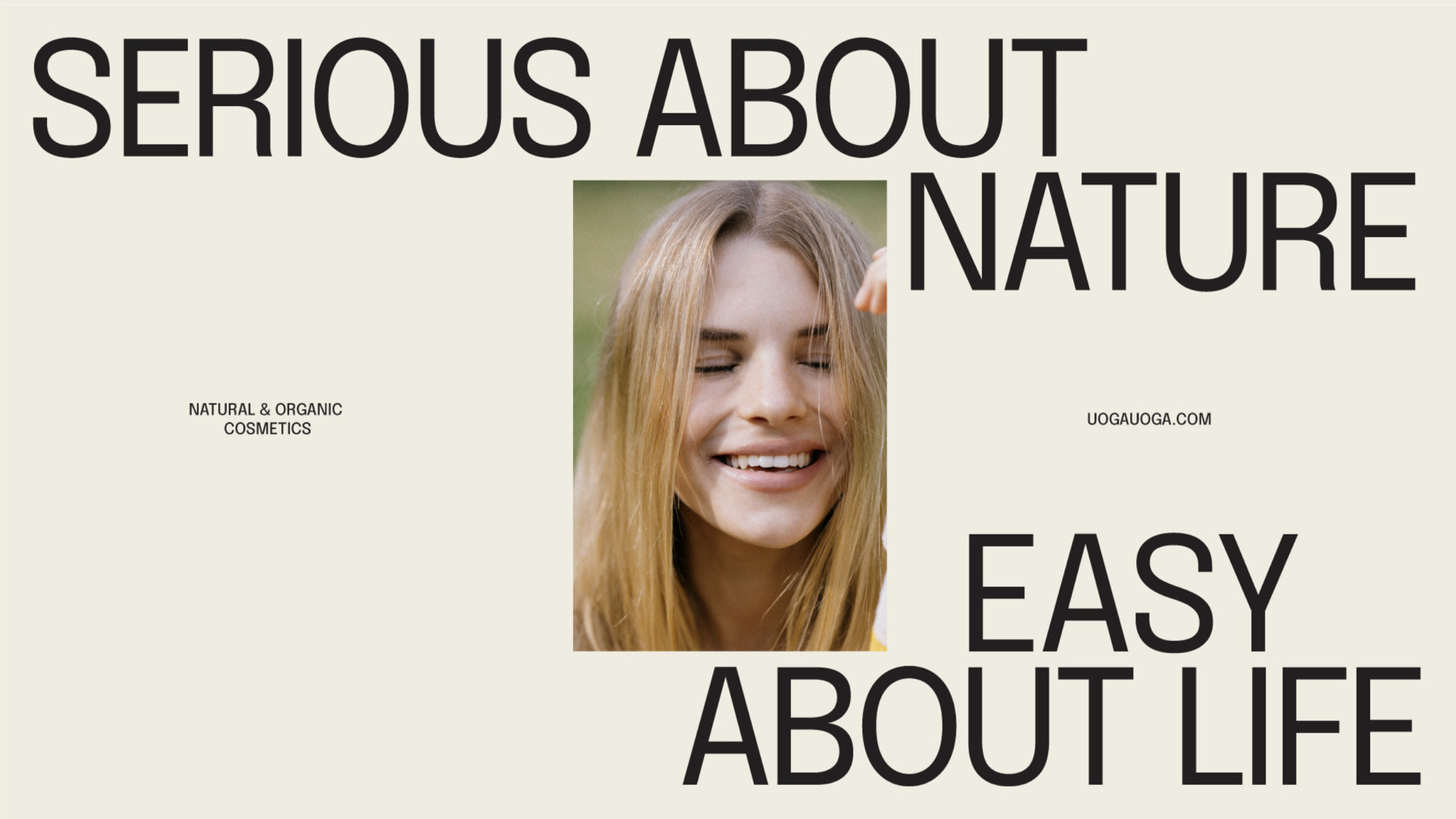
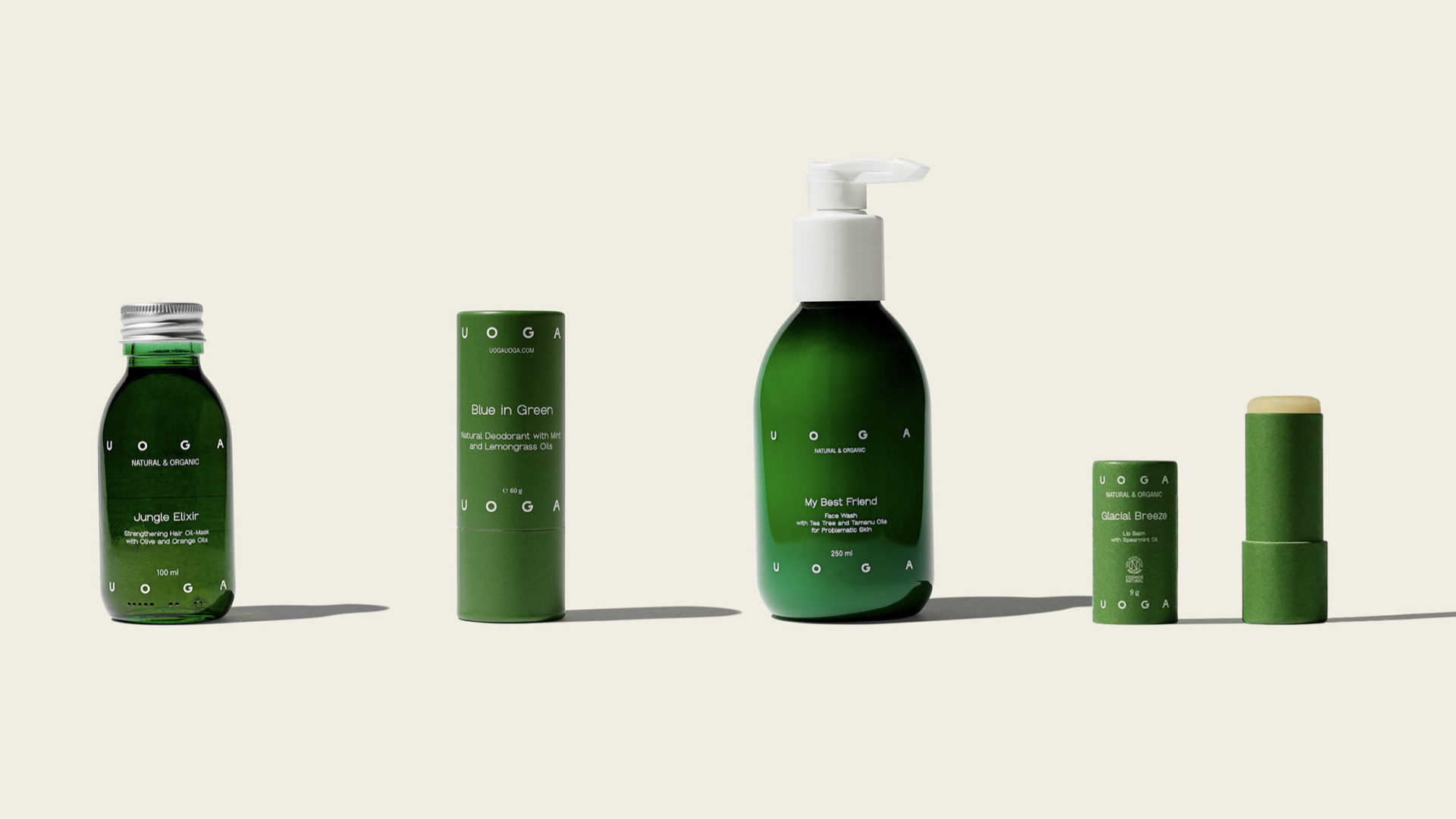
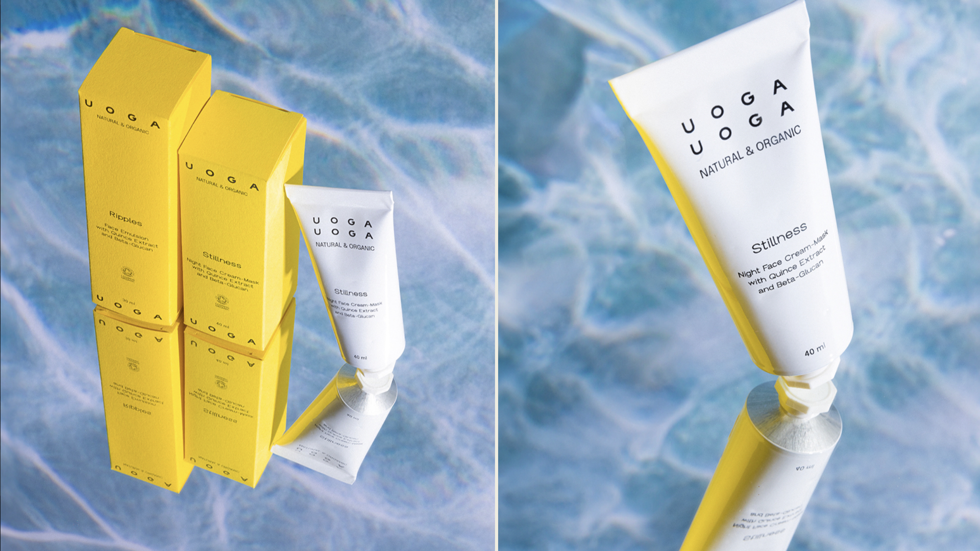
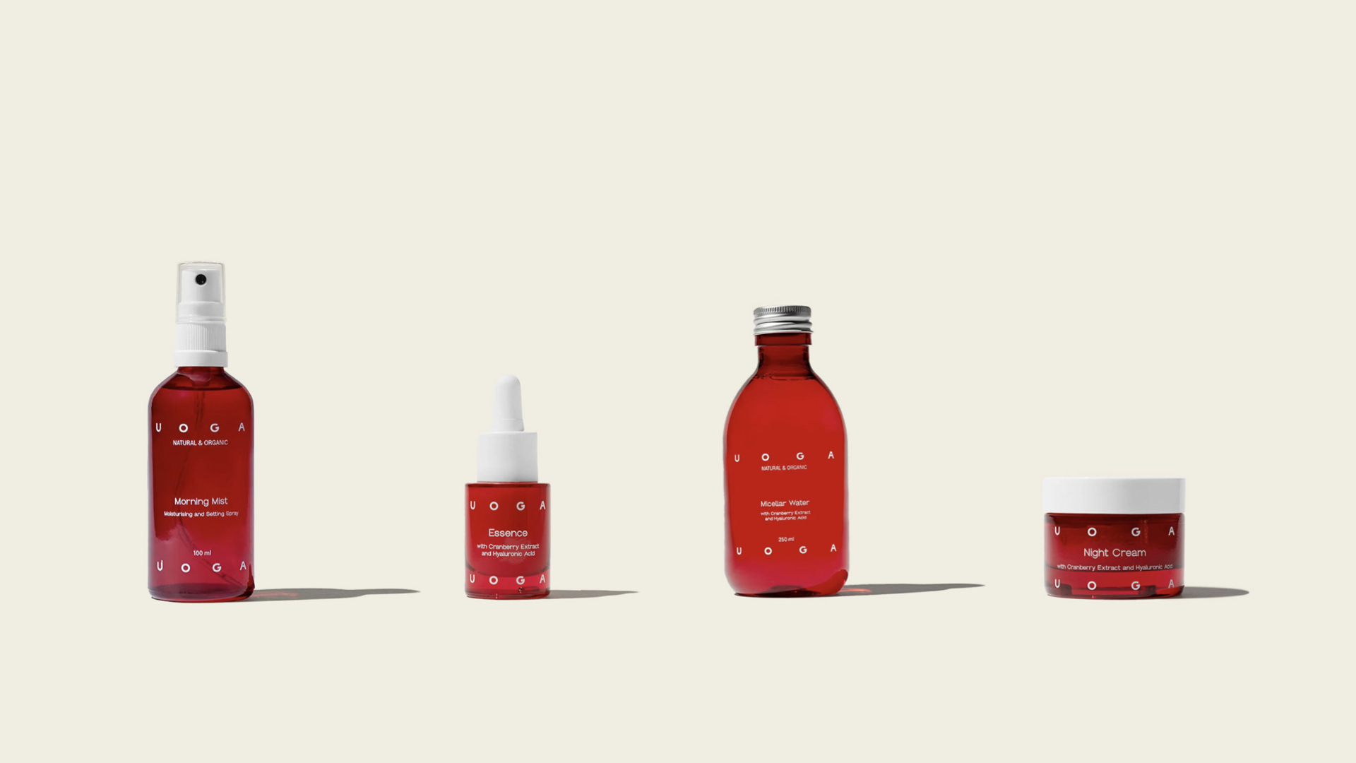
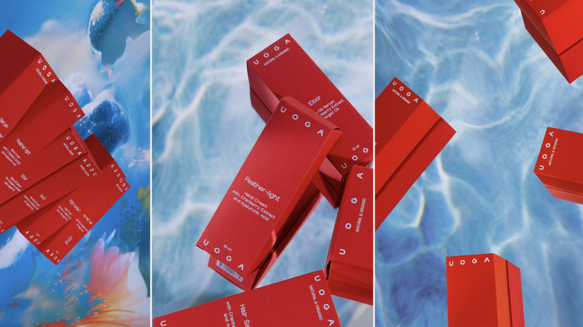
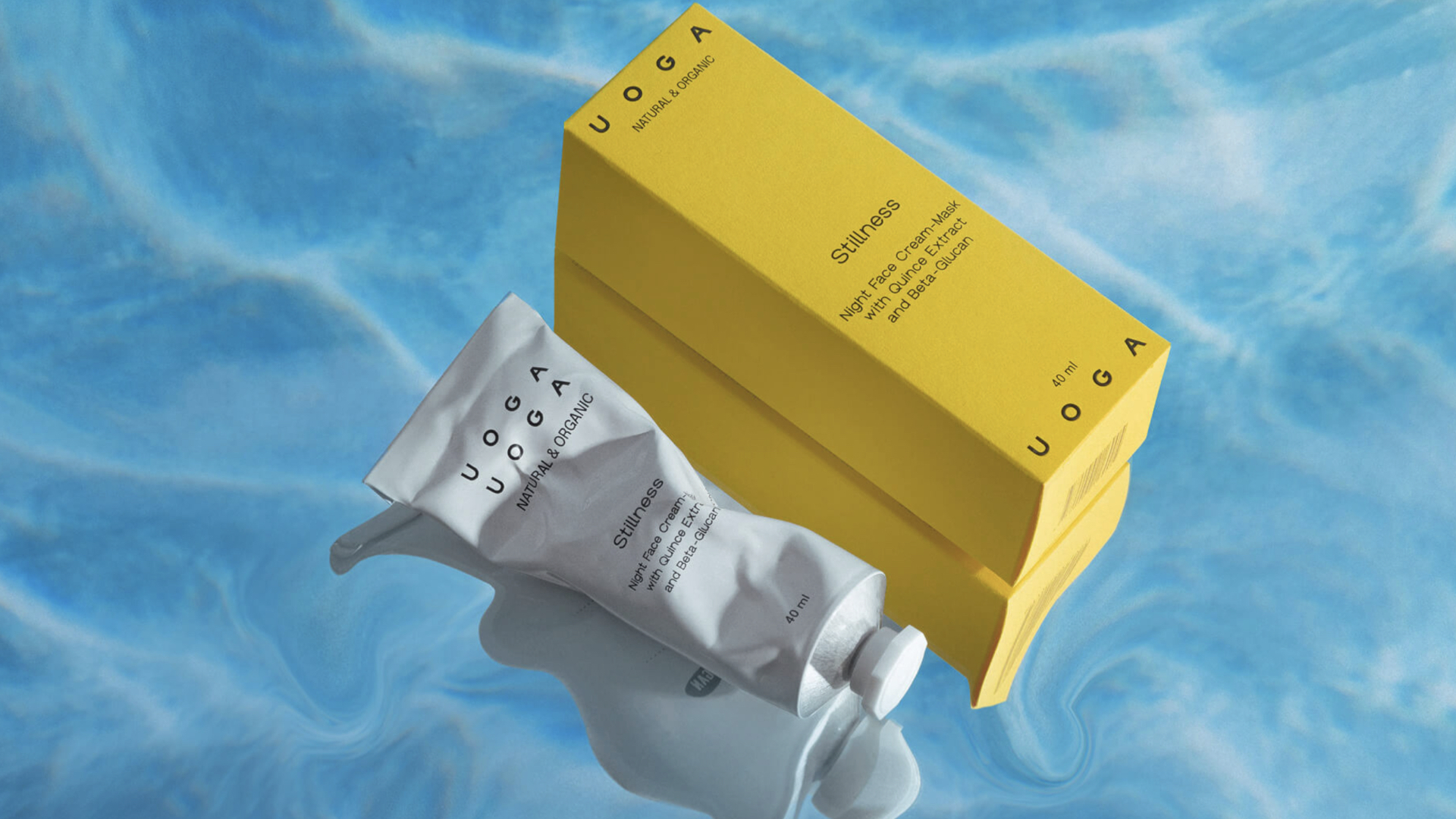
Uoga Uoga是一个天然有机化妆品品牌,这个天然化妆品的品牌需要一个有独特的外观。品牌的身份需要朝着更现代自然的方向发展,以吸引新的化妆品受众——那些即使在城市中不断奔波也关心自己的身体的人。该品牌从大自然中获取成分,以提供广受喜爱的产品,为我们的日常生活带来快乐,让我们的皮肤更加光彩照人。
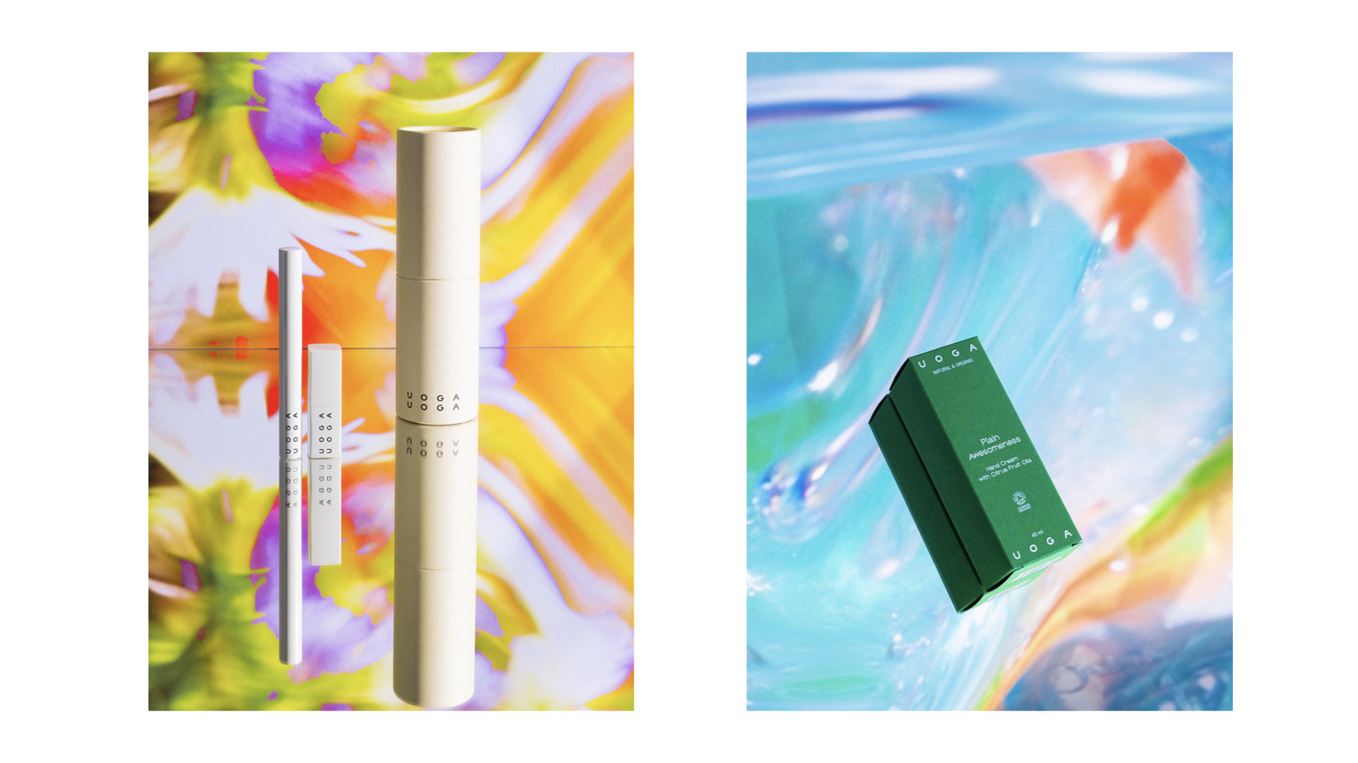
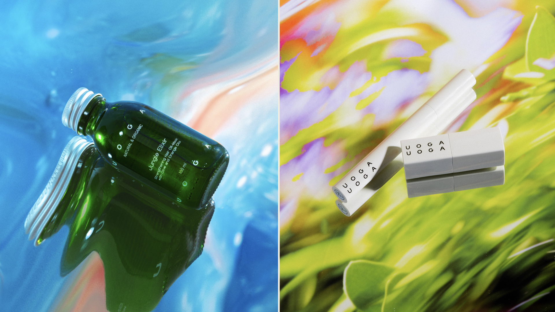
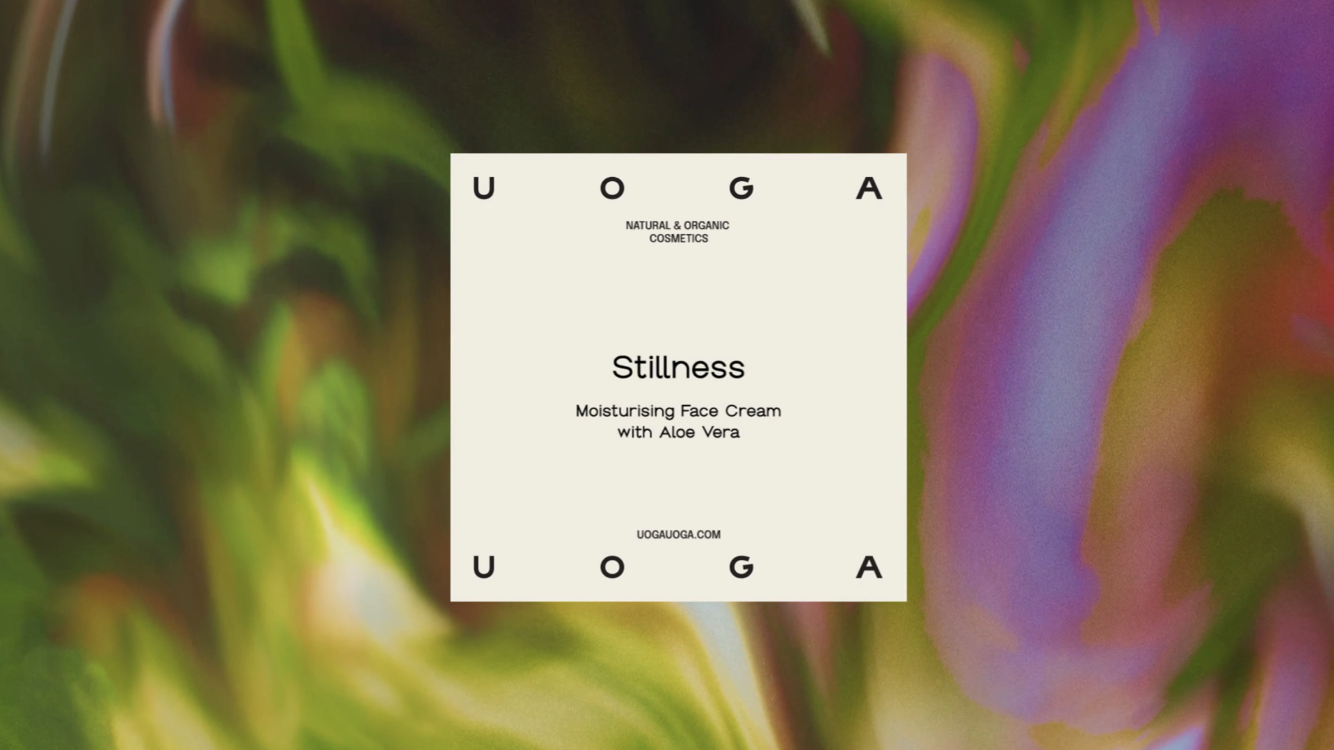
Uoga Uoga在化妆品品牌vi设计,化妆品包装设计也是明亮而多彩的风格,表达出生动的情感。提醒我们每个人都是不同的,以自己的方式看待世界。Uoga Uoga的logo反映了他们珍视的核心价值观:一种将城市与自然结合的现代方法。字体标志也可以在包装或数字表示的边缘周围舞动,配以Groteska和Epilogue字体。当这些字体一起使用时,它们创建出一种富有表现力和动态的整体,展现出身份的情绪。
Hence, through a new Uoga Uoga identity, we reveal the message of juiciness that comes from nature, from which the brand takes the ingredients to deliver broadly enjoyable products to bring little joy into our daily life and make our skin shine even more. Juiciness also comes from the brand’s name; thus, it acts as a good communicator for the dynamic brand’s nature. Unlike most boutique brands, Uoga Uoga is bright and colourful, expressing vivid emotions. It also reminds us that we are all different and perceive the world individually. The logo of Uoga Uoga reflects the core values they cherish: a modern approach to synthesising urban and natural poles. The wordmark can also be played around the edges of packaging or digital representation, accompanied by Groteska and Epilogue fonts. When used together, these fonts create an expressive and dynamic whole, revealing the identity’s mood and making it stand out from the competitors who mainly use geometric sans-serifs.
Via: andstudio agency